When Analytic Solver Data Science calculates prediction, classification, forecasting and transformation results, internal values and coefficients are generated and used in the computations. These values are saved to output sheets named, X_Stored -- where X is the abbreviated name of the data science method. For example, the name given to the stored model sheet for Linear Regression is "LinReg_Stored".
Note: In previous versions of XLMiner, this utility was a separate add-on application named XLMCalc. Starting with XLMiner V12, this utility is included free of charge and can be accessed under Score in the Tools section of the XLMiner ribbon.
For example, assume the Linear Regression prediction method has just finished. The Stored Model Sheet (LinReg_Stored) will contain the regression equation in PMML format. When the Score Test Data utility is invoked or when the PsiPredict() function is present (see below), Analytic Solver will apply this equation from the Stored Model Sheet to the test data.
Along with values required to generate the output, the Stored Model Sheet also contains information associated with the input variables that were present in the training data. The dataset on which the scoring will be performed should contain at least these original Input variables. Analytic Solver Data Science offers a “matching” utility that will match the Input variables in the training set to the variables in the new dataset so the variable names are not required to be identical in both data sets (training and test). See the sections below for more information on scoring to a database.
Scoring New Data Example
This example illustrates how to score new data using a stored model sheet using output from a Multiple Linear Regression fitted model. In other words, the fitted Linear Regression model from the Predicting Housing Prices using MLR will be used to predict values for the MEDV variable for 10 new housing tracts. The new dataset may be found below. This procedure may be repeated using any stored model sheets generated using Analytic Solver Data Science.
Click Help – Example Models on the Data Science ribbon, then Forecasting/Data Science Examples and open the example file Scoring.xlsx.
LinReg_Stored was generated while performing the steps in the “Multiple Linear Regression Prediction Method” chapter. See this chapter for details on performing a Multiple Linear Regression.
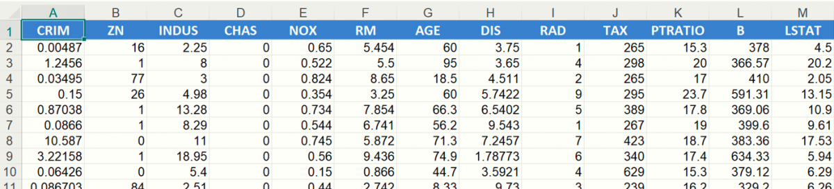
Scoring.xlsx also contains a New Data worksheet with 10 new records. Our goal is to score this new dataset to come up with a predicted housing price for each of the 10 new records.
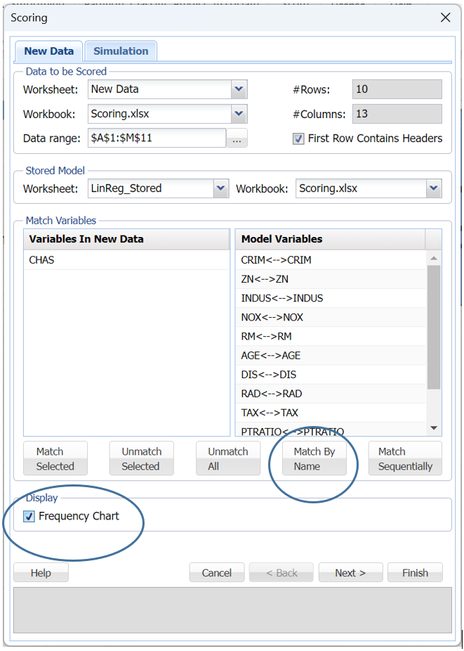
Click Score on the Data Science ribbon. Under Data to be scored, confirm that New Data appears as the Worksheet, Scoring.xlsx as the Workbook, the Data range is A1:M11 and LinReg_Stored is selected in the Worksheet drop down menu under Stored Model.
Note: Be sure not to include the N column in the Data Range. This column contains PSI Data Science Functions used in the next section.
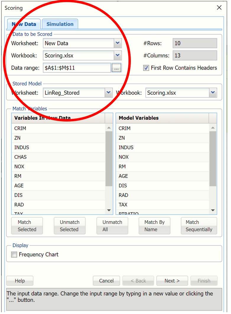
Variables in the New Data may be matched with Variables in Stored Model using three easy techniques: by name, by sequence or manually.
If Match By Name is clicked, all similar named variables in the stored model sheet will be matched with similar named variables in the new dataset.
If Match Sequentially is clicked, the Variables in the stored model will be matched with the Variables in the new data in order that they appear in the two listboxes. For example, the variable CRIM from the new dataset will be matched with the variable CRIM from the stored model sheet, the variable ZN from the new data will be matched with the variable ZN from the stored model sheet and so on.
To manually map variables from the stored model sheet to the new data set, select a variable from the new data set in the Variables in New Data listbox, then select the variable to be matched in the stored model sheet in the Variables in Stored Model listbox, then click Match. For example to match the CRIM variable in the new dataset to the CRIM variable in the stored model sheet, select CRIM from the Variables in New Data listbox, select CRIM from the stored model sheet in the Variables in Stored Model listbox, then click Match Selected to match the two variables.
To unmatch all variables click Unmatch all. To unmatch two specific variables, select the matched variables, then click Unmatch Selected.
Click Match By Name to quickly match all variables in the fitted model with the variables in the new data.
Click the Frequency Chart checkbox, in the bottom left of the chart, to display frequency charts for all variables in the output.
From here you can either click Finish to score the data on the New Data worksheet. Or, if you are scoring a classification or prediction model, you can click Next to advance to the Simulation tab where you can perform a complete risk analysis on the data.
Click Next.
Once the Simulate Response Prediction checkbox is selected, a new Training Data tab appears to the left of the Simulation tab. Use this tab to select the continuous variables to be included in the risk analysis. Make sure to select Worksheet: Data and Data range: A1:O507 within the Data Source section of the Training Data tab.
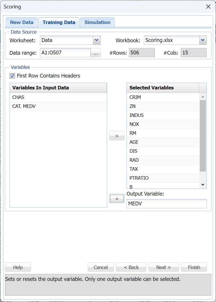
The same variables must be selected as what were selected previously when the stored model sheet was created.
Click the LinReg_Output worksheet to see the variables selected for the original fitted model: CRIM, ZN, INDUS, NOX, RM, AGE, DIS, RAD, TAX, PTRATIO, B and LSTAT with MEDV as the output variable.
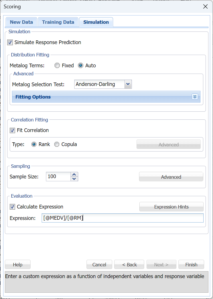
Click Next to return to the Simulation tab. Options for the risk analysis of the new data using the trained and validated machine learning model fit in the previous Predicting Housing Prices using MLR chapter, are set on the Simulation tab. This example uses the default of 100 simulated cases and enters an expression to calculate the median price per room in each census tract.
Enter the following formula for Expression: [@MEDV]/[@RM]
A chart with the results of this expression as applied to both the new data and the training data will be inserted into the output.
All options on the Simulation tab are left at their default settings. Recall that Fitting Options (click the down arrow to open) controls the automated fitting of Metalog probability distributions to each feature in the dataset. By default, bounds in the dataset are used as bounds for the family of Metalog distributions. However, users can easily and quickly adjust or remove the lower and/or upper bounds. Correlation Fitting will, by default, construct a rank-order correlation matrix that includes all features, but choosing “Copula” activates the “Advanced” button, where types of copulas (Clayton, Frank, Gumbel, etc) may be selected. For more information on each option, see the Generate Data chapter within the Data Science Reference Guide.
Click Finish to score the new data (from the New Data worksheet) and the synthetic data and to also perform a risk analysis on the original data (from the Data worksheet).
Two new worksheets, Scoring_LinearRegression and Scoring_Simulation, are inserted to the right of the LinReg_Stored tab.
Scoring_LinearRegression
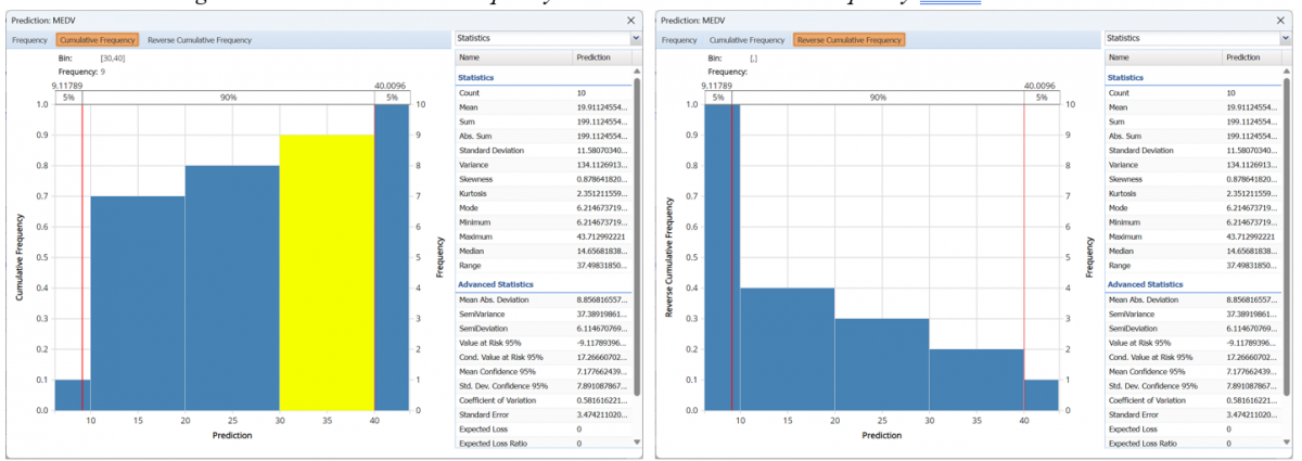
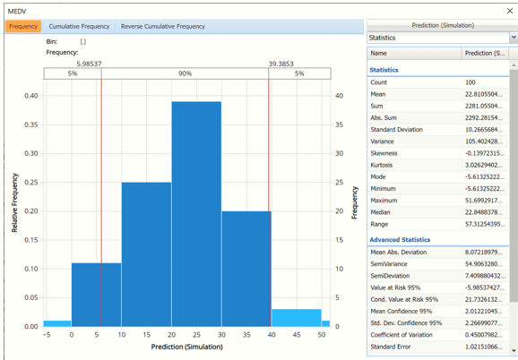
The first thing you’ll notice is the frequency chart that appears when the tab opens. This chart displays the frequency of the output variable, MEDV, for the new data dataset. Use the mouse to hover over any of the bars in the graph to populate the Bin and Frequency headings at the top of the chart.
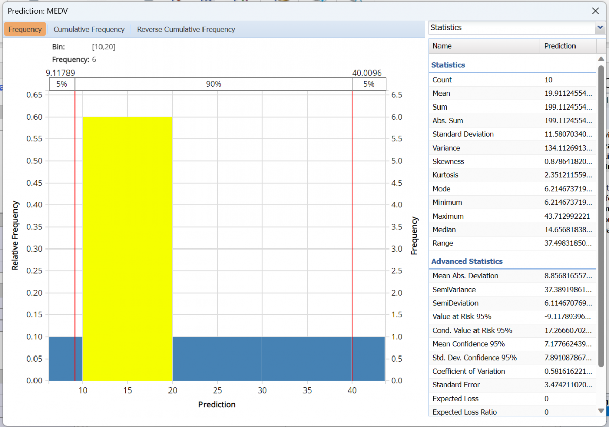
From this chart, you can see the number of records contained in the new data plus Advanced and Summary statistics.
Red vertical lines appear at the 5% and 95% percentile values in all three charts (Frequency, Cumulative Frequency and Reverse Cumulative Frequency) effectively displaying the 90th confidence interval. The middle percentage is the percentage of all the variable values that lie within the ‘included’ area, i.e. the darker shaded area. The two percentages on each end are the percentage of all variable values that lie outside of the ‘included’ area or the “tails”. Percentile values can be altered by moving either red vertical line to the left or right.
Click Cumulative Frequency and Reverse Cumulative Frequency tabs to see the Cumulative Frequency and Reverse Cumulative Frequency charts, respectively.
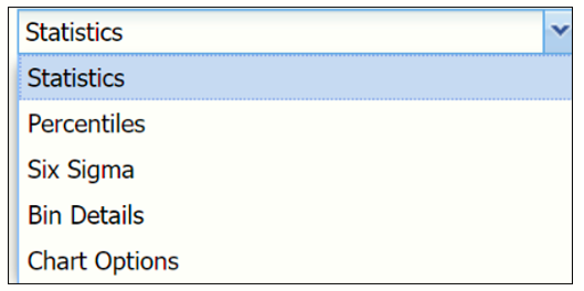
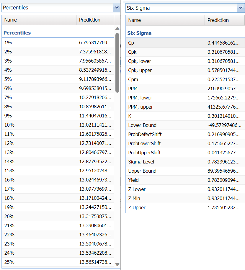
Click the down arrow next to Statistics to view Percentiles, Six Sigma metrics, details related to the histogram bins in the chart and also to change the look of the chart using Chart Options.
Percentiles and Six Sigma views.
Select Bin Details to view details pertaining to each bin in the chart.
Hover over the bars in the chart to display important bin statistics such as frequency, relative frequency, sum and absolute sum.
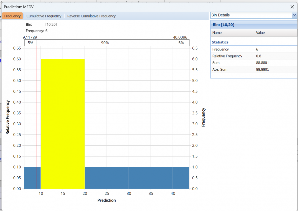
- Frequency is the number of observations assigned to the bin.
- Relative Frequency is the number of observations assigned to the bin divided by the total number of observations.
- Sum is the sum of all observations assigned to the bin.
- Absolute Sum is the sum of the absolute value of all observations assigned to the bin, i.e. |observation 1| + |observation 2| + |observation 3| + …
As discussed above, see the Generate Data section of the Exploring Data chapter (within the Analytic Solver Reference Guide) for an in-depth discussion of this chart as well as descriptions of all statistics, percentiles, bin details and six sigma indices.
Click the X in the upper right hand corner to close the frequency chart. You can reopen the chart simply by clicking on a different worksheet tab and then clicking back to the Scoring_LinearRegression tab.
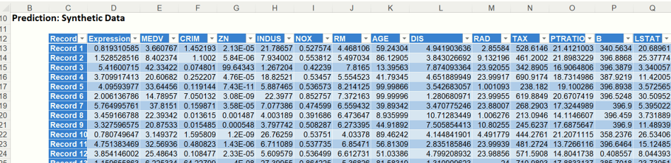
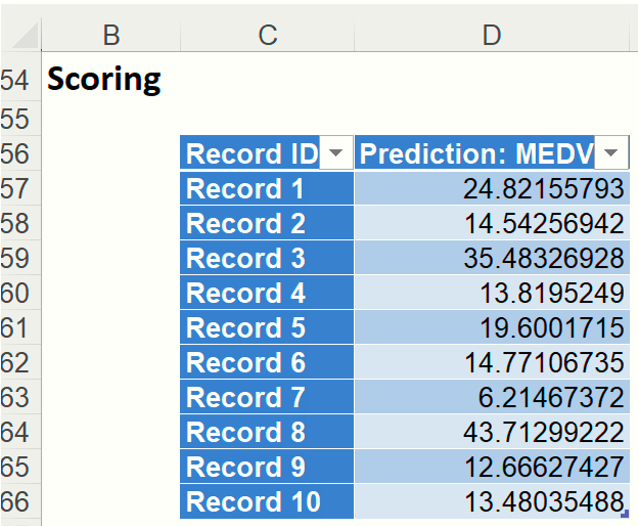
The results from scoring can be found under: Scoring. These are the mean predicted prices for the MEDV variable for each of the ten new records.
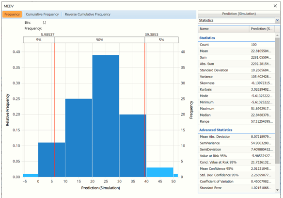
Click the 2nd output tab, Scoring_Simulation. You’ll notice a similar chart appear. This chart displays a frequency histogram of the predicted values for the synthetic data.
Scoring_Simulation
Analytic Solver Data Science generates a new output worksheet, Scoring_Simulation, when Simulate Response Prediction is selected on the Simulation tab of the Scoring dialog.
From this chart, users can view charts containing histograms of the synthetic data, the training data and the results of the Expression applied to both datasets, if populated in the dialog.
This chart is similar to the chart on the Scoring_LinearRegression output sheet in that it also contains the same three charts described above (Frequency, Cumulative Frequency and Reverse Cumulative Frequency) and the same views: Statistics, Percentiles, Six Sigma and Bin Details. Click each chart tab to view the selected chart and click the down arrow next to Statistics to change the view.
By default, this chart first opens to the Prediction (Simulation) view, which displays a histogram of the predicted values in the simulation (or synthetic) data.
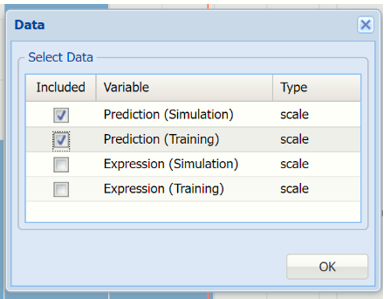
Click Prediction (Simulation) to open the Data dialog. Select Prediction (Simulation) and Prediction (Training) to view the predicted values in both the training and synthetic datasets.
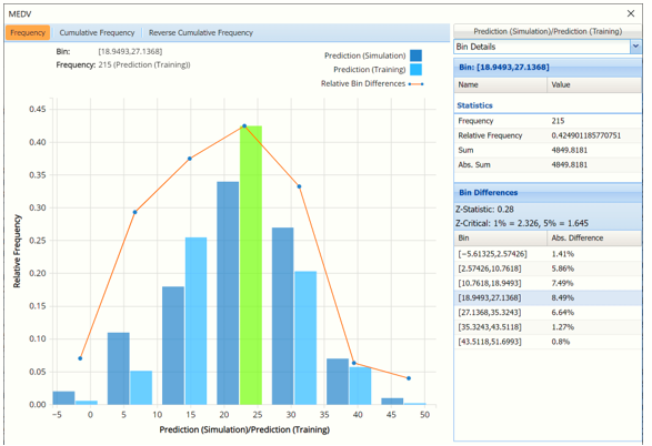
The dark blue bars display the frequencies of the MEDV variable in the synthetic data, or Prediction (Simulation), and the lighter blue bars display the frequencies of the MEDV variable in the original data, or Prediction (Training). The synthetic data is predicting a slightly higher number of homes in the $27,000 to $35,000 (remember these are 1940’s housing prices!) range and fewer number of homes in the $19,000 to $27,000 range.
Notice that red curve which connects the relative Bin Differences for each bin. As discussed in the previous chapters, Bin Differences are computed based on the frequencies of records which predictions fall into each bin. For example, consider the highlighted bin in the screenshot above [x0, x1] = [18.949, 27.137]. This bin contains 34 records in the synthetic data and 215 records in the training data. The relative frequency of the Simulation data is 34/100 = 34% and the relative frequency of the Training data is 215/506 = 42.5%. Hence the Absolute Difference (in frequencies) is = 42.5 – 34 = 8.5%.
Click back to the Data dialog and select Expression (Simulation) and Expression (Training) to view the results of the expression for both datasets.
Recall the expression: [@MEDV]/[@RM] which is simply the median value of houses in each housing tract divided by the average number of rooms in each dwelling, or a rudimentary calculation of the price per room.
The highlighted bar above shows 28 records in the synthetic data are contained in the Bin: [2.998, 4.00] meaning that there are 28 records in the synthetic data where the value of the expression falls within this interval.
Click the X in the upper right hand corner to close the dialog to view the simulated data for each variable. (To reopen, simply click another tab and then click back to the Scoring_Simulation tab. )