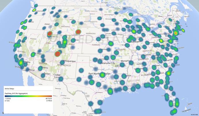
Before we dive into building a supervised model for predicting flight delays, we quickly illustrate the process of summarizing and visualizing Big Data. We can answer many questions by just looking at the aggregated representation of this data. We'll also show how using Analytic Solver Data Mining and Power Map, we can rapidly build the visualization shown in the introduction, illustrating the airline delays in different cities/airports across the USA.
Summarizing Big Data
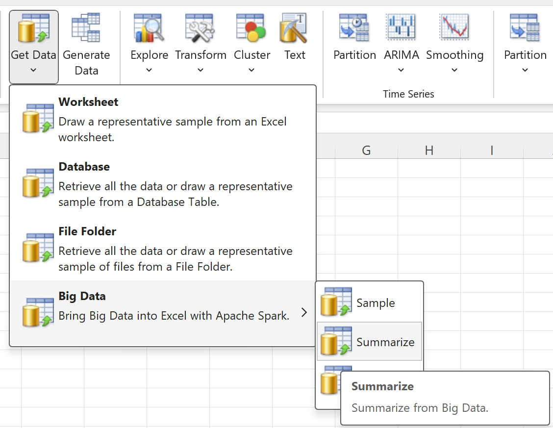
One of the variables in the Airline dataset, DepDelay, reports the number of minutes each of the 120 million flights was delayed. Another variable is the Origin airport for the flight. In Excel's Ribbon on the Data Mining tab, we choose Get Data - Big Data - Summarize:

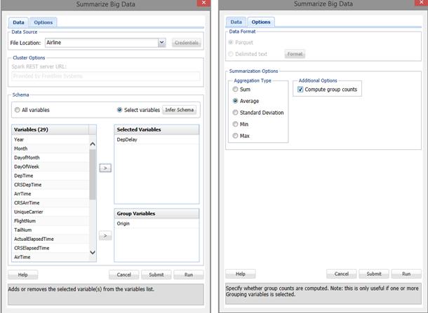
We choose an aggregation -- namely "average" -- of the DepDelay variable, grouped by the Origin variable. Via "point and click," we can perform a query against the data in Frontline's Apache Spark Big Data cluster on Amazon Web Services (or any other Spark cluster with Frontline's server-side component installed):

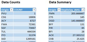
In a matter of seconds we have the average delays for 341 airports, aggregated over the 22-year period from 1987-2008, as an Excel "data table". We can immediately answer questions like “Which airport is most prone, or least prone to delays?”

Farmington, NM seems to have the longest delays on average (203.6 minutes), while flights from Pellston Regional Airport (PLN) tend to depart earlier than the scheduled time on average (-7.6 minutes).
Of course, you can obtain summary statistics using traditional data science tools as well. Here's how it's done in the HortonWorks tutorial, in an excerpt from an iPython notebook:

Don't get us wrong -- as professional software developers, we love Python! And our forthcoming Data Mining SDK, aimed at software developers, uses similar concepts. We just don't think it's suitable for the business analyst who is savvy enough to ask the right business questions, but would rather "point-and-click" than write code.
Creating the “Airline Delays in US airports”
Visualization with Microsoft Power Map
The same summary data table we just created in Excel can be used to easily create the visualization shown earlier and repeated below. We'll skip the step-by-step details of using Microsoft Power Map, but it's free in Excel. You can find it under Insert - Maps.
