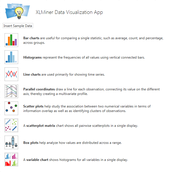
With our free XLMiner Data Visualization App for Office 365 and SharePoint 2013, you can quickly visualize data in your Excel spreadsheet. You can use to App to create 8 different chart types, including advanced multi variate charts such as a Scatterplot Matrix or Parallel Coordinates chart. You can quickly change the variables plotted on each axis, "size by" and "color by" categorical variables for quick insights, zoom in and out, and apply filters to highlight data of interest. The App offers a subset of the data visualization features of XLMiner Pro, which also includes advanced data mining and forecasting capabilities. See More Analytics Apps.
Inserting the Data Viz App
At present, you cannot insert Apps directly in Excel Online; you must insert them in desktop Excel 2013. For more information see Microsoft Office Support on How to get an app for Excel.
- In Excel 2013, open the workbook where you want to use the App. Click the Insert tab, then click the Apps for Office button. If XLMiner Data Visualization appears in the Recently Used Apps dropdown list, select it there, and skip to step 4.
- Select See All... from the dropdown menu. If this is your first time using the App, click find more apps at the Office Store, and look in the Data Visualization + BI category. Otherwise, in the Apps for Office dialog, find and select the XLMIner Data Visualization App under My Apps or My Organization.
- The XLMiner Data Visualization pane should appear. Click File Save As, and save to your Office 365 or SharePoint document library.
- Now when you open your workbook in Excel Online, the XLMiner Data Visualization pane should appear.
Inserting Sample Data
To get started with this App, select a cell in an empty area of at least 6 columns, and click the button Insert Sample Data in the upper left corner of the App's content pane. This will insert an Excel table of 6 columns and 151 rows, with headers "Species No", "Petal Width", "Petal Length", "Sepal Width", "Sepal Length", and "Species Name". This data, from the famous 1936 paper by statistician R.A. Fisher introducing the method of discriminant analysis, consists of measurements of a series of Iris flowers, of three different species: Setosa, Versicolor and Virginica.
The cell range containing the inserted table will be selected, so you can immediately visualize this data in charts. When using your own data, click the icon for a chart type, then click in the Data edit box, select the cell range containing your data, and check the box First Row Contains Headers if applicable. Your data doesn't have to be in an Excel table, but it should be in a cell range where each "variable" or "measure" is in a column, and each "observation" or "record" is in a row.
Displaying a Bar Chart
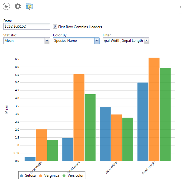
Click the Bar Chart icon to display a bar chart of the data in the currently-selected cell range. The chart appears immediately in the App content pane, but you'll usually want to customize it, using the controls at the top of the chart. Select a choice from the Statistic dropdown list (such as Mean, Count, Maximum, etc.) to be plotted on the vertical axis. A bar for each variable appears on the horizontal axis; note that nothing is plotted for the Species Name, since this is a categorical variable with text values. To remove the empty bar, select the Filter dropdown list and uncheck the box for Species Name, then click elsewhere to close the dropdown. Now select the Color By dropdown list, and choose Species Name (to "color by" the distinct values of a categorical variable). You should see a chart like this.
Filtering Displayed Values
Click the Gear icon at the top of the chart to display a set of sliders you can use to filter the data that appears in the chart. As shown in this example, using the top two sliders to restrict Petal Width to values of 0.5 or greater, and Petal Length values of 2.0 or greater, will filter out 50 observations and select the remaining 100 rows. If you click the Left Arrow above the sliders to return to the bar chart, you'll see that this has filtered out all the flowers of species Setosa, and the corresponding bars no longer appear. Click the Left Arrow at the top of the chart to return to the App's main display of available chart types.
Displaying a Histogram
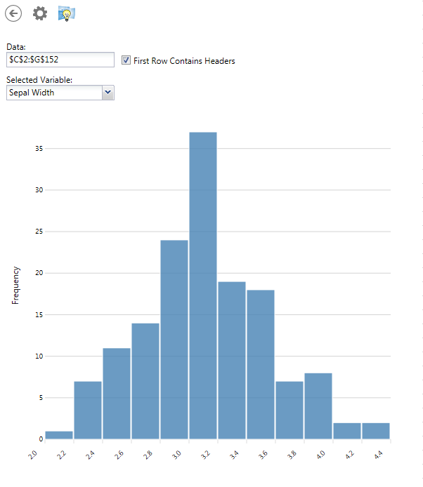
Click the Histogram icon to display this chart. Where a Bar Chart is used to compare a single statistic, such as the Mean, Count, Maximum, etc. across several variables, a Histogram (which looks similar to a Bar Chart) is used to display the frequency of different data values for a single variable. If you display a Histogram of Petal Width or Petal Length, you'll notice that the data contains a lot of flowers with short, narrow petals; but if you display a Histogram of Sepal Width, you'll see that this measure has a more "normal" distribution.
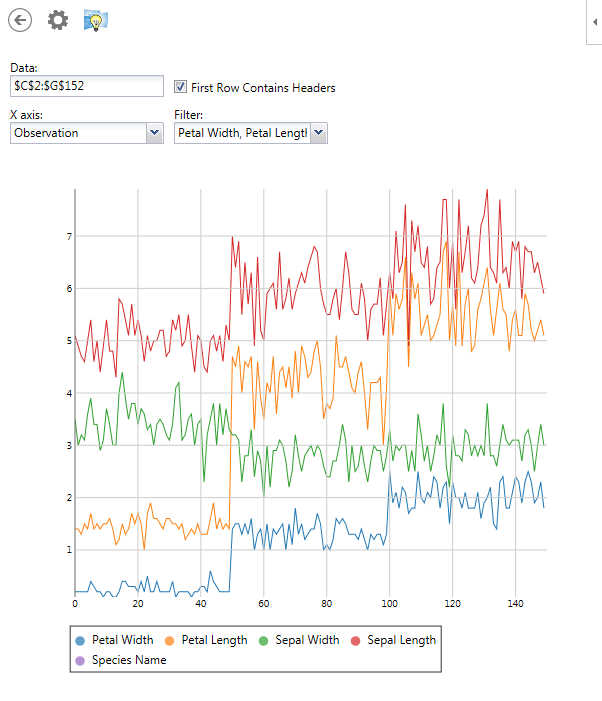
Displaying a Line Chart
Click the Line Chart icon to display this chart. A Line Chart plots each variable's value on the vertical (Y) axis, using either the Observation Number (the usual choice) or another variable on the horizontal (X) axis. This type of chart is most meaningful for time series data, but for the Iris flower data it will show an interesting pattern for Observation Number, and unusual patterns if you select another variable for the X axis.
If your mouse or other pointer has a scroll wheel, you can zoom in and out on a Line Chart by simply moving the wheel. Zooming takes place at the current position of the pointer.
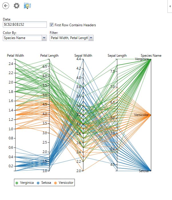
Displaying a Parallel Coordinates Chart
Click the Parallel Coordinates icon to display this chart. If you Color By Species Name, and include Species Name in the Filter dropdown, the chart should appear like this example.
Each line represents a single observation, or row in the data; the clusters of lines give you an overall visualization of the nature of the data.
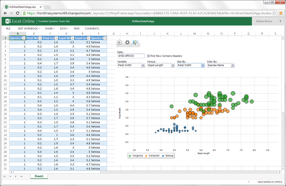
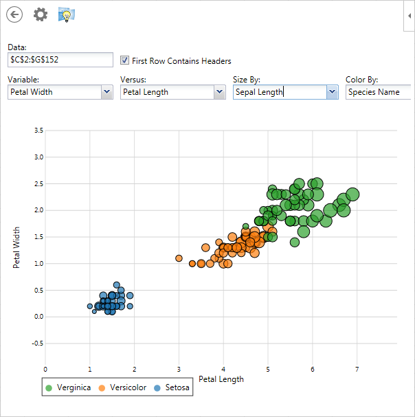
Displaying a Scatter Plot
Click the Scatter Plot icon to display this chart. You can choose any variable to appear on the vertical (Y) axis, and any variable to appear on the horizontal (X) axis; you can choose to Color By and Size By other variables. If your mouse or other pointer has a scroll wheel, you can zoom in and out of a Scatter Plot.
This example of a Scatter Plot displays Petal Width versus Petal Length, Colored By Species Name, and Sized By Sepal Length -- revealing that the larger flowers, with wider, longer Petals and longer Sepals, are of species Verginica.
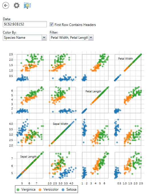
Displaying a Scatterplot Matrix
Click the Scatterplot Matrix icon to display this chart. You'll see a matrix of small Scatter Plots, where each variable (selected by the Filter dropdown list) is plotted against each other variable in the list. The charts on the "diagonal" of the matrix are always straight lines, since they plot a variable against itself. A Scatterplot Matrix gives you a quick overall view of your data -- in the Iris data set Colored By Species Name, you can easily see the groupings of Setosa, Versicolor and Virginica species.
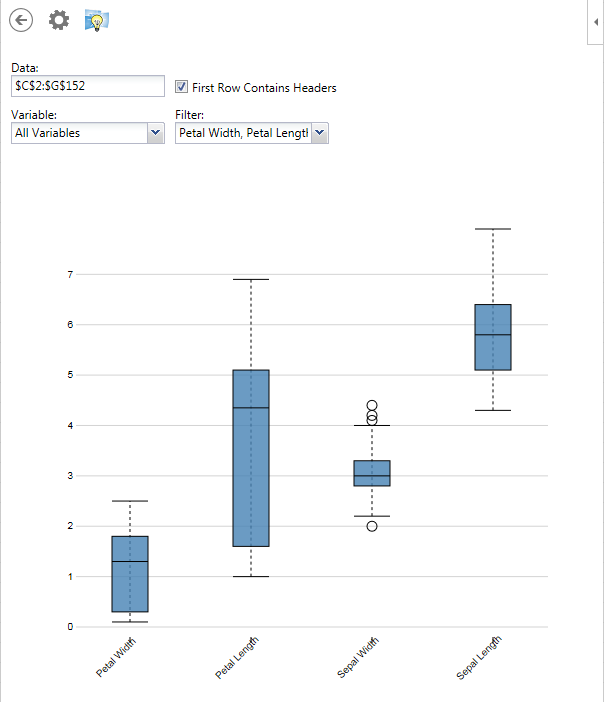
Displaying a Box Plot
Click the Box Plot icon to display this chart. A Box Plot (sometimes called a Box-Whisker chart) offers a quick visual summary of key statistics for each variable displayed. The "box" shows the range of values from the 10th to the 90th percentile, and the mean value appears inside the box as a crossbar. The "whiskers" show the full range of values from the minimum to the maximum, excluding certain "outliers" which are shown as small circles. An array of Box Plots gives you a quick visual comparison of the magnitudes of the different variables.
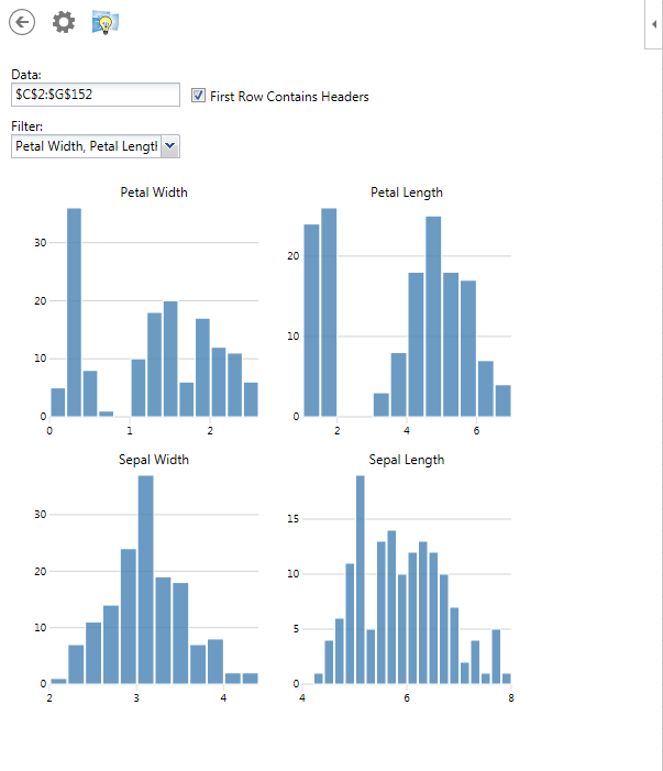
Displaying a Variables Chart
Click the Variables Chart icon to display this chart. A Variables Chart gives you a quick overview of your data, like a Scatterplot Matrix, by displaying array of Histograms, one for each variable. Here's an example for the Iris flower dataset.