Logistic Regression Example
This example illustrates how to fit a model using Analytic Solver Data Science’s Logistic Regression algorithm using the Boston_Housing dataset by developing a model for predicting the median price of a house in a census track in the Boston area.
Click Help - Example Models on the Data Science ribbon, then Forecasting/Data Science Examples and open the example file, Boston_Housing.xlsx.
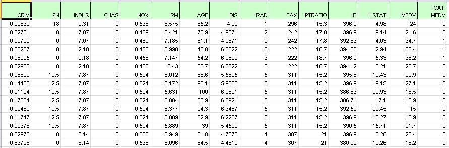
This dataset includes fourteen variables pertaining to housing prices from census tracts in the Boston area collected by the US Census Bureau.
The figure below displays a portion of the data; observe the last column (CAT. MEDV). This variable has been derived from the MEDV variable by assigning a 1 for MEDV levels above 30 (>= 30) and a 0 for levels below 30 (<30) and will not be used in this example.
All supervised algorithms in V2023 include a new Simulation tab. This tab uses the functionality from the Generate Data feature (described in the What’s New section of this guide and then more in depth in the Analytic Solver Data Science Reference Guide) to generate synthetic data based on the training partition, and uses the fitted model to produce predictions for the synthetic data. The resulting report, CFBM_Simulation, will contain the synthetic data, the predicted values and the Excel-calculated Expression column, if present. In addition, frequency charts containing the Predicted, Training, and Expression (if present) sources or a combination of any pair may be viewed, if the charts are of the same type. Since this new functionality does not support categorical variables, these types of variables will not be present in the model, only continuous variables.
Inputs
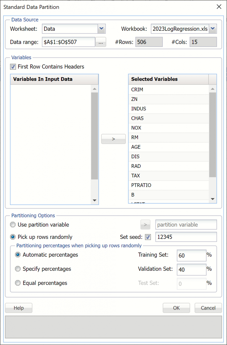
First, we partition the data into training and validation sets using the Standard Data Partition defaults of 60% of the data randomly allocated to the Training Set and 40% of the data randomly allocated to the Validation Set. For more information on partitioning a dataset, see the Data Science Partitioning chapter.
Click Classify - Logistic Regression on the Data Science ribbon. The Logistic Regression dialog appears.
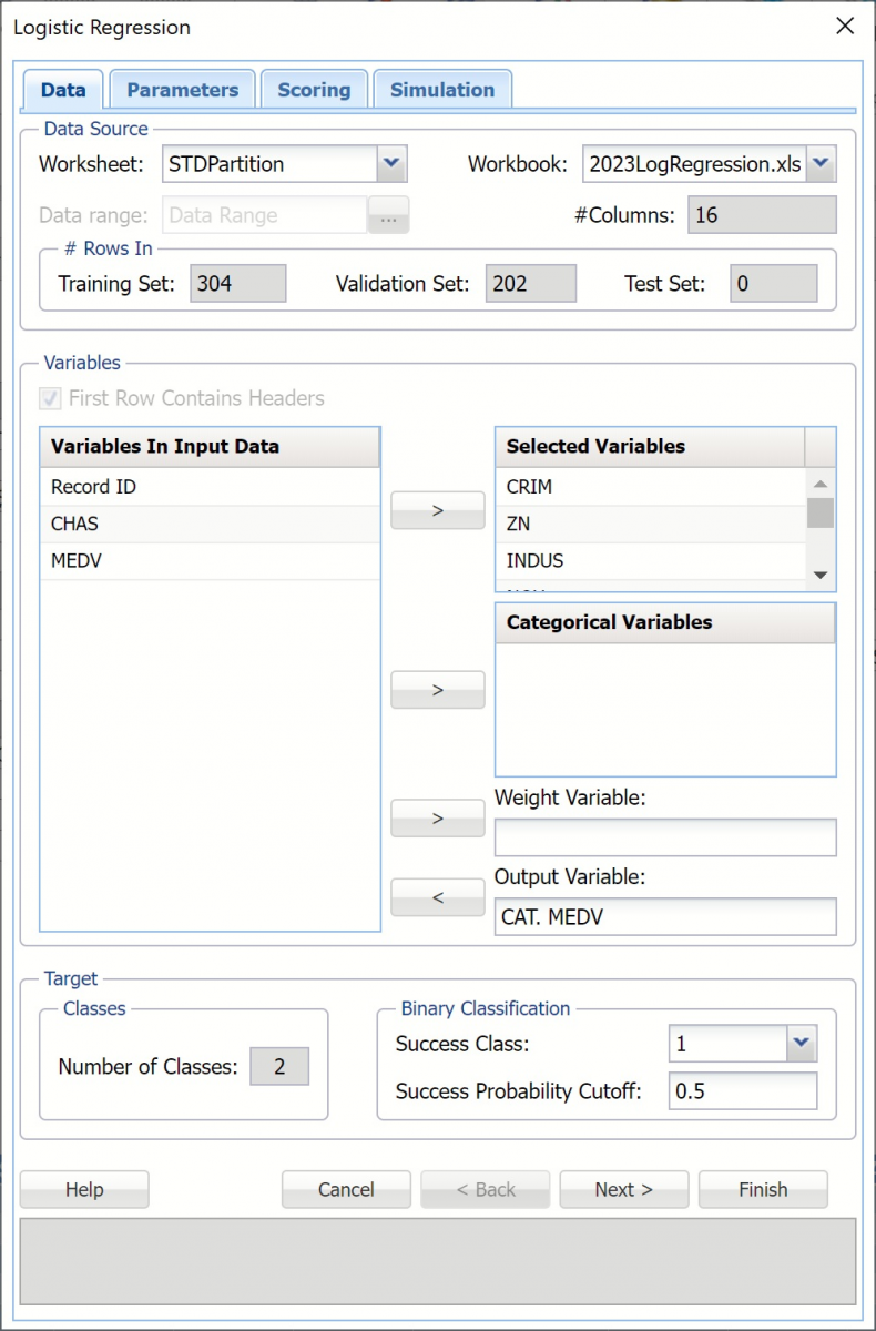
The categorical variable CAT.MEDV has been derived from the MEDV variable (Median value of owner-occupied homes in $1000's) a 1 for MEDV levels above 30 (>= 30) and a 0 for levels below 30 (<30). This will be our Output Variable.
Select the nominal categorical variable, CHAS, as a Categorical Variable. This variable is a 1 if the housing tract is located adjacent to the Charles River.
Select the remaining variables, except Record ID, CHAS and MEDV, as Selected Variables. Since this example showcases the newly added Simulation tab example, no categorical variables will be included in the model. (Recall that Simulation tab functionality does not support categorical variables.)
One major assumption of Logistic Regression is that each observation provides equal information. Analytic Solver Data Science offers an opportunity to provide a Weight Variable. Using a Weight Variable allows the user to allocate a weight to each record. A record with a large weight will influence the model more than a record with a smaller weight. For the purposes of this example, a Weight Variable will not be used.
Choose the value that will be the indicator of “Success” by clicking the down arrow next to Success Class. In this example, we will use the default of 1.
Enter a value between 0 and 1 for Success Probability Cutoff. If this value is less than this value, then a 0 will be entered for the class value, otherwise a 1 will be entered for the class value. In this example, we will keep the default of 0.5.
Click Next to advance to the Logistic Regression - Parameters dialog.
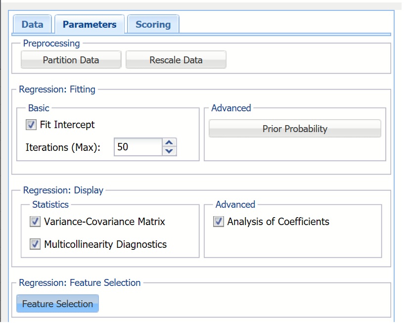
Analytic Solver Data Science includes the ability to partition or rescale a dataset from within a classification or prediction method by selecting Partition Data or Rescale Data on the Parameters dialog. Analytic Solver Data Science will rescale and/or partition your dataset (according to the rescaling and partition options you set) immediately before running the classification method. If partitioning or rescaling has already occurred on the dataset, the option will be disabled. For more information on partitioning, please see the Data Science Partitioning chapter. For more information on rescaling your data, see the Transform Continuous Data chapter. Both chapters occur earlier in this guide.
Keep Fit Intercept selected, the default setting, to fit the Logistic Regression intercept. If this option is not selected, Analytic Solver will force the intercept term to 0.
Keep the default of 50 for the Maximum # iterations. Estimating the coefficients in the Logistic Regression algorithm requires an iterative non-linear maximization procedure. You can specify a maximum number of iterations to prevent the program from getting lost in very lengthy iterative loops. This value must be an integer greater than 0 or less than or equal to 100 (1< value <= 100).
Click Prior Probability to open the Prior Probability dialog.
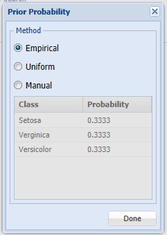
Analytic Solver will incorporate prior assumptions about how frequently the different classes occur in the partitions.
- If Empirical is selected, Analytic Solver will assume that the probability of encountering a particular class in the dataset is the same as the frequency with which it occurs in the training data.
- If Uniform is selected, Analytic Solver will assume that all classes occur with equal probability.
- If Manual is selected, the user can enter the desired class probability value.
For this example, click Done to select the default of Empirical and close the dialog.
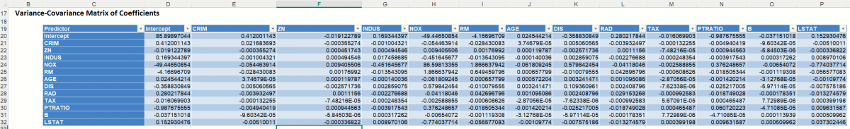
Select Variance - Covariance Matrix. When this option is selected, Analytic Solver will display the coefficient covariance matrix in the output. Entries in the matrix are the covariances between the indicated coefficients. The “on-diagonal” values are the estimated variances of the corresponding coefficients.
Select Multicollinearity Diagnostics. At times, variables can be highly correlated with one another which can result in large standard errors for the affected coefficients. Analytic Solver will display information useful in dealing with this problem if this option is selected.
Select Analysis of Coefficients. When this option is selected, Analytic Solver will produce a table with all coefficient information, such as the Estimate, Odds, Standard Error, etc. When this option is not selected, Analytic Solver will only print the Estimates.
When you have a large number of predictors and you would like to limit the model to only the significant variables, click Feature Selection to open the Feature Selection dialog and select Perform Feature Selection at the top of the dialog. Keep the default selection for Maximum Subset Size. This option can take on values of 1 up to N where N is the number of Selected Variables. The default setting is N.
Note: If any categorical variables exist in the model, the default setting for Maximum Subset Size will be 15. Categorical variables are expanded into a number of new columns using “one-hot-encoding” (Create Dummies) before Logistic Regression is started. As a result, the default value of 15 is set in this dialog and no upper bound for Maximum Subset Size is enforced as would be if only continuous variables were to appear in the model.
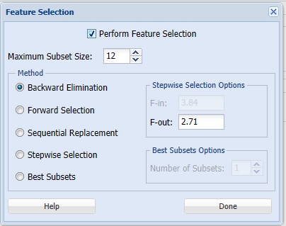
Analytic Solver offers five different selection procedures for selecting the best subset of variables.
- Backward Elimination in which variables are eliminated one at a time, starting with the least significant. If this procedure is selected, FOUT is enabled. A statistic is calculated when variables are eliminated. For a variable to leave the regression, the statistic's value must be less than the value of FOUT (default = 2.71).
- Forward Selection in which variables are added one at a time, starting with the most significant. If this procedure is selected, FIN is enabled. On each iteration of the Forward Selection procedure, each variable is examined for the eligibility to enter the model. The significance of variables is measured as a partial F-statistic. Given a model at a current iteration, we perform an F Test, testing the null hypothesis stating that the regression coefficient would be zero if added to the existing set if variables and an alternative hypothesis stating otherwise. Each variable is examined to find the one with the largest partial F-Statistic. The decision rule for adding this variable into a model is: Reject the null hypothesis if the F-Statistic for this variable exceeds the critical value chosen as a threshold for the F Test (FIN value), or Accept the null hypothesis if the F-Statistic for this variable is less than a threshold. If the null hypothesis is rejected, the variable is added to the model and selection continues in the same fashion, otherwise the procedure is terminated.
- Sequential Replacement in which variables are sequentially replaced and replacements that improve performance are retained. When this method is selected, the Stepwise selection options F-IN and F-OUT are disabled.
- Stepwise Selection is similar to Forward selection except that at each stage, Analytic Solver considers dropping variables that are not statistically significant. When this procedure is selected, the Stepwise selection options FIN and FOUT are enabled. In the stepwise selection procedure a statistic is calculated when variables are added or eliminated. For a variable to come into the regression, the statistic's value must be greater than the value for FIN (default = 3.84). For a variable to leave the regression, the statistic's value must be less than the value of FOUT (default = 2.71). The value for FIN must be greater than the value for FOUT.
- Best Subsets where searches of all combinations of variables are performed to observe which combination has the best fit. (This option can become quite time consuming depending on the number of input variables.) If this procedure is selected, Number of best subsets is enabled.
Click Done to accept the default choice, Backward Elimination with an F-out setting of 2.71, and return to the Parameters dialog, then click Next to advance to the Scoring dialog.
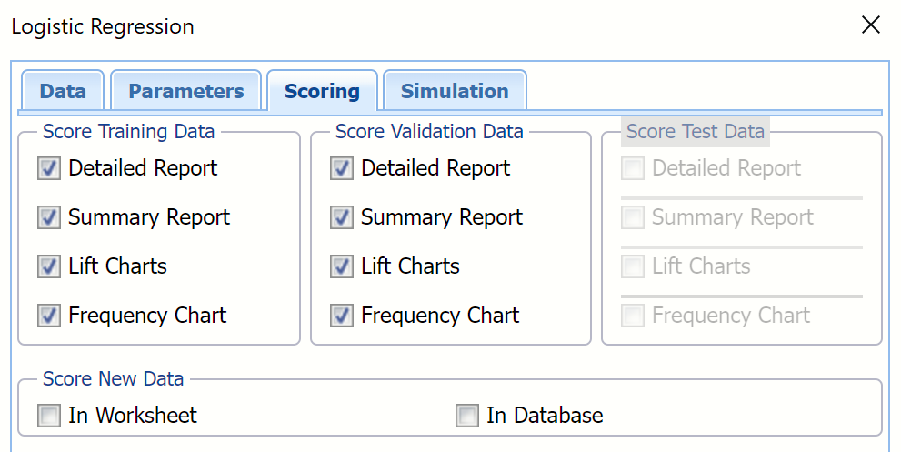
Click Next to advance to the Scoring dialog.
Select Detailed Report, Summary Report and Lift Charts under both Score Training Data and Score Validation Data. Analytic Solver will create a detailed report, complete with the Output Navigator for ease in routing to specific areas in the output, a report that summarizes the regression output for both datasets, and lift charts, ROC curves, and Decile charts for both partitions.
New in V2023: When Frequency Chart is selected under both Score Training Data and Score Validation Data, a frequency chart will be displayed when the LogReg_TrainingScore and LogReg_ValidationScore worksheets are selected. This chart will display an interactive application similar to the Analyze Data feature, explained in detail in the Analyze Data chapter that appears earlier in this guide. This chart will include frequency distributions of the actual and predicted responses individually, or side-by-side, depending on the user’s preference, as well as basic and advanced statistics for variables, percentiles, six sigma indices.
Since we did not create a test partition when we partitioned our dataset, Score Test Data options are disabled. See the chapter “Data Science Partitioning” for details on how to create a test set.
For information on scoring in a worksheet or database, please see the “Scoring New Data” chapter in the Analytic Solver Data Science User Guide.
Click Next to advance to the Simulation tab.
Select Simulate Response Prediction to enable all options on the the Simulation tab.
Simulation tab: All supervised algorithms in V2023 include a new Simulation tab. This tab uses the functionality from the Generate Data feature (described earlier in this guide) to generate synthetic data based on the training partition, and uses the fitted model to produce predictions for the synthetic data. The resulting report, LogReg_Simulation, will contain the synthetic data, the predicted values and the Excel-calculated Expression column, if present. In addition, frequency charts containing the Predicted, Training, and Expression (if present) sources or a combination of any pair may be viewed, if the charts are of the same type.
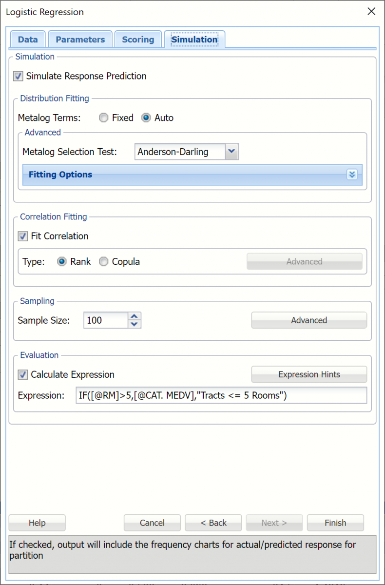
Evaluation: Select Calculate Expression to amend an Expression column onto the frequency chart displayed on the LogReg_Simulation output tab. Expression can be any valid Excel formula that references a variable and the response as [@COLUMN_NAME]. Click the Expression Hints button for more information on entering an expression.
For the purposes of this example, leave all options at their defaults in the Distribution Fitting, Correlation Fitting and Sampling sections of the dialog. For Expression, enter the following formula to display houses that are less than 20 years old.
IF[@RM]>5,[@CAT.MEDV],"Tracks <= 5 Rooms")
Note that variable names are case sensitive.
For more information on the remaining options shown on this dialog in the Distribution Fitting, Correlation Fitting and Sampling sections, see the Generate Data chapter that appears earlier in this guide.
Click Finish to run Logistic Regression on the example dataset. The logistic regression output is inserted to the right of the STDPartition worksheet.
Output Worksheets
Output sheets containing the Logistic Regression results will be inserted into your active workbook to the right of the STDPartition worksheet.
LogReg_Output
Output Navigator: The Output Navigator appears at the top of all result worksheets. Use this feature to quickly navigate to all reports included in the output.

Inputs: Scroll down to the Inputs section to find all inputs entered or selected on all tabs of the Logistic Regression dialog.
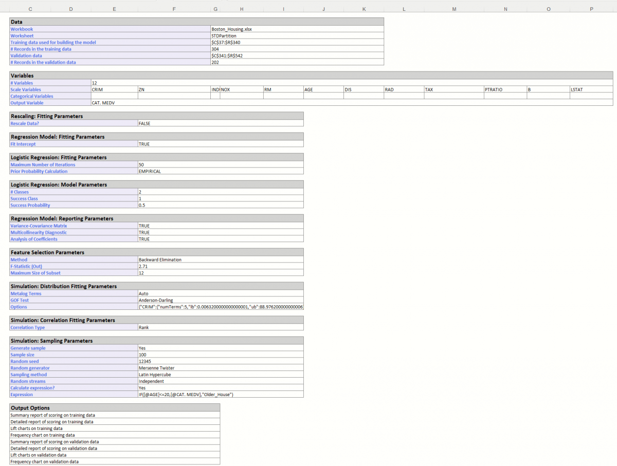
Regression Summary: Summary statistics, found directly below Inputs in the Regression Summary report, show the residual degrees of freedom (#observations - #predictors), a standard deviation type measure for the model (which typically has a chi-square distribution), the number of iterations required to fit the model, and the Multiple R-squared value.
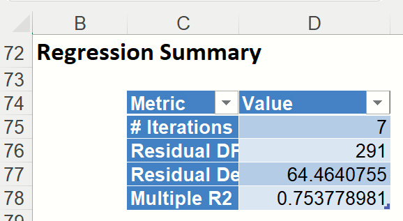
The multiple R-squared value shown here is the r-squared value for a logistic regression model , defined as
R2 = (D0-D)/D0 ,
where D is the Deviance based on the fitted model and D0 is the deviance based on the null model. The null model is defined as the model containing no predictor variables apart from the constant.
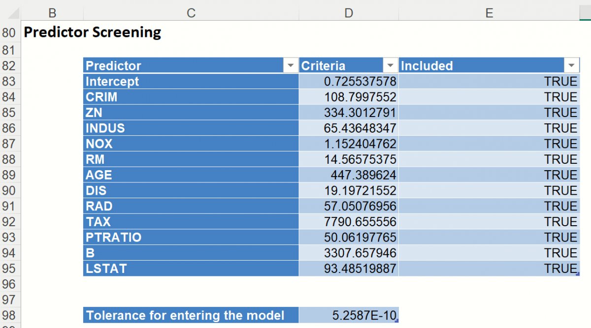
Predictor Screening: Scroll down to the Predictor Screening report. In Analytic Solver Data Science, a preprocessing feature selection step is included to take advantage of automatic variable screening and elimination using Rank-Revealing QR Decomposition. This allows Analytic Solver Data Science to identify the variables causing multicollinearity, rank deficiencies and other problems that would otherwise cause the algorithm to fail. Information about “bad” variables is used in Variable Selection and Multicollinearity Diagnostics and in computing other reported statistics.
Included and excluded predictors are shown in the table below. In this model there were no excluded predictors. All predictors were eligible to enter the model passing the tolerance threshold of 5.26E-10. This denotes a tolerance beyond which a variance – covariance matrix is not exactly singular to within machine precision. The test is based on the diagonal elements of the triangular factor R resulting from Rank-Revealing QR Decomposition. Predictors that do not pass the test are excluded.
Note: If a predictor is excluded, the corresponding coefficient estimates will be 0 in the regression model and the variable – covariance matrix would contain all zeros in the rows and columns that correspond to the excluded predictor. Multicollinearity diagnostics, variable selection and other remaining output will be calculated for the reduced model.
The design matrix may be rank-deficient for several reasons. The most common cause of an ill-conditioned regression problem is the presence of feature(s) that can be exactly or approximately represented by a linear combination of other feature(s). For example, assume that among predictors you have 3 input variables X, Y, and Z where Z = a * X + b * Y where a and b are constants. This will cause the design matrix to not have a full rank. Therefore, one of these 3 variables will not pass the threshold for entrance and will be excluded from the final regression model.
Coefficients: Model terms are shown in the Coefficients output.
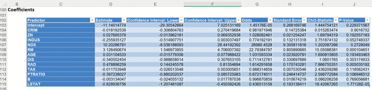
This table contains the coefficient estimate, the standard error of the coefficient, the p-value, the odds ratio for each variable (which is simply ex where x is the value of the coefficient) and confidence interval for the odds. (Note for the Intercept term, the Odds Ratio is calculated as exp^0.)
Note: If a variable has been eliminated by Rank-Revealing QR Decomposition, the variable will appear in red in the Coefficients table with a 0 Coefficient, Std. Error, CI Lower, CI Upper, and RSS Reduction and N/A for the t-Statistic and P-Values.
Variance-Covariance Matrix of Coefficients: This square matrix contains the variances of the fitted model’s coefficient estimates in the center diagonal elements and the pair-wise covariances between coefficient estimates in the non-diagonal elements.
Multicollinarity Diagnostics: Collinearity Diagnostics help assess whether two or more variables so closely track one another as to provide essentially the same information.
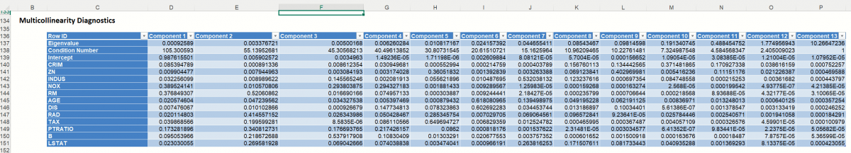
The columns represent the variance components (related to principal components in multivariate analysis), while the rows represent the variance proportion decomposition explained by each variable in the model. The eigenvalues are those associated with the singular value decomposition of the variance-covariance matrix of the coefficients, while the condition numbers are the ratios of the square root of the largest eigenvalue to all the rest. In general, multicollinearity is likely to be a problem with a high condition number (more than 20 or 30), and high variance decomposition proportions (say more than 0.5) for two or more variables.
LogReg_FS
Since we selected Perform Feature Selection on the Feature Selection dialog, Analytic Solver Data Science has produced the following output on the LogReg_FS tab which displays the variables that are included in the subsets. This table contains the two subsets with the highest Residual Sum of Squares values.
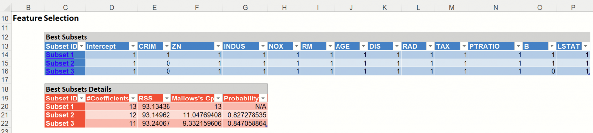
In this table, every model includes a constant term (since Fit Intercept was selected) and one or more variables as the additional coefficients. We can use any of these models for further analysis simply by clicking the hyperlink under Subset ID in the far left column. The Logistic Regression dialog will open. Click Finish to run Logistic Regression using the variable subset as listed in the table.
The choice of model depends on the calculated values of various error values and the probability. RSS is the residual sum of squares, or the sum of squared deviations between the predicted probability of success and the actual value (1 or 0). "Mallows Cp" is a measure of the error in the best subset model, relative to the error incorporating all variables. Adequate models are those for which Cp is roughly equal to the number of parameters in the model (including the constant), and/or Cp is at a minimum. "Probability" is a quasi hypothesis test of the proposition that a given subset is acceptable; if Probability < .05 we can rule out that subset.
The considerations about RSS, Cp and Probability in this example would lead us to believe that the subset with 12 coefficients is the best model in this example.
LogReg_TrainingScore
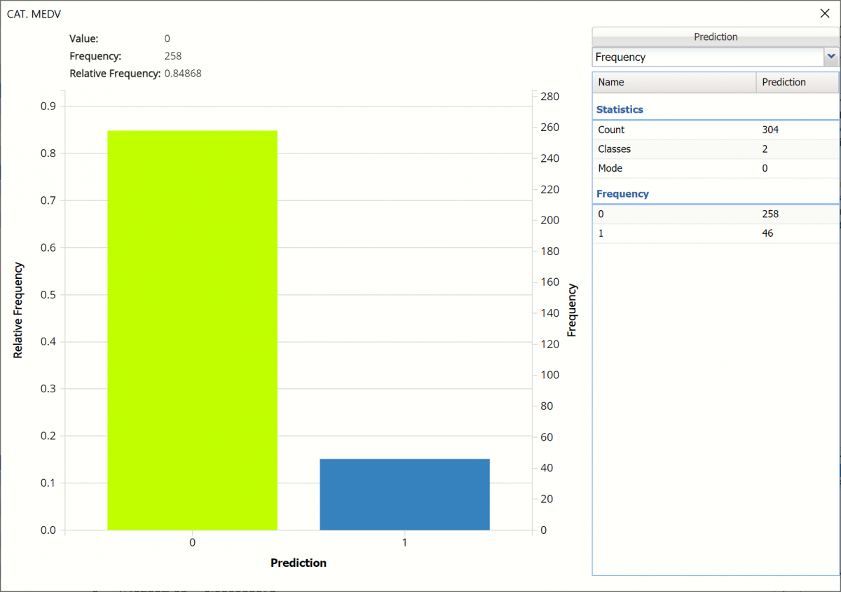
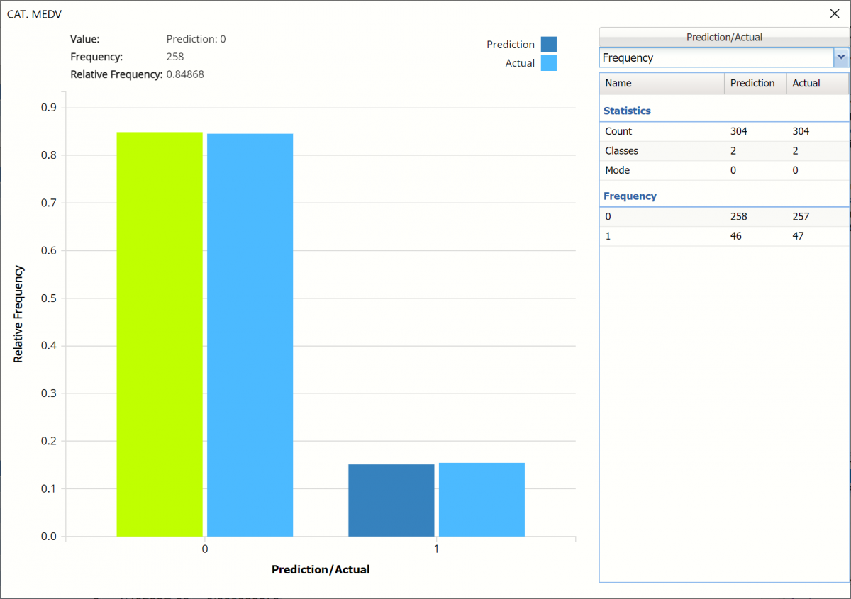
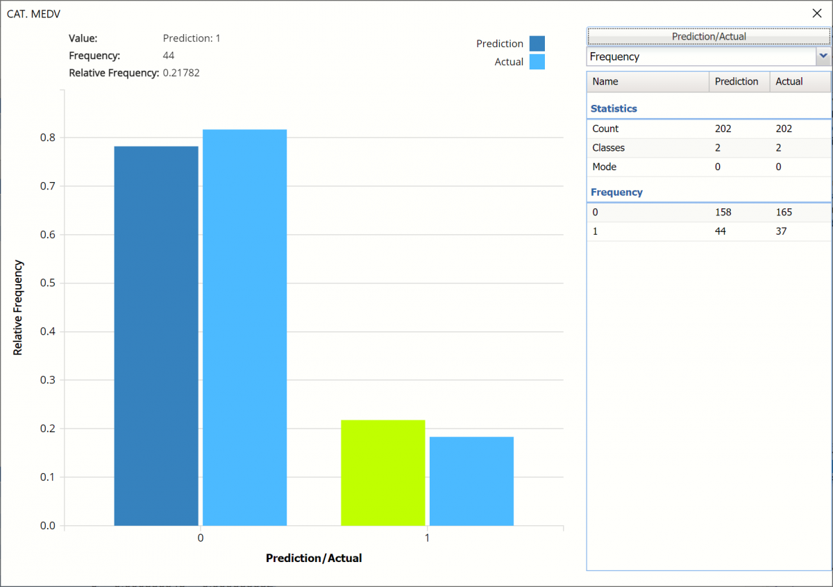
Click the Training: Classification Details link in the Output Navigator to open the Training: Classification Summary and view the newly added Output Variable frequency chart, the Training: Classification Summary and the Training: Classification Details report. All calculations, charts and predictions on this worksheet apply to the Training data.
Note: To view charts in the Cloud app, click the Charts icon on the Ribbon, select a worksheet under Worksheet and a chart under Chart.
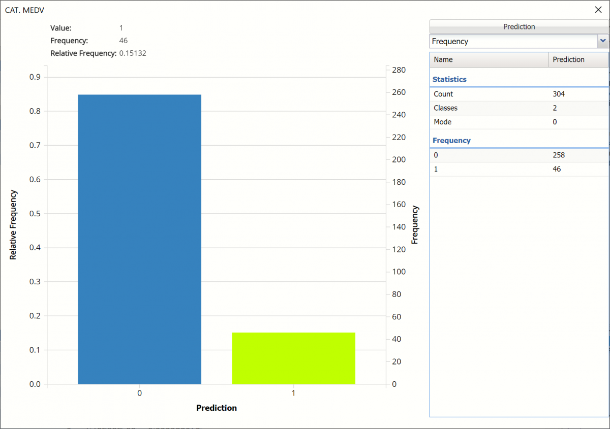
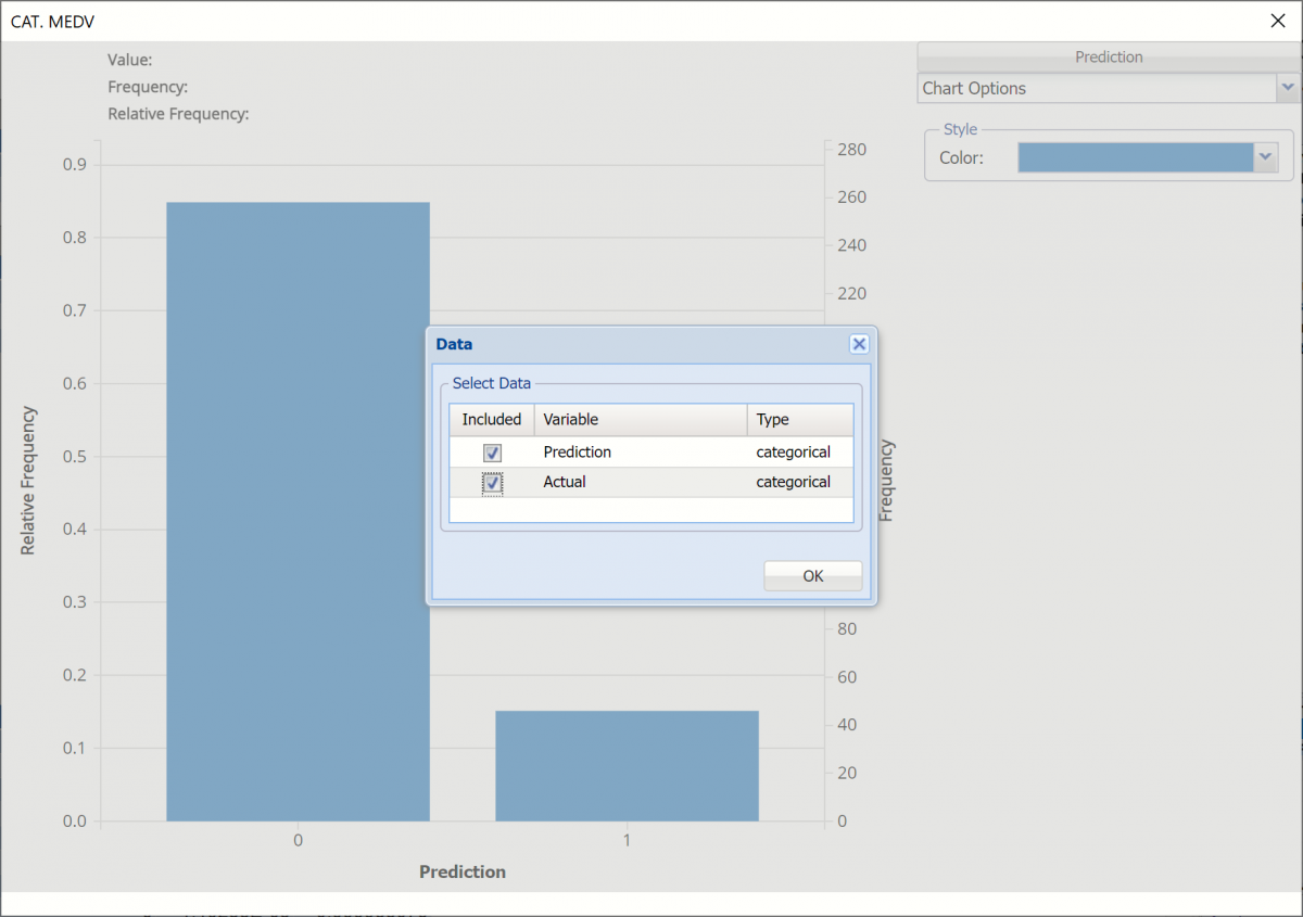
Frequency Charts: The output variable frequency chart opens automatically once the LogReg_TrainingScore worksheet is selected. To close this chart, click the “x” in the upper right hand corner of the chart. To reopen, click onto another tab and then click back to the LogReg_TrainingScore tab. To change the location of the chart, grab the title bar of the dialog and drag the chart to the desired location on the screen.
Frequency: This chart shows the frequency for both the predicted and actual values of the output variable, along with various statistics such as count, number of classes and the mode.
Click the down arrow next to Frequency to switch to Relative Frequency, Bin Details or Chart Options view.
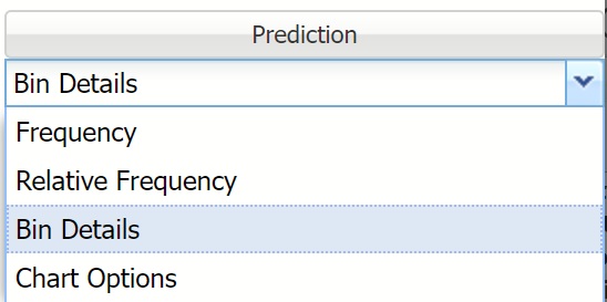
Relative Frequency: Displays the relative frequency chart.
Bin Details: See pertinent information about each bin in the chart.
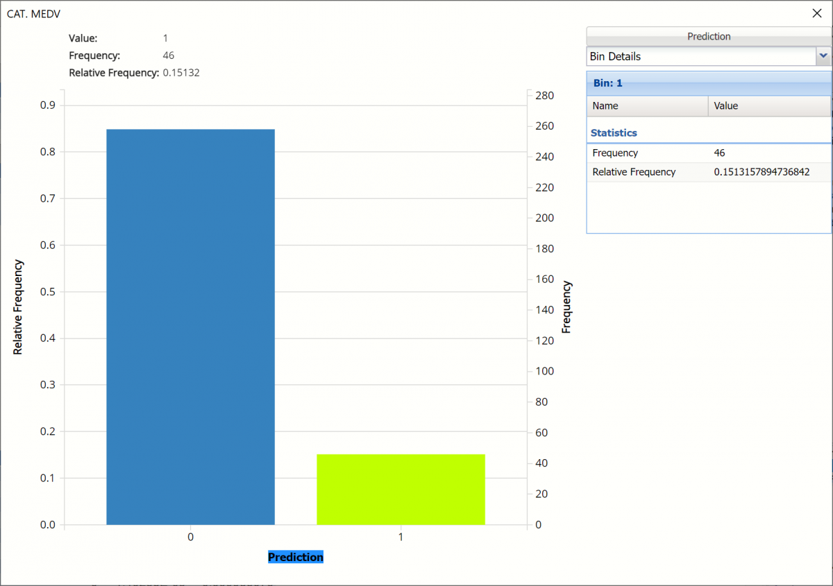
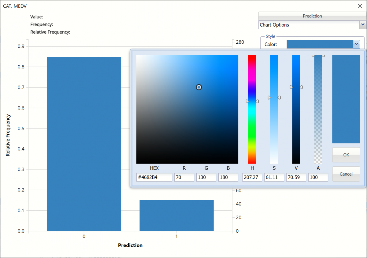
Chart Options: Use this view to change the color of the bars in the chart.
To see both the actual and predicted frequency, click Prediction and select Actual. This change will be reflected on all charts.
Classification Summary: A Confusion Matrix is used to evaluate the performance of a classification method. This matrix summarizes the records that were classified correctly and those that were not.
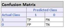
- True Positive cases (TP) are the number of cases classified as belonging to the Success class that actually were members of the Success class.
- False Negative cases (FN) are the number of cases that were classified as belonging to the Failure class when they were actually members of the Success class (i.e. if a cancerous tumor is considered a "success", then imagine patients with cancerous tumors who were told their tumors were benign).
- False Positive (FP) cases were assigned to the Success class but were actually members of the Failure group (i.e. patients who were told they tested positive for cancer when, in fact, their tumors were benign).
- True Negative (TN) cases were correctly assigned to the Failure group.
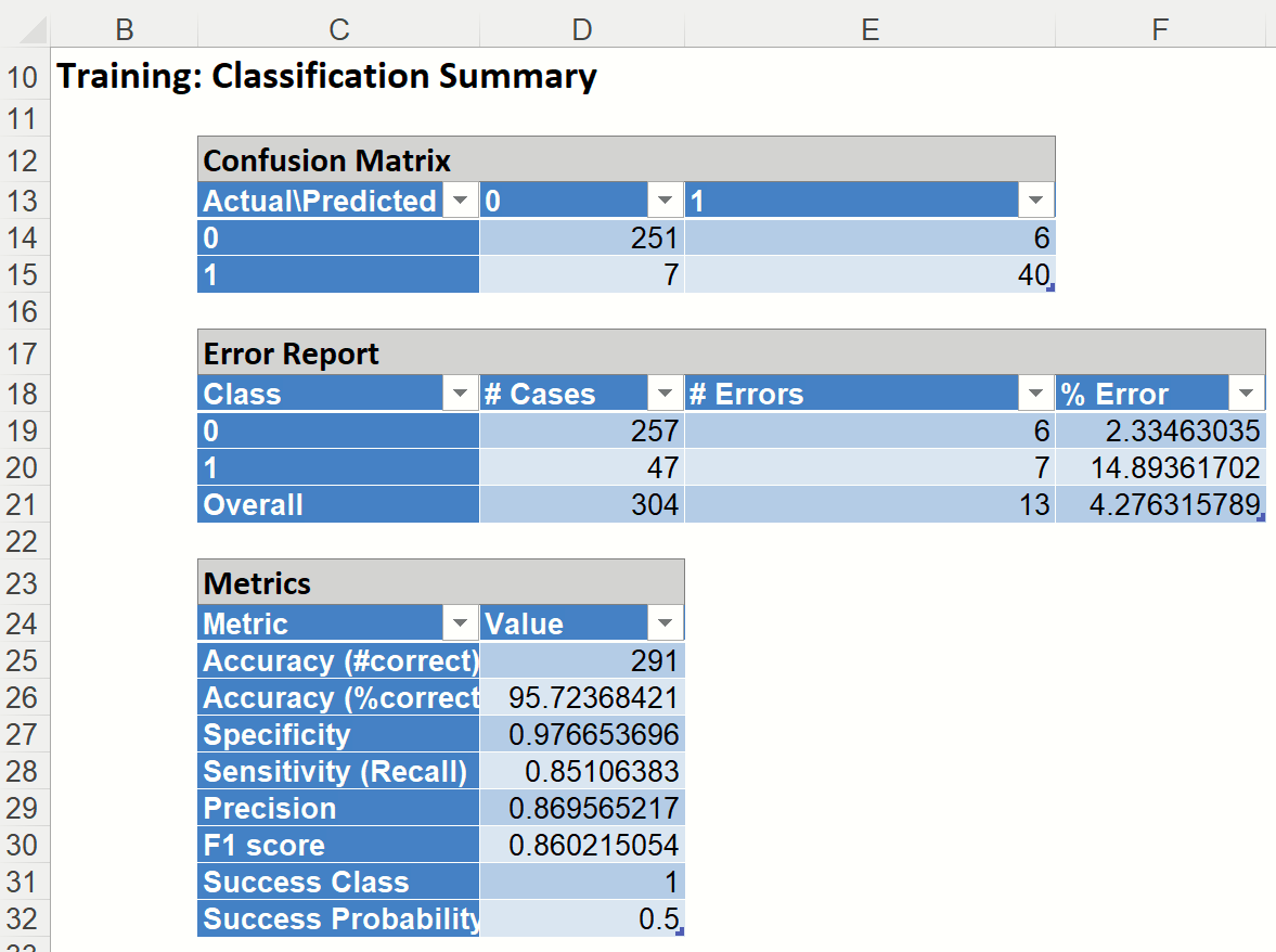
In the Training Dataset, we see 40 records belonging to the Success class were correctly assigned to that class while 7 records belonging to the Success class were incorrectly assigned to the Failure class. In addition, 251 records belonging to the Failure class were correctly assigned to this same class while 6 records belonging to the Failure class were incorrectly assigned to the Success class. The total number of misclassified records was 13 (7+6) which results in an error equal to 4.28%.
Precision is the probability of correctly identifying a randomly selected record as one belonging to the Success class (i.e. the probability of correctly identifying a random patient with cancer as having cancer).
- Precision = TP/ (TP+FP)
Recall (or Sensitivity) measures the percentage of actual positives which are correctly identified as positive (i.e. the proportion of people with cancer who are correctly identified as having cancer).
- Sensitivity or True Positive Rate (TPR) = TP/(TP + FN)
Specificity (also called the true negative rate) measures the percentage of failures correctly identified as failures (i.e. the proportion of people with no cancer being categorized as not having cancer.)
- Specificity (SPC) or True Negative Rate =TN / (FP + TN)
The F-1 score, which fluctuates between 1 (a perfect classification) and 0, defines a measure that balances precision and recall.
- F1 = 2 * TP /(2TP+ FP + FN)
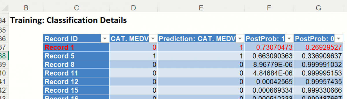
Training: Classification Details: This table displays how each observation in the training data was classified. The probability values for success in each record are shown after the predicted class and actual class columns. Records assigned to a class other than what was predicted are highlighted in red.
LogReg_ValidationScore
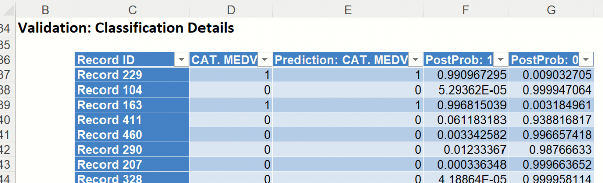
Click the LogReg_ValidationScore tab to view the newly added Output Variable frequency chart, the Validation: Classification Summary and the Validation: Classification Details report. All calculations, charts and predictions on this worksheet apply to the Validation data.
Frequency Charts: The output variable frequency chart opens automatically once the LogReg_ValidationScore worksheet is selected. To close this chart, click the “x” in the upper right hand corner. To reopen, click onto another tab and then click back to the LogReg_ValidationScore tab.
Click the Frequency chart to display the frequency for both the predicted and actual values of the output variable, along with various statistics such as count, number of classes and the mode. Selective Relative Frequency from the drop down menu, on the right, to see the relative frequencies of the output variable for both actual and predicted. See above for more information on this chart.
Classification Summary: This report contains the confusion matrix for the validation data set.
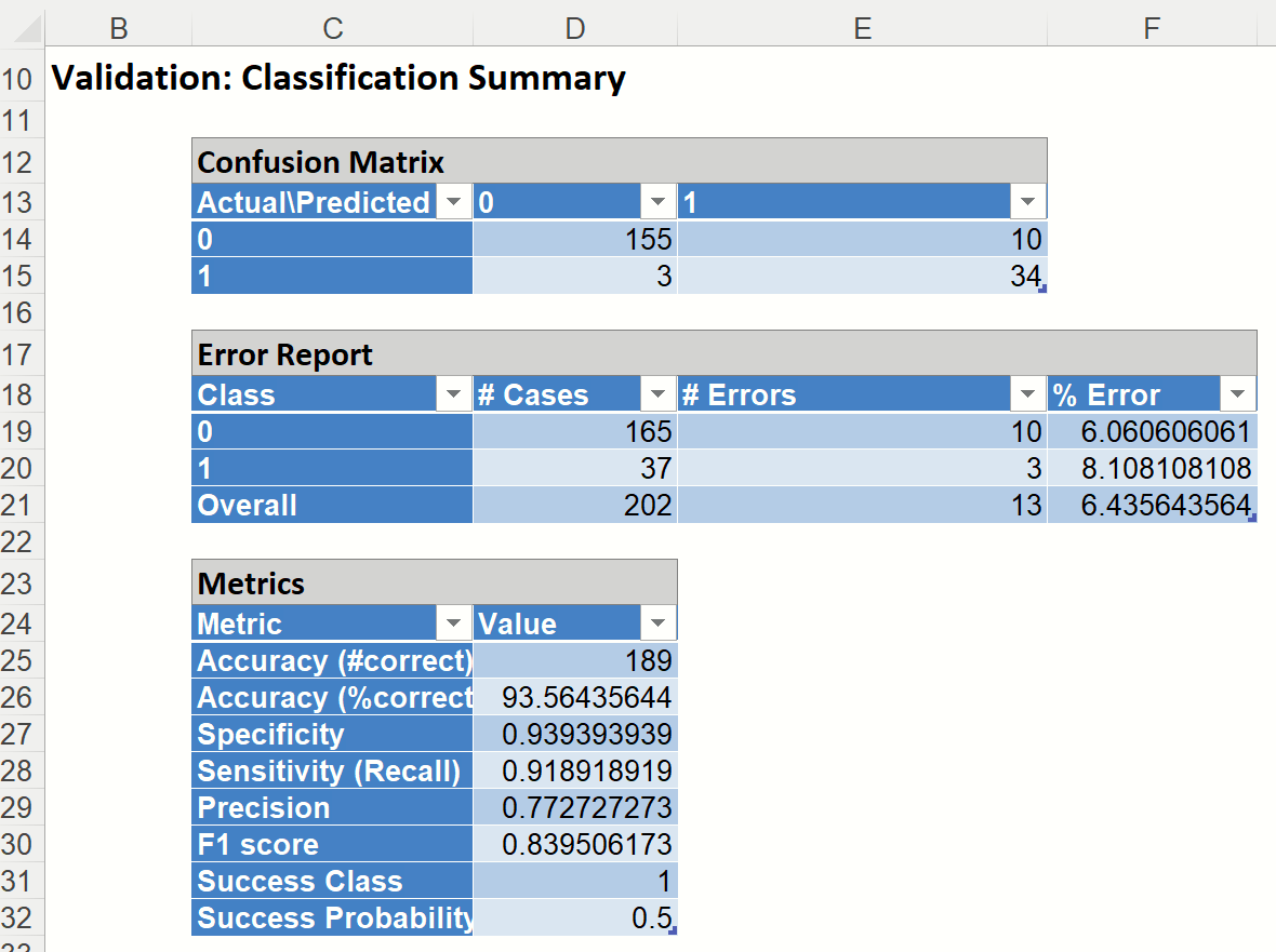
In the Validation Dataset…
- 34 records were correctly classified as belonging to the Success class
- 155 cases were correctly classified as belonging to the Failure class.
- False Positives: 10 records were incorrectly classified as belonging to the Success class when they were, in fact, members of the Failure class.
- False Negatives: 3 records were incorrectly classified as belonging to the Failure class, when they were members of the Success class.
This resulted in a total classification error of 6.44%
Scroll down to view the Validation: Classification Details table. Again, misclassified records appear in red.
LogReg_TrainingLiftChart and LogReg_ValidationLiftChart
Click LogReg_TrainingLiftChart and LogReg_ValidationLiftChart tab to navigate to the Training and Validation Data Lift, Decile, and ROC Curve charts.
Lift Charts and ROC Curves are visual aids that help users evaluate the performance of their fitted models. Charts found on the LogReg_Training LiftChart tab were calculated using the Training Data Partition. Charts found on the LogReg_ValidationLiftChart tab were calculated using the Validation Data Partition. It is good practice to look at both sets of charts to assess model performance on both datasets.
Note: To view these charts in the Cloud app, click the Charts icon on the Ribbon, select LogReg_TrainingLiftChart or LogReg_ValidationLiftChart for Worksheet and Decile Chart, ROC Chart or Gain Chart for Chart.
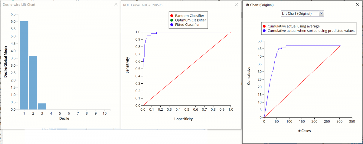
Decile-wise Lift Chart, ROC Curve and Lift Charts for Training Partition
Decile-wise Lift Chart, ROC Curve and Lift Charts for Validation Partition

After the model is built using the training data set, the model is used to score on the training data set and the validation data set (if one exists). Then the data set(s) are sorted in decreasing order using the predicted output variable value. After sorting, the actual outcome values of the output variable are cumulated and the lift curve is drawn as the cumulative number of cases in decreasing probability (on the x-axis) vs the cumulative number of true positives on the y-axis. The baseline (red line connecting the origin to the end point of the blue line) is a reference line. For a given number of cases on the x-axis, this line represents the expected number of successes if no model existed, and instead cases were selected at random. This line can be used as a benchmark to measure the performance of the fitted model. The greater the area between the lift curve and the baseline, the better the model. In the Training Lift chart, if we selected 100 cases as belonging to the success class and used the fitted model to pick the members most likely to be successes, the lift curve tells us that we would be right on about 45 of them. Conversely, if we selected 100 random cases, we could expect to be right on about 15 of them. The Validation Lift chart tells us that if we selected 100 cases as belonging to the success class and used the fitted model to pick the members most likely to be successes, the lift curve tells us that we would be right on about 37 of them. If we selected 100 random cases, we could expect to be right on about 15 of them.
The decilewise lift curve is drawn as the decile number versus the cumulative actual output variable value divided by the decile's mean output variable value. The bars in this chart indicate the factor by which the model outperforms a random assignment, one decile at a time. Refer to the validation graph above. In the first decile, taking the most expensive predicted housing prices in the dataset, the predictive performance of the model is about 4.5 times better as simply assigning a random predicted value.
The Regression ROC curve was updated in V2017. This new chart compares the performance of the regressor (Fitted Predictor) with an Optimum Predictor Curve and a Random Classifier curve. The Optimum Predictor Curve plots a hypothetical model that would provide perfect classification results. The best possible classification performance is denoted by a point at the top left of the graph at the intersection of the x and y axis. This point is sometimes referred to as the “perfect classification”. The closer the AUC is to 1, the better the performance of the model. In the Validation Partition, AUC = .98 which suggests that this fitted model is a good fit to the data.
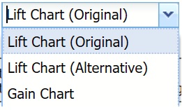
In V2017, two new charts were introduced: a new Lift Chart and the Gain Chart. To display these new charts, click the down arrow next to Lift Chart (Original), in the Original Lift Chart, then select the desired chart.
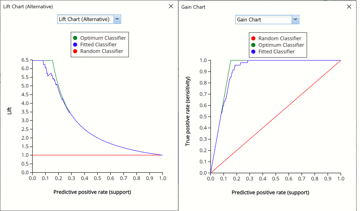
Select Lift Chart (Alternative) to display Analytic Solver Data Science's new Lift Chart. Each of these charts consists of an Optimum Predictor curve, a Fitted Predictor curve, and a Random Predictor curve. The Optimum Predictor curve plots a hypothetical model that would provide perfect classification for our data. The Fitted Predictor curve plots the fitted model and the Random Predictor curve plots the results from using no model or by using a random guess (i.e. for x% of selected observations, x% of the total number of positive observations are expected to be correctly classified).
The Alternative Lift Chart plots Lift against the Predictive Positive Rate or Support.
Lift Chart (Alternative) and Gain Chart for Training Partition
Lift Chart (Alternative) and Gain Chart for Validation Partition
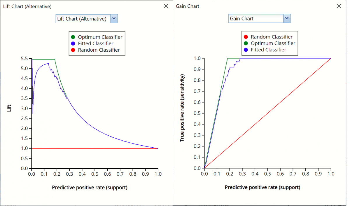
Click the down arrow and select Gain Chart from the menu. In this chart, the True Positive Rate or Sensitivity is plotted against the Predictive Positive Rate or Support.
LogReg_Simulation
As discussed above, Analytic Solver Data Science generates a new output worksheet, LogReg_Simulation, when Simulate Response Prediction is selected on the Simulation tab of the Logistic Regression dialog.
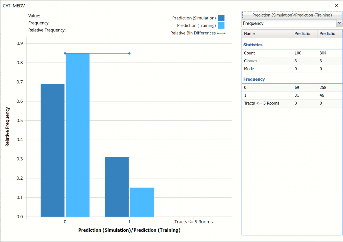
This report contains the synthetic data (with or without correlation fitting), the prediction (using the fitted model) and the Excel – calculated Expression column, if populated in the dialog. A chart is also displayed with the option to switch between the Predicted, Training, and Expression sources or a combination of two, as long as they are of the same type.
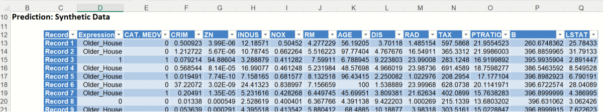
Note the first column in the output, Expression. This column was inserted into the Synthetic Data results because Calculate Expression was selected and an Excel function was entered into the Expression field, on the Simulation tab of the Logistic Regression dialog
Expression: IF([@RM]>5,[@CAT. MEDV],"racks <= 5 Rooms")
The rest of the data in this report is syntehtic data, generated using the Generate Data feature described in the chapter with the same name, that appears earlier in this guide.
The chart that is displayed once this tab is selected, contains frequency information pertaining to the output variable in the actual data and the synthetic data. In the screenshot below, the bars in the darker shade of blue are based on the synthetic data. The bars in the lighter shade of blue are based on the predicted values for the training partition. In the synthetic data, about 70% of the housing tracts where CAT. MEDV = 0, have more than 5 rooms and about 85% of the housing tracts in the training partition where CAT. MEDV = 0 have more than 5 rooms.
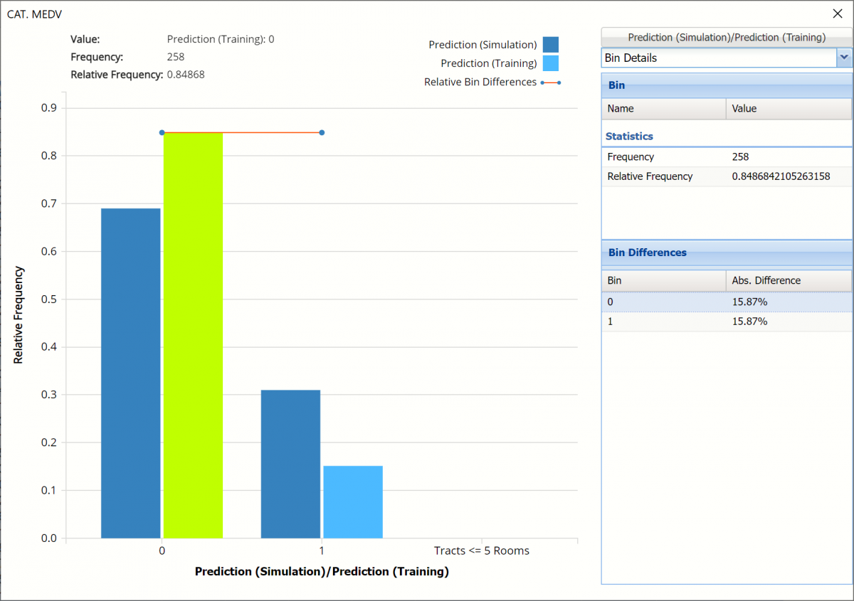
Click the array next to Frequency and select Bin Details. Notice that the abosulte difference in each bin is the same. Hence the flat Relative Bin Difference curve in the chart.
Click Prediction (Simulation) / Prediction (Training) to change the chart view to Expression (Simulation) and Expression (Training)
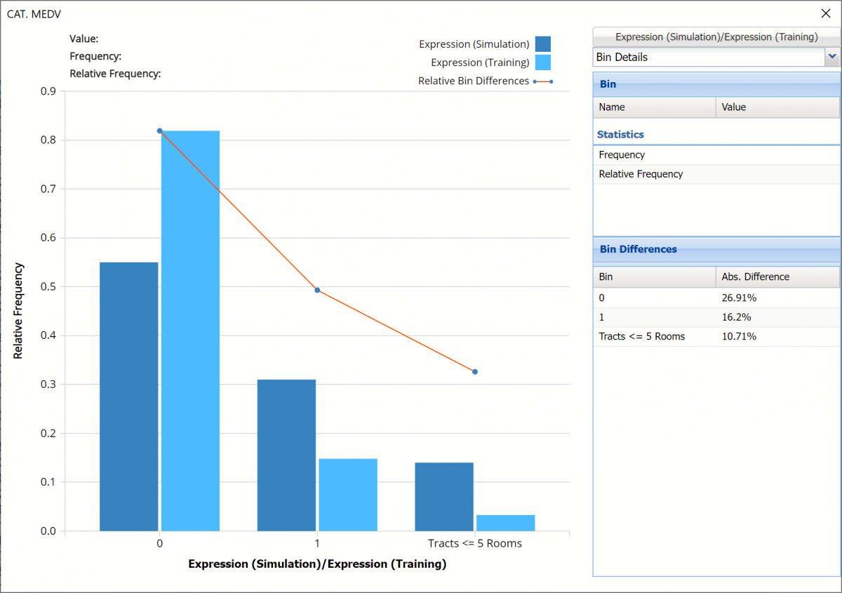
This chart shows the relative bin differences are decreasing. Only about 15% of the housing tracts in the synthetic data were predicted has having less than 5 rooms. Less than 5% of the housing tracts in the training data were predicted as having 5 rooms or less.
Click the down arrow next to Frequency to change the chart view to Relative Frequency or to change the look by clicking Chart Options. Statistics on the right of the chart dialog are discussed earlier in this section. For more information on the generated synthetic data, see the Generate Data chapter that appears earlier in this guide.
For information on Stored Model Sheets, in this example LogReg_Stored, please refer to the “Scoring New Data” chapter within the Analytic Solver Data Science User Guide.