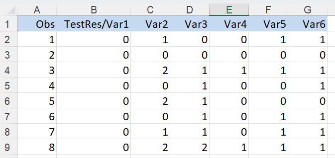
The following example illustrates Analytic Solver Data Science’s Naïve Bayes classification method. Click Help – Example Models on the Data Science ribbon, then Forecasting/Data Science Examples to open the Flying_Fitness.xlsx example dataset. A portion of the dataset appears below.
In this example, we will classify pilots on whether they are fit to fly based on various physical and psychological tests. The output variable, TestRes/Var1 equals 1 if the pilot is fit and 0 if not.
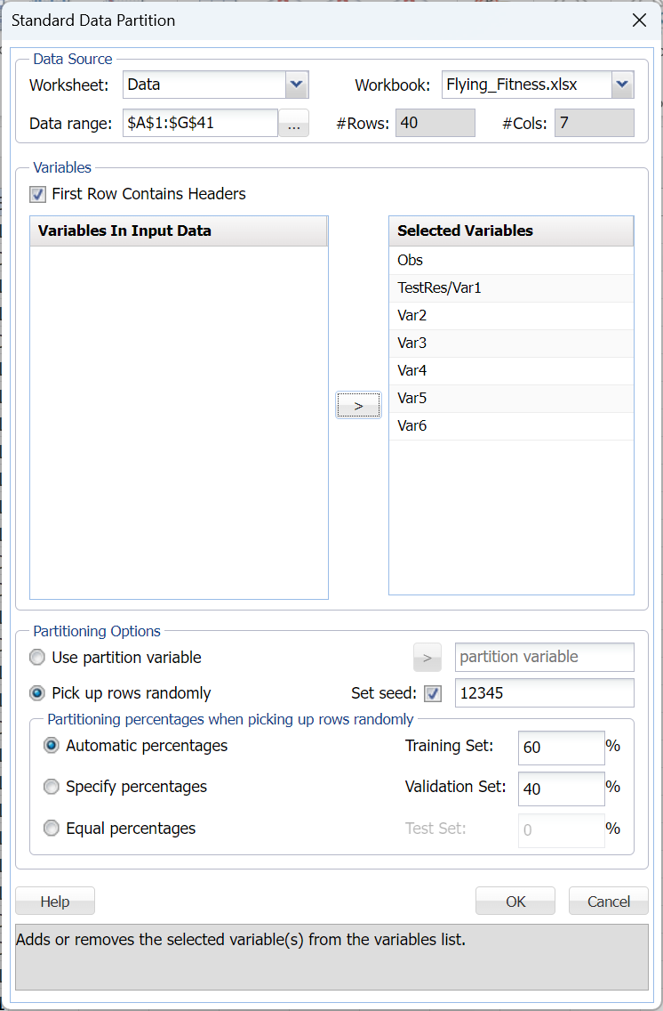
First, we partition the data into training and validation sets using the Standard Data Partition defaults of 60% of the data randomly allocated to the Training Set and 40% of the data randomly allocated to the Validation Set. For more information on partitioning a dataset, see the Data Science Partitioning chapter.
Click Classify – Naïve Bayes. The following Naïve Bayes dialog appears.
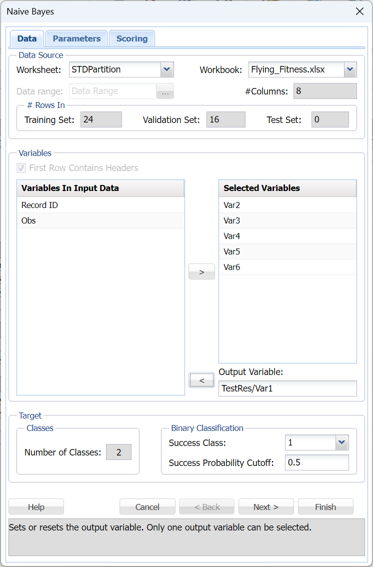
Select Var2, Var3, Var4, Var5, and Var6 as Selected Variables and TestRest/Var1 as the Output Variable. The Number of Classes statistic will be automatically updated with a value of 2 when the Output Variable is selected. This indicates that the Output variable, TestRest/Var1, contains two classes, 0 and 1.
Choose the value that will be the indicator of “Success” by clicking the down arrow next to Success Class. In this example, we will use the default of 1 indicating that a value of “1” will be specified as a “success”.
Enter a value between 0 and 1 for Success Probability Cutoff. If the Probability of success (probability of the output variable = 1) is less than this value, then a 0 will be entered for the class value, otherwise a 1 will be entered for the class value. In this example, we will keep the default of 0.5.
Click Next to advance to the Naïve Bayes – Parameters tab.
Analytic Solver Data Science includes the ability to partition a dataset from within a classification or prediction method by clicking Partition Data on the Parameters tab. If this option is selected, Analytic Solver Data Science will partition your dataset (according to the partition options you set) immediately before running the classification method. If partitioning has already occurred on the dataset, this option will be disabled. For more information on partitioning, please see the Data Science Partitioning chapter.
On the Parameters tab, click Prior Probability to calculate the Prior class probabilities. When this option is selected, Analytic Solver Data Science will calculate the class probabilities from the training data . For the first class, Analytic Solver Data Science will calculate the probability using the number of “0” records / total number of points. For the second class, Analytic Solver Data Science will calculate the probability using the number of “1” records / total number of points.
- If the first option is selected, Empirical, Analytic Solver Data Science will assume that the probability of encountering a particular class in the dataset is the same as the frequency with which it occurs in the training data.
- If the second option is selected, Uniform, Analytic Solver Data Science will assume that all classes occur with equal probability.
- Select the third option, Manual, to manually enter the desired class and probability value.
Click Done to accept the default setting, Empirical, and close the dialog.
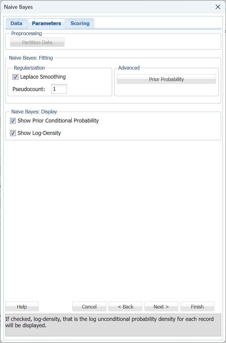
In Analytic Solver, users have the ability to use Laplace smoothing, or not, during model creation. In this example, leave Laplace Smoothing and Pseudocount at their defaults.
If a particular realization of some feature never occurs in a given class in the training partition, then the corresponding frequency-based prior conditional probability estimate will be zero. For example, assume that you have trained a model to classify emails using the Naïve Bayes Classifier with 2 classes: work and personal. Assume that the model rates one email as having a high probability of belonging to the "personal" class. Now assume that there is a 2nd email that is the same as the previous email, but this email includes one word that is different. Now, if this one word was not present in any of the “personal” emails in the training partition, the estimated probability would be zero. Consequently, the resulting product of all probabilities will be zero, leading to a loss of all the strong evidence of this email to belong to a “personal” class. To mitigate this problem, Analytic Solver Data Science allows you to specify a small correction value, known as a pseudocount, so that no probability estimate is ever set to 0. Normalizing the Naïve Bayes classifier in this way is called Laplace smoothing. Pseudocount set to zero is equivalent to no smoothing. There are arguments in the literature which support a pseudocount value of 1, although in practice fractional values are often used. When Laplace Smoothing is selected, Analytic Solver Data Science will accept any positive value for pseudocount.
Under Naïve Bayes: Display, select Show Prior Conditional Probability and Show Log-Density to add both in the output.
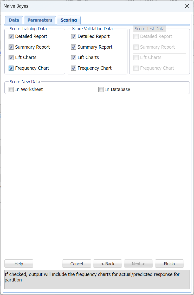
Click Next to advance to the Scoring tab.
Select Detailed report and Lift Charts under both Score training data and Score validation data. Summary report under both Score Training Data and Score Validation Data are selected by default. These settings will allow us to obtain the complete output results for this classification method. Since we did not create a test partition, the options for Score test data are disabled. See the chapter “Data Science Partitioning” for information on how to create a test partition.
For more information on the options for Score new data, please see the chapters “Scoring New Data” and “Scoring Test Data" within the Analytic Solver Data Science User Guide.
Click Finish to generate the output. Results are inserted to the right.
Click the NB_Output worksheet to display the Output Navigator. Click any link to navigate to the selected topic.

Click Training: Classification Details to open the NB_TrainingScore output worksheet.
NB_TrainingScore
Click Training: Classification Details in the Output Navigator top open the NB_TrainingScore output worksheet. Immediately, the Output Variable frequency chart appears. The worksheet contains the Training: Classification Summary and the Training: Classification Details reports. All calculations, charts and predictions on this worksheet apply to the Training data.
Note: To view charts in the Cloud app, click the Charts icon on the Ribbon, select a worksheet under Worksheet and a chart under Chart.
Frequency Charts: The output variable frequency chart opens automatically once the NB_TrainingScore worksheet is selected. To close this chart, click the “x” in the upper right hand corner of the chart. To reopen, click onto another tab and then click back to the NB_TrainingScore tab. To move, click the title bar on the dialog and drag the chart to the desired location.
Frequency: This chart shows the frequency for both the predicted and actual values of the output variable, along with various statistics such as count, number of classes and the mode.
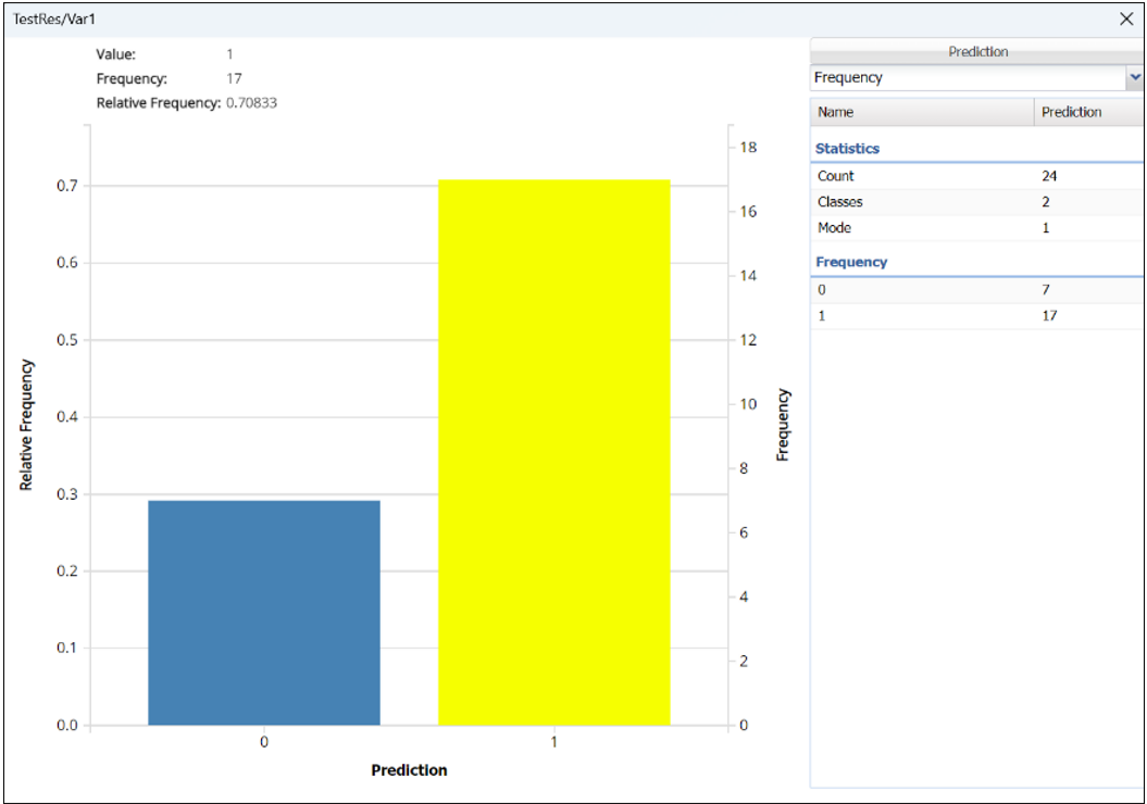
Click the down arrow next to Frequency to switch to Relative Frequency, Bin Details or Chart Options view.
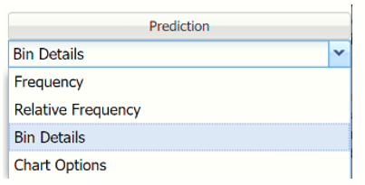
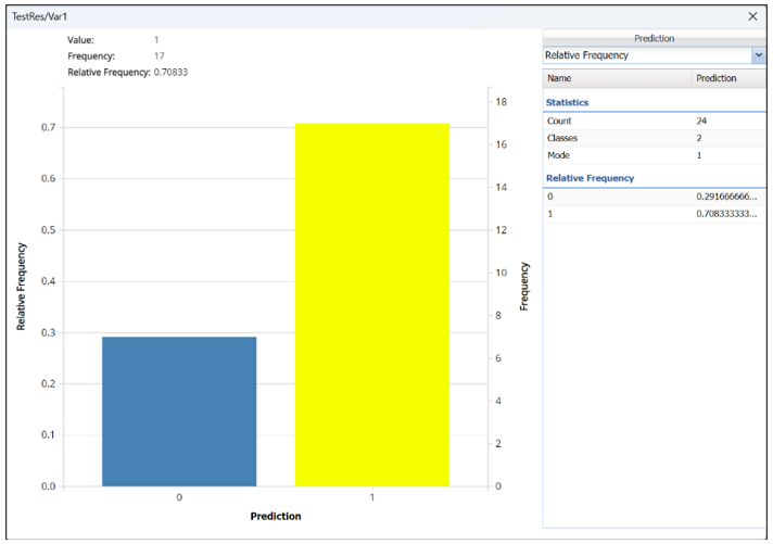
Relative Frequency: Displays the relative frequency chart.
Bin Details: Use this view to find metrics related to each bin in the chart.
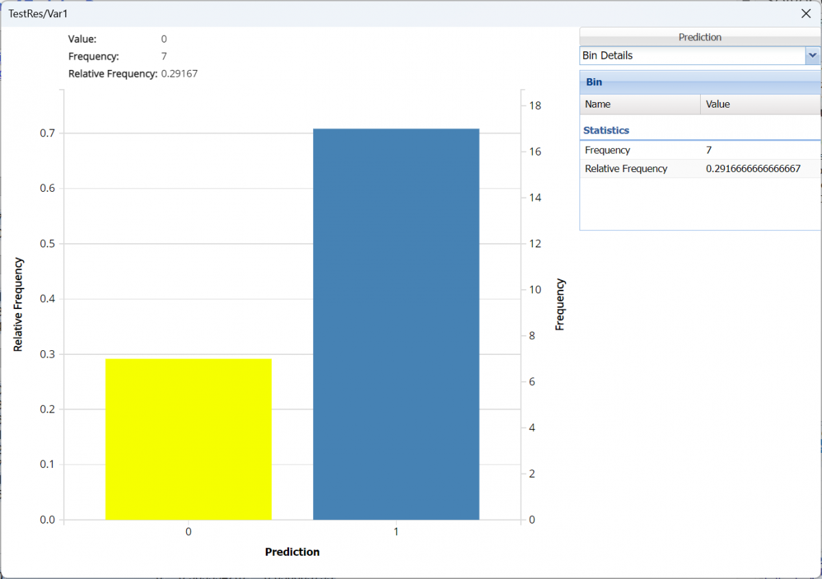
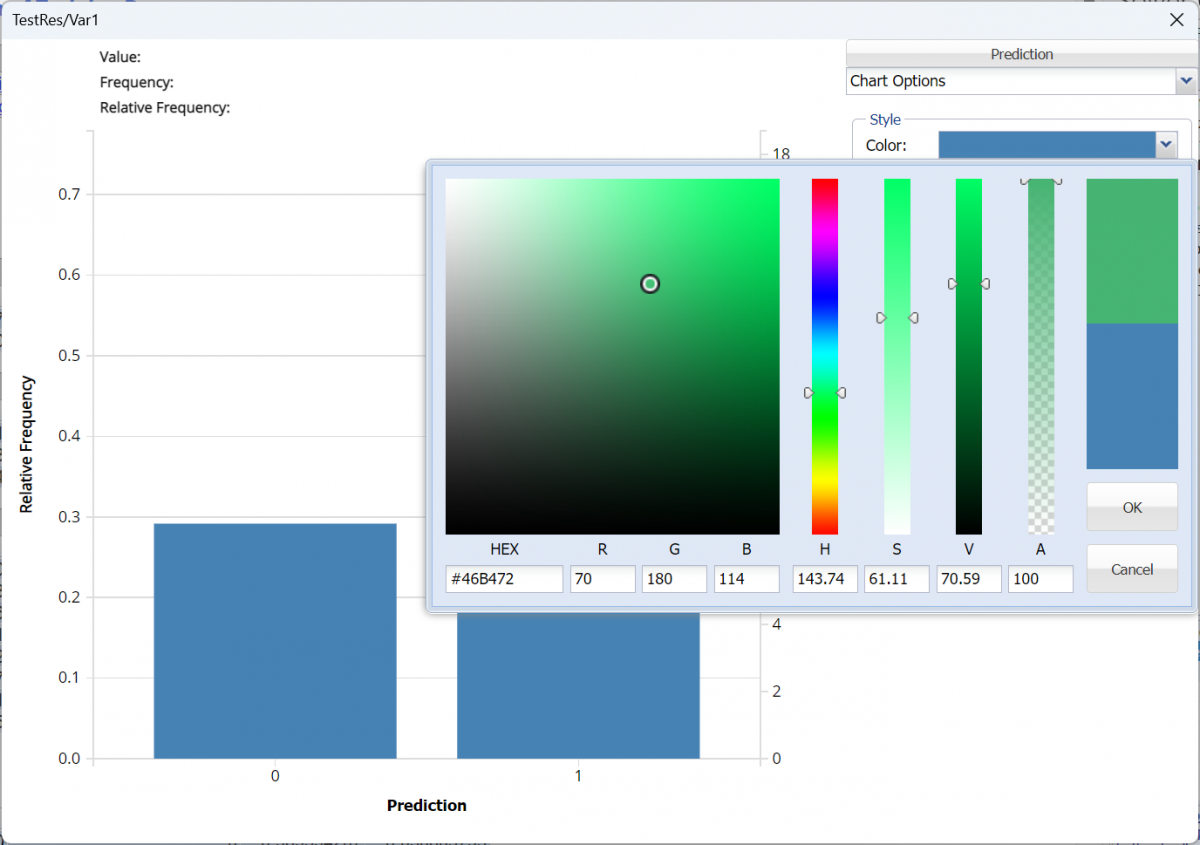
Chart Options: Use this view to change the color of the bars in the chart.
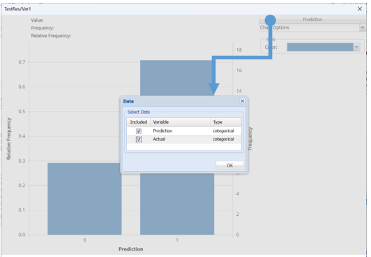
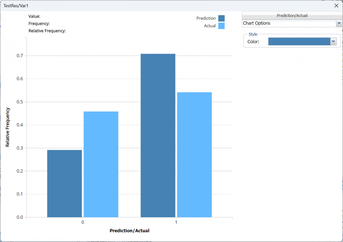
To see both the actual and predicted frequency, click Prediction and select Actual. This change will be reflected on all charts.
Classification Summary: In the Classification Summary report, a Confusion Matrix is used to evaluate the performance of the classification method.
Recall that in this example, we are classifying pilots on whether they are fit to fly based on various physical and psychological tests. Our output variable, TestRes/Var1 is 1 if the pilot is fit and 0 if not.
A Confusion Matrix is used to evaluate the performance of a classification method. This matrix summarizes the records that were classified correctly and those that were not.

TP stands for True Positive. These are the number of cases classified as belonging to the Success class that actually were members of the Success class. FP stands for False Positive. These are the number of cases that were classified as belonging to the Failure class when they were actually members of the Success class. FN stands for False Negative. These cases were assigned to the Success class, but were actually members of the Failure group. TN stands for True Negative. These cases were correctly assigned to the Failure group.
Precision is the proportion of True Positives divided by True Positives + False Positives. Sensitivity (or the true positive rate) measures the percentage of actual positives that are correctly identified as positive (i.e., the proportion of people with cancer who are correctly identified as having cancer). Specificity (also called the true negative rate) measures the percentage of failures correctly identified as failures (i.e., the proportion of people with no cancer being categorized as not having cancer). The F-1 score measures the accuracy of the classification method, and fluctuates between 1 (a perfect classification) and 0.
Precision = TP/(TP+FP)
Sensitivity or True Positive Rate (TPR) = TP/(TP + FN)
Specificity (SPC) or True Negative Rate =TN / (FP + TN)
F1 = 2 * ((Precision * recall) /( precision + recall))
Click the Training: Classification Summary link to view the Classification Summary for the training partition.
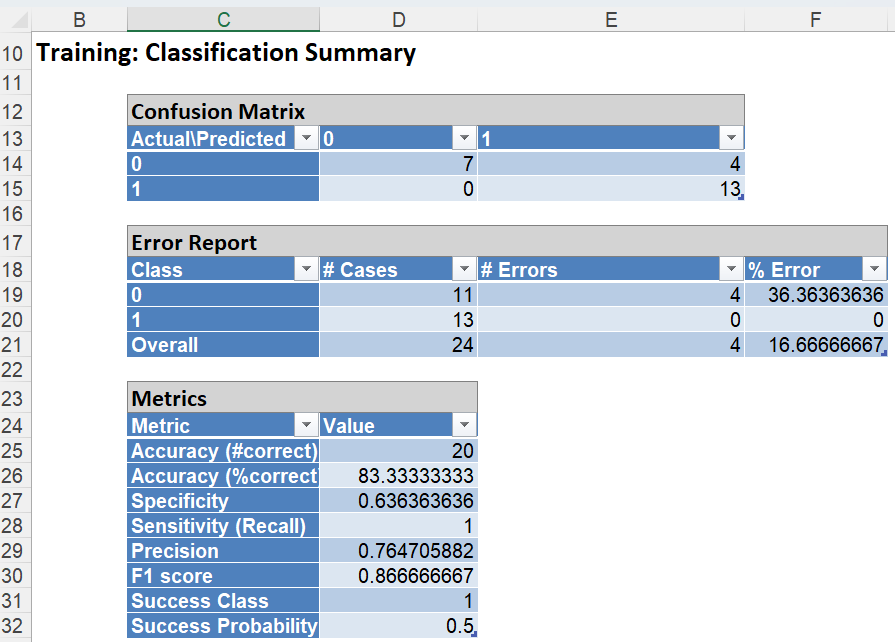
In the Training Dataset, we see 4 records were misclassified giving a misclassification error of 16.67%. Four (4) records were misclassified as successes.
NB_ValidationScore
Click the link for Validation: Classification Summary in the Output Navigator to open the Classification Summary for the validation partition.
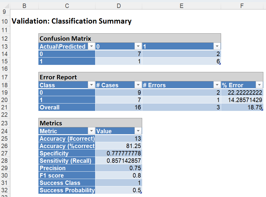
However, in the Validation Dataset, 7 records were correctly classified as belonging to the Success class while 1 case was incorrectly assigned to the Failure class. Six (6) cases were correctly classified as belonging to the Failure class while 2 records were incorrectly classified as belonging to the Success class. This resulted in a total classification error of 18.75%.
While predicting the class for the output variable, Analytic Solver Data Science calculates the conditional probability that the variable may be classified to a particular class. In this example, the classes are 0 and 1. For every record in each partition, the conditional probabilities for class - 0 and for class - 1 are calculated. Analytic Solver Data Science assigns the class to the output variable for which the conditional probability is the largest. Misclassified records will be highlighted in red.
It's possible that a N/A "error" may be displayed in the Classification table. These appear when the Naïve Bayes classifier is unable to classify specific patterns because they have not been seen in the training dataset. Rows of such partitions with unseen values are considered to be outliers. When N/A’s are present, Lift charts will not be available for that dataset.
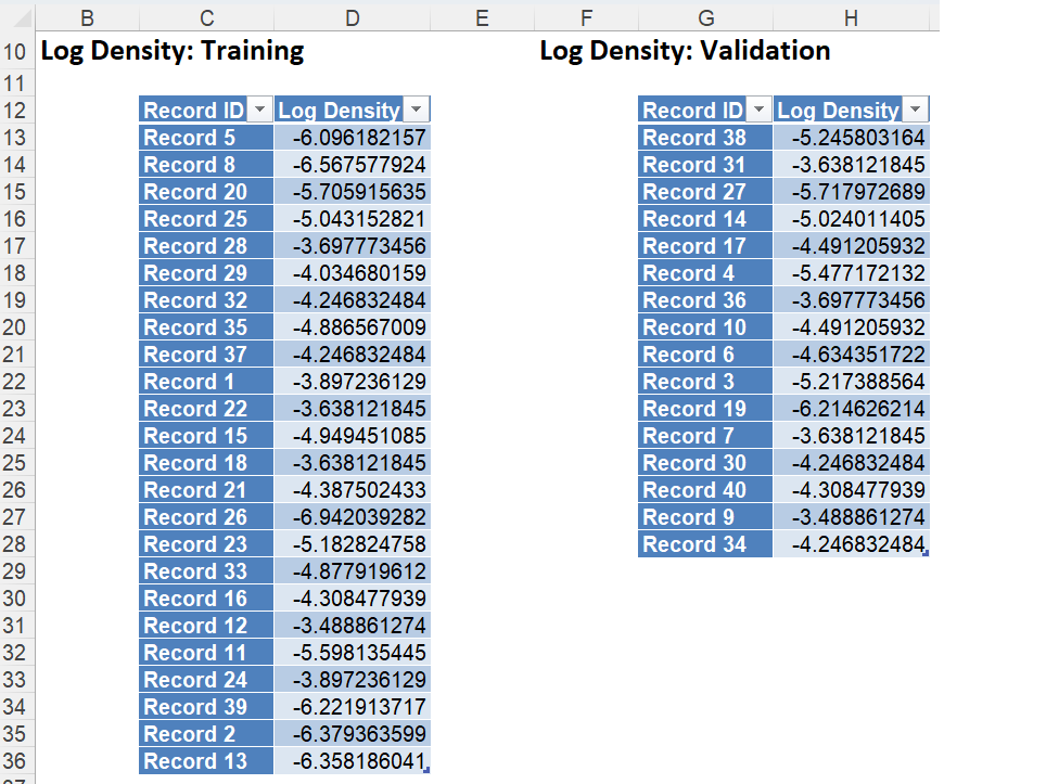
NB_LogDensity
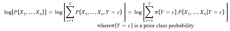
Click the NB_LogDensity tab to view the Log Densities for each partition. Log PDF, or Logarithm of Unconditional Probability Density, is the distribution of the predictors marginalized over the classes and is computed using:
NB_Output
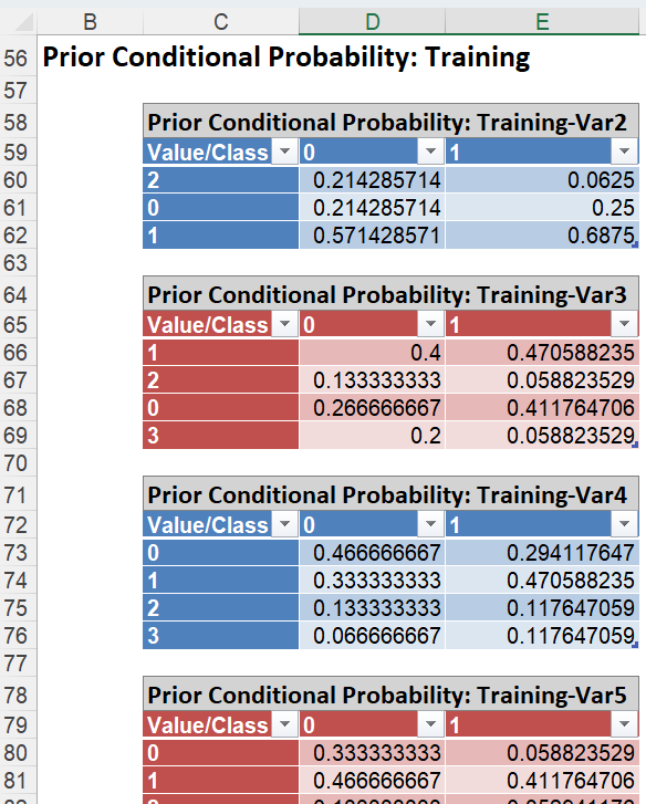
Click the Prior Conditional Probability: Training link to display the table below. This table shows the probabilities for each case by variable. For example, for Var2, 21% of the records where Var2 = 0 were assigned to Class 0, 57% of the records where Var2 = 1 were assigned to Class 0 and 21% of the records where Var2 = 2 were assigned to Class 0.
NB_TrainingLiftChart and NB_ValidationLiftChart
Click the NB_TrainingLiftChart and NB_ValidationLiftChart tabs to find the Lift Chart, ROC Curve, and Decile Chart for both the Training and Validation partitions.
Lift Charts and ROC Curves are visual aids that help users evaluate the performance of their fitted models. Charts found on the NB_Training LiftChart tab were calculated using the Training Data Partition. Charts found on the NB_ValidationLiftChart tab were calculated using the Validation Data Partition. It is good practice to look at both sets of charts to assess model performance on both datasets.
Note: To view these charts in the Cloud app, click the Charts icon on the Ribbon, select CT_TrainingLiftChart or CT_ValidationLiftChart for Worksheet and Decile Chart, ROC Chart or Gain Chart for Chart.
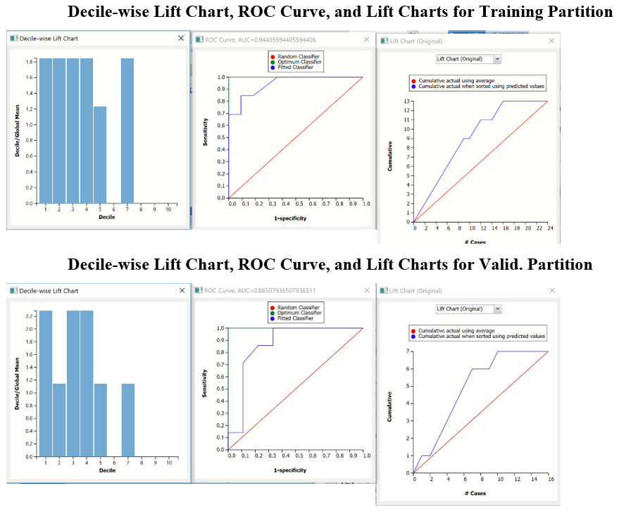
After the model is built using the training data set, the model is used to score on the training data set and the validation data set (if one exists). Then the data set(s) are sorted in decreasing order using the predicted output variable value. After sorting, the actual outcome values of the output variable are cumulated and the lift curve is drawn as the cumulative number of cases in decreasing probability (on the x-axis) vs the cumulative number of true positives on the y-axis. The baseline (red line connecting the origin to the end point of the blue line) is a reference line. For a given number of cases on the x-axis, this line represents the expected number of successes if no model existed, and instead cases were selected at random. This line can be used as a benchmark to measure the performance of the fitted model. The greater the area between the lift curve and the baseline, the better the model. In the Training Lift chart, if we selected 10 cases as belonging to the success class and used the fitted model to pick the members most likely to be successes, the lift curve tells us that we would be right on about 9 of them. Conversely, if we selected 10 random cases, we could expect to be right on about 4 of them. The Validation Lift chart tells us that we could expect to see the Random model perform the same or better on the validation partition than our fitted model.
The decilewise lift curve is drawn as the decile number versus the cumulative actual output variable value divided by the decile's mean output variable value. This bars in this chart indicate the factor by which the model outperforms a random assignment, one decile at a time. Refer to the validation graph above. In the first decile, the predictive performance of the model is about 1.8 times better as simply assigning a random predicted value.
The Regression ROC curve was updated in V2017. This new chart compares the performance of the regressor (Fitted Predictor) with an Optimum Predictor Curve and a Random Classifier curve. The Optimum Predictor Curve plots a hypothetical model that would provide perfect classification results. The best possible classification performance is denoted by a point at the top left of the graph at the intersection of the x and y axis. This point is sometimes referred to as the “perfect classification”. The closer the AUC is to 1, the better the performance of the model. In the Validation Partition, AUC = .43 which suggests that this fitted model is not a good fit to the data.
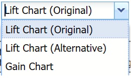
In V2017, two new charts were introduced: a new Lift Chart and the Gain Chart. To display these new charts, click the down arrow next to Lift Chart (Original), in the Original Lift Chart, then select the desired chart.
Select Lift Chart (Alternative) to display Analytic Solver Data Science's new Lift Chart. Each of these charts consists of an Optimum Predictor curve, a Fitted Predictor curve, and a Random Predictor curve. The Optimum Predictor curve plots a hypothetical model that would provide perfect classification for our data. The Fitted Predictor curve plots the fitted model and the Random Predictor curve plots the results from using no model or by using a random guess (i.e. for x% of selected observations, x% of the total number of positive observations are expected to be correctly classified).
The Alternative Lift Chart plots Lift against the Predictive Positive Rate or Support.
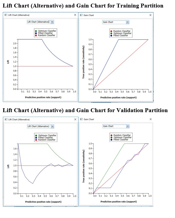
Click the down arrow and select Gain Chart from the menu. In this chart, the True Positive Rate or Sensitivity is plotted against the Predictive Positive Rate or Support.
Please see the “Scoring New Data” chapter within the Analytic Solver Data Science User Guide for information on NB_Stored.