This example uses the same partitioned dataset to illustrate the use of the Manual Network Architecture selection. This example reuses the partitions created on the STDPartition worksheet in the previous section, Automatic Neural Network Classification Example.
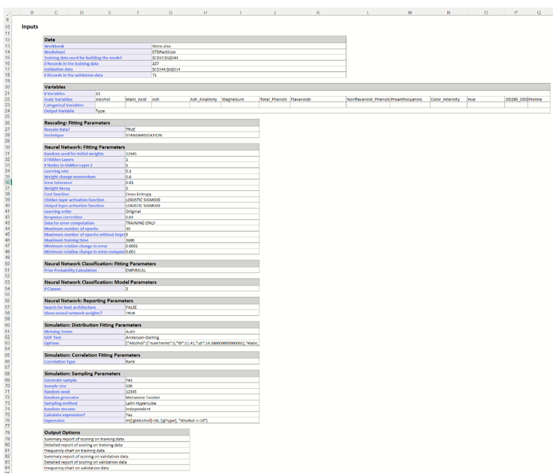
Inputs
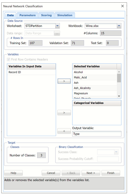
Select a cell on the StdPartition worksheet, then click Classify – Neural Network – Manual Network on the Data Science ribbon. The Neural Network Classification dialog appears.
Select Type as the Output variable and the remaining variables as Selected Variables. Since the Output variable contains three classes (A, B, and C) to denote the three different wineries, the options for Classes in the Output Variable are disabled. (The options under Classes in the Output Variable are only enabled when the number of classes is equal to 2.)
Nueral Network Classification dialog, Data Tab
Click Next to advance to the next tab.
As discussed in the previous sections, Analytic Solver Data Science includes the ability to partition a dataset from within a classification or prediction method by clicking Partition Data Parameters tab. Analytic Solver Data Science will partition your dataset (according to the partition options you set) immediately before running the classification method. If partitioning has already occurred on the dataset, this option will be disabled. For more information on partitioning, please see the Data Science Partitioning chapter.
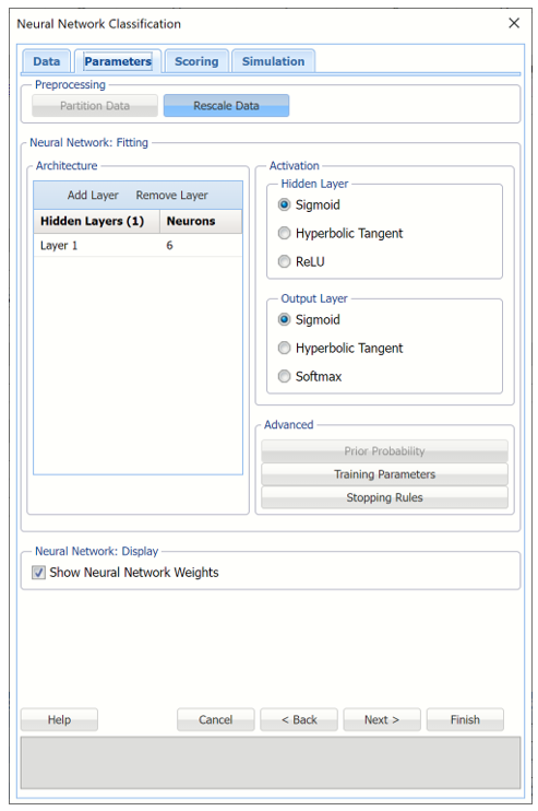
Click Rescale Data to open the Rescaling dialog.
Use Rescaling to normalize one or more features in your data during the data preprocessing stage. Analytic Solver Data Science provides the following methods for feature scaling: Standardization, Normalization, Adjusted Normalization and Unit Norm. See the important note related to Rescale Data and the new Simulation tab in the Using Neural Networks section by clicking the right facing arrow at the bottom of this topic.
For more information on rescaling, see the Rescale Continuous Data topic that occurs earlier in the Help.
Note: When selecting a rescaling technique, it's recommended that you apply Normalization ([0,1)] if Sigmoid is selected for Hidden Layer Activation and Adjusted Normalization ([-1,1]) if Hyperbolic Tangent is selected for Hidden Layer Activation. However, in this particular example dataset, the Neural Network algorithm performs best when Standardization was selected, rather than Normalization.
Click Add Layer to add a hidden layer to the Neural Network. To remove a layer, select the layer to be removed, then click Remove Layer. Enter 12 for Neurons.
Keep the default selections for the Hidden Layer and Output Layer options. See the Neural Network Classification Options section below for more information on these options.
Click Prior Probability. Three options appear in the Prior Probability Dialog: Empirical, Uniform and Manual.
Prior Probability dialog
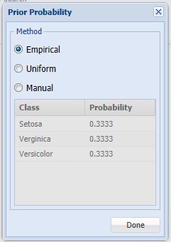
If the first option is selected, Empirical, Analytic Solver Data Science will assume that the probability of encountering a particular class in the dataset is the same as the frequency with which it occurs in the training data.
If the second option is selected, Uniform, Analytic Solver Data Science will assume that all classes occur with equal probability.
Select the third option, Manual, to manually enter the desired class and probability value.
Click Done to close the dialog and accept the default setting, Empirical.
Click Training Parameters to open the Training Parameters dialog. See the next section, Using Neural Networks Options, for more information on these options. For now, click Done to accept the default settings and close the dialog.
Training Parameters Dialog

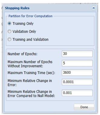
Click Stopping Rules to open the Stopping Rules dialog. Here users can specify a comprehensive set of rules for stopping the algorithm early plus cross-validation on the training error. Again, see the example above or the Neural Network Options section below for more information on these parameters. For now, click Done to accept the default settings and close the dialog.
Stopping Rules dialog
Select Show Neural Network Weights to include this information in the output.
Keep the default selections for the Hidden Layer and Output Layer options. See the Neural Network Classification Options section below for more information on these options.
Neural Network Classification dialog, Parameters tab
Click Next to advance to the Scoring tab.
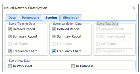
Select Detailed Report and Summary report under both Score Training Data and Score Validation Data. Lift Charts are disabled since the number of classes is greater than 2.
Since a Test Data partition was not created, the options under Score Test Data are disabled. For information on how to create a test partition, see the "Data Science Partition" chapter.
For more information on the Score New Data options, see the “Scoring New Data” chapter.
Neural Network Classification dialog, Scoring tab
Select Simulation Response Prediction to enable all options on the Simulation tab of the Discriminant Analysis dialog. (This tab is disabled in Analytic Solver Optimization, Analytic Solver Simulation and Analytic Solver Upgrade.)
Simulation tab: All supervised algorithms include a new Simulation tab. This tab uses the functionality from the Generate Data feature (described earlier in this guide) to generate synthetic data based on the training partition, and uses the fitted model to produce predictions for the synthetic data. The resulting report, _Simulation, will contain the synthetic data, the predicted values and the Excel-calculated Expression column, if present. In addition, frequency charts containing the Predicted, Training, and Expression (if present) sources or a combination of any pair may be viewed, if the charts are of the same type.
Evaluation: Select Calculate Expression to amend an Expression column onto the frequency chart displayed on the PFBM_Simulation output tab. Expression can be any valid Excel formula that references a variable and the response as [@COLUMN_NAME]. Click the Expression Hints button for more information on entering an expression.
Enter the following Excel formula into the expression field.
IF([@Alcohol]<10, [@Type], "Alcohol >=10")

Neural Network Classification dialog, Simulation tab

Click Finish to run the Neural Network Clasification algorithm.
Output Worksheets
Output worksheets are inserted to the right of the STDPartition worksheet.
NNC_Output
Scroll down to the Inputs section of the output sheet. This section includes all of the input selections from the
Click NNC_Output1 to view the Output Navigator. Click any link within the table to navigate to the report. Each output worksheet includes the Output Navigator at the top of the sheet.

Scroll down to the Inputs section. This section includs all the inputs selected on the Neural Network Classification dialog.
Scroll down to the Neuron Weights report. Analytic Solver Data Science provides intermediate information produced during the last pass through the network. Click the Neuron Weights link in the Output Navigator to view the Interlayer connections' weights table.
Neuron Weights Report
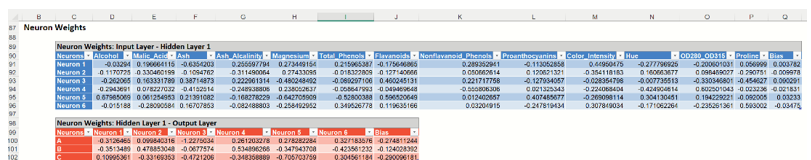
Recall that a key element in a neural network is the weights for the connections between nodes. In this example, we chose to have one hidden layer containing 6 neurons. Analytic Solver Data Science's output contains a section that contains the final values for the weights between the input layer and the hidden layer, between hidden layers, and between the last hidden layer and the output layer. This information is useful at viewing the “insides” of the neural network; however, it is unlikely to be of use to the data analyst end-user. Displayed above are the final connection weights between the input layer and the hidden layer for our example.
NNC_TrainLog
Click the Training Log link in the Output Navigator or click the NNC_TrainLog output tab, to display the Neural Network Training Log. This log displays the Sum of Squared errors and Misclassification errors for each epoch or iteration of the Neural Network. Thirty epochs, or iterations, were performed.
During an epoch, each training record is fed forward in the network and classified. The error is calculated and is back propagated for the weights correction. Weights are continuously adjusted during the epoch. The misclassification error is computed as the records pass through the network. This table does not report the misclassification error after the final weight adjustment. Scoring of the training data is performed using the final weights so the training classification error may not exactly match with the last epoch error in the Epoch log.

NNC_TrainingScore
Click the NNC_TrainingScore tab to view the newly added Output Variable frequency chart, the Training: Classification Summary and the Training: Classification Details report. All calculations, charts and predictions on this worksheet apply to the Training data.
Note: To view charts in the Cloud app, click the Charts icon on the Ribbon, select the desired worksheet under Worksheet and the desired chart under Chart.
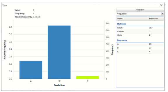
Frequency Charts: The output variable frequency chart opens automatically once the NNC_TrainingScore worksheet is selected. To close this chart, click the “x” in the upper right hand corner of the chart. To reopen, click onto another tab and then click back to the NNC_TrainingScore tab. To change the position of the chart on the screen, simply grab the title bar of the chart and move to the desired location.
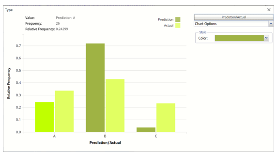
Frequency: This chart shows the frequency for both the predicted and actual values of the output variable, along with various statistics such as count, number of classes and the mode.
Frequency Chart on NNC_TrainingScore output sheet
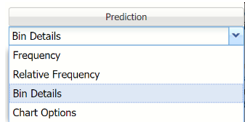
Click the down arrow next to Frequency to switch to Relative Frequency, Bin Details or Chart Options view.
Frequency Chart, Frequency View
Relative Frequency: Displays the relative frequency chart.
Relative Frequency Chart

Bin Details: Displays information related to each bin in the chart.
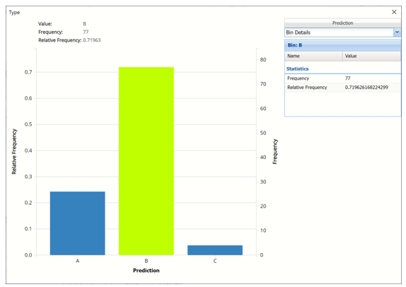
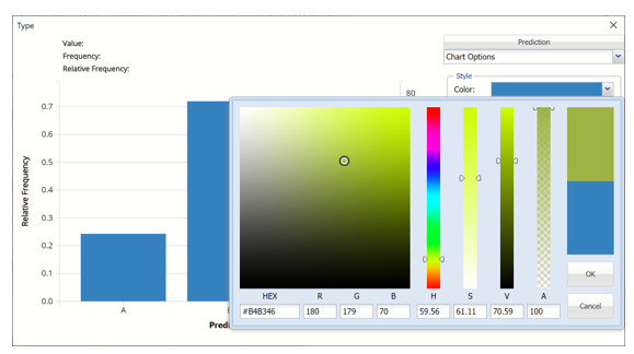
Chart Options: Use this view to change the color of the bars in the chart.
Chart Options View
To see both the actual and predicted frequency, click Prediction and select Actual. This change will be reflected on all charts.
Click Predicted/Actual to change view
NNC_TrainingScore Frequency Chart with Actual and Predicted
Classification Summary: In the Classification Summary report, a Confusion Matrix is used to evaluate the performance of the classification method.
NNC_TrainingScore: Training: Classification Summary
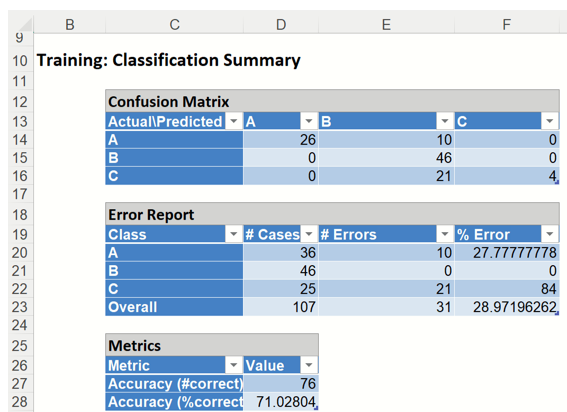
This Summary report tallies the actual and predicted classifications. (Predicted classifications were generated by applying the model to the validation data.) Correct classification counts are along the diagonal from the upper left to the lower right.
There were 31 misclassified records labeled in the Training partition:
Ten type A records were incorrectly assigned to type B.
Twenty-one type C records were incorrectly assigned to type B.
The total misclassification error is 28.97% (31 misclassified records / 107 total records). Any misclassified records will appear under Training: Classification Details in red.
Metrics
The following metrics are computed using the values in the confusion matrix.
Accuracy (#Correct = 76 and %Correct = 71.03%): Refers to the ability of the classifier to predict a class label correctly.
Classification Details: This table displays how each observation in the training data was classified. The probability values for success in each record are shown after the predicted class and actual class columns. Records assigned to a class other than what was predicted are highlighted in red.
NNC_TrainingScore: Training: Classification Details
NNC_ValidationScore
Click the NNC_ValidationScore tab to view the newly added Output Variable frequency chart, the Validation: Classification Summary and the Validation: Classification Details report. All calculations, charts and predictions on this worksheet apply to the Validation data.
Frequency Charts: The output variable frequency chart opens automatically once the NNC_ValidationScore worksheet is selected. To close this chart, click the “x” in the upper right hand corner. To reopen, click onto another tab and then click back to the NNC_ValidationScore tab. To change the placement of the chart, grab the title bar and move to the desired location on the screen.
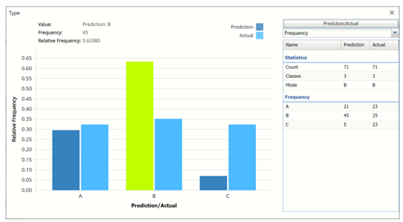
Click the Frequency chart to display the frequency for both the predicted and actual values of the output variable, along with various statistics such as count, number of classes and the mode. Selective Relative Frequency from the drop down menu, on the right, to see the relative frequencies of the output variable for both actual and predicted. See above for more information on this chart.
DA_ValidationScore Frequency Chart
Classification Summary: This report contains the confusion matrix for the validation data set.
NNC_ValidationScore: Classification Summary
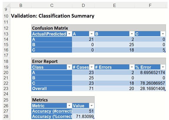
Twenty records were miscalssified by Neural Networks Classification.
Two (2) type A records were misclassified as type B.
Eighteen (18) type C records were miscalssified as Type B.
The total number of misclassified records was 20 (18 + 2 which results in an error equal to 28.2%.
Metrics
The following metrics are computed using the values in the confusion matrix.
Accuracy (#Correct = 51 and %Correct = 71.8%): Refers to the ability of the classifier to predict a class label correctly.
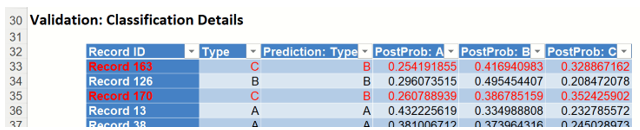
Classification Details: This table displays how each observation in the validation data was classified. The probability values for success in each record are shown after the predicted class and actual class columns. Records assigned to a class other than what was predicted are highlighted in red.
NNC_ValidationScore: Validation: Classification Details
NNC_Simulation
As discussed above, Analytic Solver Data Science generates a new output worksheet, NNC_Simulation, when Simulate Response Prediction is selected on the Simulation tab of the Neural Network Classification dialog in Analytic Solver Comprehensive and Analytic Solver Data Science. (This feature is not supported in Analytic Solver Optimization, Analytic Solver Simulation or Analytic Solver Upgrade.)
This report contains the synthetic data, the training partition predictions (using the fitted model) and the Excel – calculated Expression column, if populated in the dialog. A dialog is displayed with the option to switch between the Predicted, Training, and Expression sources or a combination of two, as long as they are of the same type. Note that this data has been rescaled because we selected Rescale Data on the Parameters tab in the Neural Network Classification dialog.
Synthetic Data
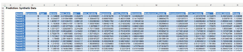
Note the first column in the output, Expression. This column was inserted into the Synthetic Data results because Calculate Expression was selected and an Excel function was entered into the Expression field, on the Simulation tab of the Discriminant Analysis dialog
IF([@Alcohol]<10, [@Type], "Alcohol >=10")
The results in this column are either A, B, C or Alcohol >= 10 depending on the alcohol content for each record in the synthetic data.
The remainder of the data in this report is synthetic data, generated using the Generate Data feature described in the chapter with the same name, that appears earlier in this guide.
The chart that is displayed once this tab is selected, contains frequency information pertaining to the output variable in the training partition and the synthetic data. The chart below displays frequency information for the predicted values in the synthetic data.
Prediction Frequency Chart for NNC_Simulation output
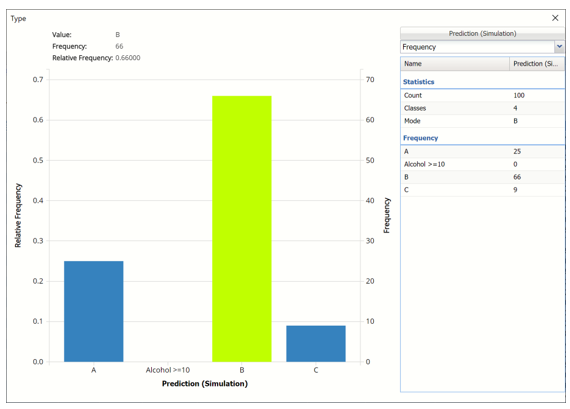
In the synthetic data, 25 records were classified as Type A, 66 for Type B and 9 for Type C.
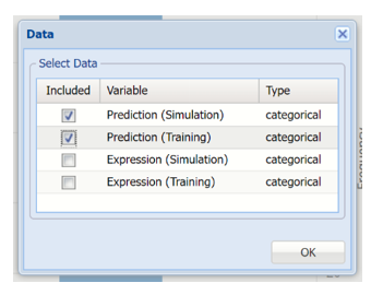
Click Prediction (Simulation) and select Prediction (Training) in the Data dialog to display a frequemcy chart based on the Training partition.
Data Dialog
Prediction (Simulation)/ Prediction (Training) Frequency Chart
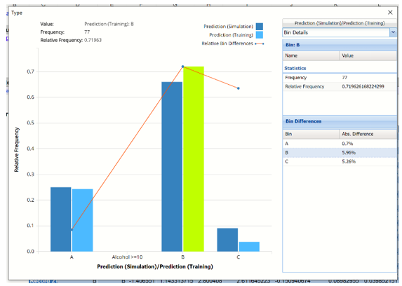
In this chart, the columns in the darker shade of blue relate to the predicted wine type in the synthetic, or simulated data. The columns in the lighter shade of blue relate to the predicted wine type in the training partition.
Note the red Relative Bin Differences curve. Click the arrow next to Frequency and select Bin Details from the menu. This tab reports the absolute differences between each bin in the chart.
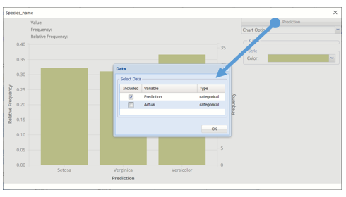
Click Prediction (Simulation)/Prediction (Training) and select Expression (Simulation) and Expression (Training) in the Data dialog to display both a chart of the results for the expression that was entered in the Simulation tab.
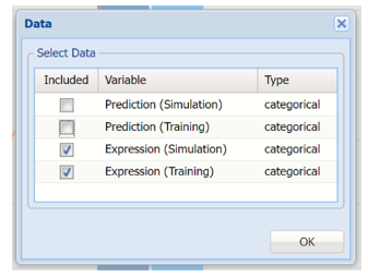
Chart displaying evaluation of expression
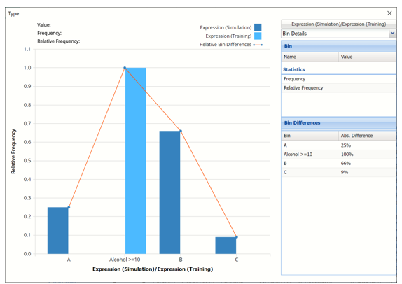
The columns in darker blue display the wine type for each record in the simulated, or synthetic, data. In the simulated data, 25% of the records in the data were assigned to type A, 66% were assigned to type B and 9% were assigned to type C. There were no records in the simulated data where the alcohol content was less than 10. As a result, the value for Expression for all records in the synthetic data are labeled as “Alcohol >= 10”.
Click the down arrow next to Frequency to change the chart view to Relative Frequency or to change the look by clicking Chart Options. Statistics on the right of the chart dialog are discussed earlier in this section. For more information on the generated synthetic data, see the Generate Data chapter that appears earlier in this guide.
For information on Stored Model Sheets, in this example DA_Stored, please refer to the “Scoring New Data” chapter within the Analytic Solver Data Science User Guide.