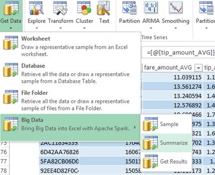
We'll start by exploring properties of the entire 48GB dataset, by using Analytic Solver Data Science's Big Data Summarization feature.
In our study of the FAA Airline Big Data set, we saw that the HortonWorks tutorial, to simplify the problem, restricted much of its analysis to one airport, Chicago O'Hare. In Jose Mazo's GitHub thesis, we see that the author selected a single month of data (the one with the fewest records) to simplify the analysis on a single machine.
But thanks to our Analytic Solver-Apache Spark link, we don't have to make this compromise, which necessarily draws into question whether the results were in fact representative of the entire dataset. For the FAA Airline Big Data set, we drew a representative sample of the entire dataset, covering all 3,376 airports. Here we'll use our Spark link to group and summarize statistics over the full NYC Taxi dataset, then we'll draw a representative sample from all 170 million rows, to train and validate our predictive model.
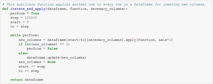
The GitHub thesis presents Python code for summarizing the distributions of various data features. Here's an excerpt:
We'll do this in a much simpler, point-and-click manner using Excel and Analytic Solver Data Science. The user selects a dropdown menu option Get Data - Big Data - Summarize as shown above, then selects features in this dialog:
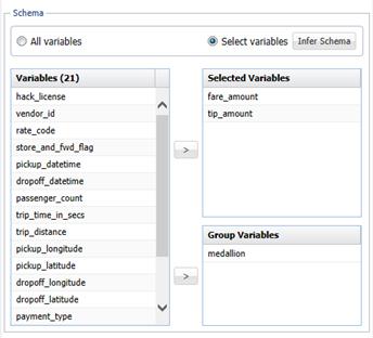
XLMiner takes less than a second to process the entire dataset on the cluster using Apache Spark. If we group by vendor ID instead of medallion, Analytic Solver Data Science reports that the average fare and tip amount is slightly larger in the taxi cabs equipped with Verifone Transportation Systems (VTS) than with Mobile Knowledge Systems (CMT) machines (we'll revisit this point later).

Another quick Summarization step shows us the fare and average tip, grouped by the number of passengers in the cab:
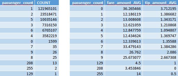
Real-world datasets are far from perfect, and this data is no exception. Can you picture a taxi ride with 208 people in the cab? The dataset includes 13 instances of such rides. That illustrates why exploration and preprocessing is an essential first step in any data analysis.
With a few clicks in Excel and its Chart Wizard, we can visualize the distribution of tips, excluding corrupted data with 0 passengers or more than 100 passengers:
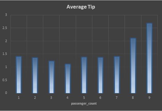
We see a distribution of tip amounts from roughly $1 and $3, where the rides with larger numbers of passengers correspond to the larger tips, as expected.
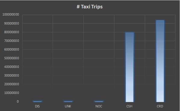
One more Summarize step, grouping the data by the payment type (another one-second task for the Analytic Solver-Spark link) shows that the vast majority (99.58%) of payments were made with a credit card (53.89%) or cash (45.68%).

With about two clicks in the Excel Chart Wizard, we can visualize this:
So far, we've used Summarize on the entire dataset. Next, we'll "drill down" to see fares and tips for individual taxi cabs. As shown on the next page, that's just as easy in Analytic Solver Data Science.
