Bagging Ensemble Classification Method Example
This example illustrates the use of the Bagging Ensemble Classification Method using the Boston Housing dataset. This dataset contains information collected by the US Census Service concerning housing in the Boston, MA area in the 1940’s.
Inputs
Click Help – Example Models, then Forecasting/Data Science Examples to open the Boston Housing dataset.
Descriptions of the “features” or independent variables in this dataset can be found on the Data worksheet tab.
All supervised algorithms include a new Simulation tab. This tab uses the functionality from the Generate Data feature (described in the What’s New section of this guide and then more in depth in the Analytic Solver Data Science Reference Guide) to generate synthetic data based on the training partition, and uses the fitted model to produce predictions for the synthetic data. Since this new functionality does not support categorical input variables, these types of variables will not be present in the model, only continuous, or scale, variables.
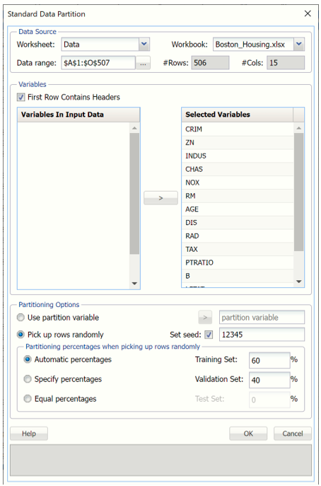
First, we partition the data into training and validation sets using a Standard Data Partition with percentages of 60% of the data randomly allocated to the Training Set and 40% of the data randomly allocated to the Validation Set. For more information on partitioning a dataset, see the Data Science Partitioning chapter.
With the STDPartition tab selected, click Classify – Ensemble – Bagging to open the Bagging: Classification dialog.
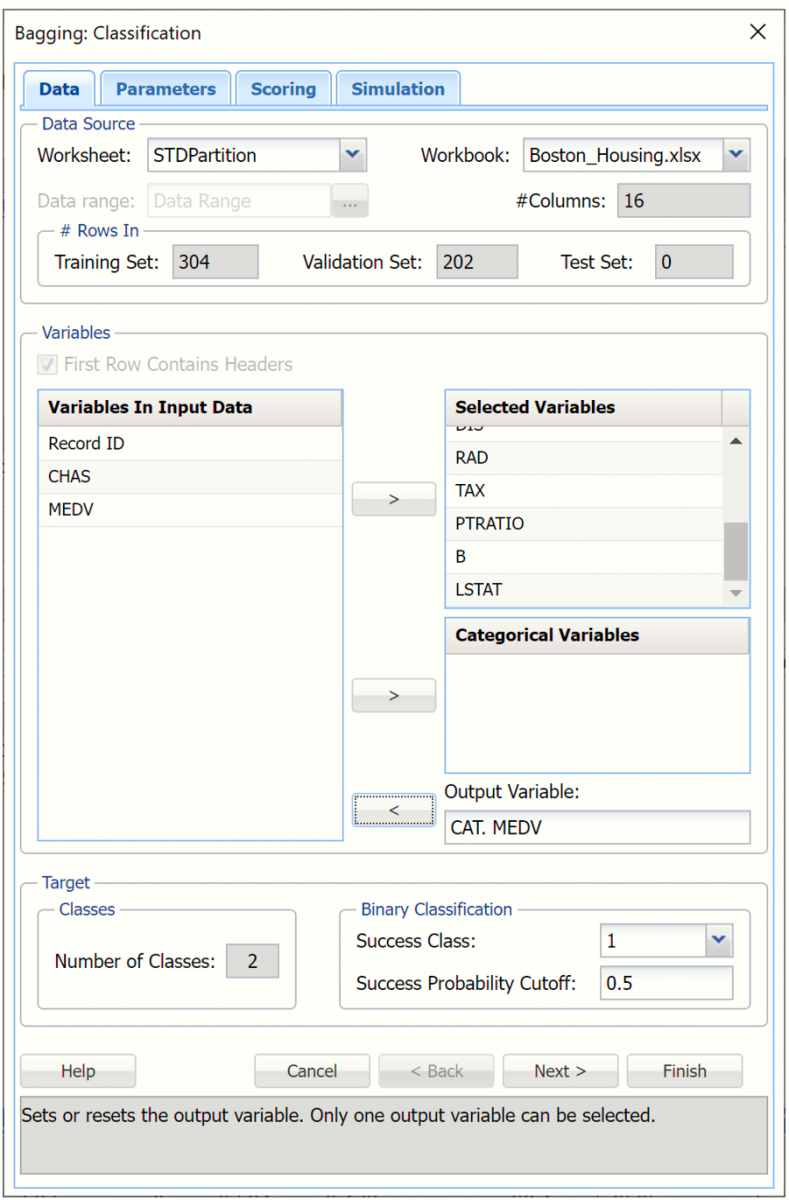
Select the following variables under Variables in Input Data and then click > next to Selected Variables to select these variables as input variables.
CRIM, ZN, INDUS, NOX, RM, AGE, DIS, RAD, TAX, PTRATIO, B and LSTAT
Omit Record ID, CHAS and MEDV variables from the input.
Select CAT. MEDV under Variables In Input Data, then click > next to Output Variable, to select this variable as the output variable. This variable is derived from the scale MEDV variable.
Choose the value that will be the indicator of “Success” by clicking the down arrow next to Success Class. In this example, we will use the default of 1.
Enter a value between 0 and 1 for Success Probability Cutoff. If the Probability of success is less than this value, then a 0 will be entered for the class value, otherwise a 1 will be entered for the class value. In this example, we will keep the default of 0.
Click Next to advance to the Bagging: Classification Parameters dialog.
Analytic Solver Data Science includes the ability to partition or rescale a dataset “on-the-fly” within a classification or regression method by clicking Partition Data or Rescale Data on the Parameters dialog. Analytic Solver Data Science will partition or rescale your dataset (according to the partition and rescaling options you set) immediately before running the classification method. If partitioning or rescaling has already occurred on the dataset, these options will be disabled. For more information on partitioning or rescaling your data, please see the Data Science Partitioning and Transform Continuous Data chapters that occur earlier in this guide.
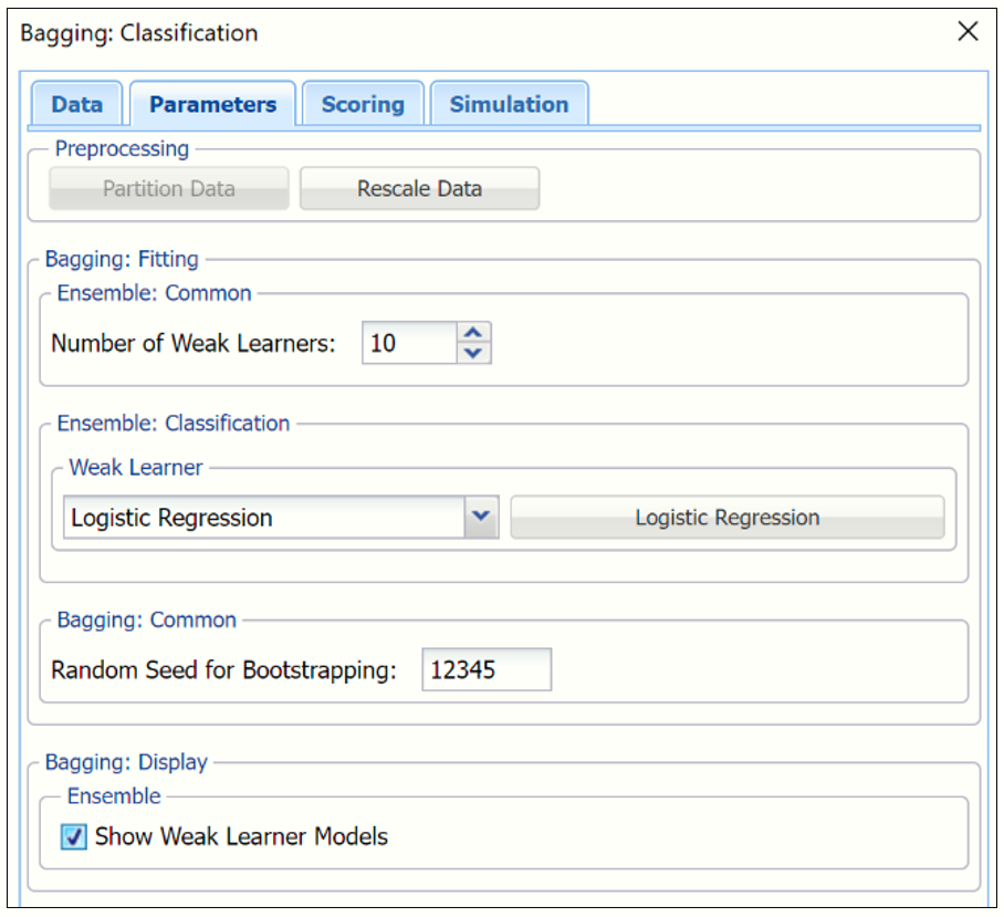
Leave the default value of "10" for the Number of weak learners. This option controls the number of “weak” classification models that will be created. The ensemble method will stop when the number or classification models created reaches the value set for this option. The algorithm will then compute the weighted sum of votes for each class and assign the “winning” classification to each record.
Under Ensemble: Classification click the down arrow beneath Weak Learner to select one of the six featured classifiers. For this example, select Logistic Regression.
Options pertaining to the Logistic Regression learner may be changed by clicking the Logistic Regression button to the right of Weak Learner.
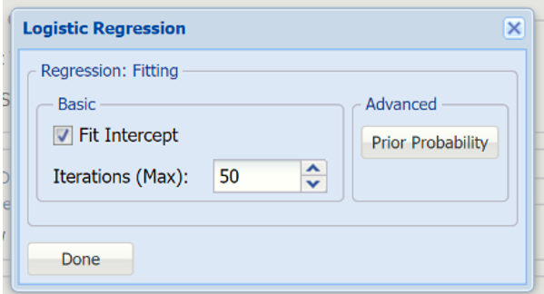
All options will be left at their default values. For more information on these options, see the Logistic Regression chapter that occurs earlier in this guide.
Leave the default setting for Random Seed for Boostrapping at “12345”. Analytic Solver Data Science will use this value to set the bootstrapping random number seed. Setting the random number seed to a nonzero value (any number of your choice is OK) ensures that the same sequence of random numbers is used each time the dataset is chosen for the classifier.
Select Show Weak Learner Models to display the weak learner models in the output.
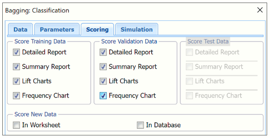
Click Next to advance to the Bagging: Classification - Scoring dialog.
Summary Report is selected by default under both Score Training Data and Score Validation Data.
- Select Detailed Report under both Score Training Data and Score Validation Data to produce a detailed assessment of the performance of the tree in both sets.
- Select Lift Charts to include Lift Charts, ROC Curves and Decile charts for both the Training and Validation datasets.
- Select Frequency Chart under Score Training/Validation Data to display a frequency chart on both the CBagging_TrainingScore and CBagging_ValidationScore worksheets. This chart will display an interactive application similar to the Analyze Data feature, explained in detail in the Analyze Data chapter that appears earlier in this guide. This chart will include frequency distributions of the actual and predicted responses individually, or side-by-side, depending on the user’s preference, as well as basic and advanced statistics for variables, percentiles, six sigma indices.
- Since we did not create a test partition, the options for Score test data are disabled. See the chapter “Data Science Partitioning” for information on how to create a test partition.
- See the “Scoring New Data” chapter within the Analytic Solver Data Science User Guide for information on the Score new data options.
Click Next to advance to the Simulation dialog.
Select Simulation Response Prediction to enable all options on the Simulation tab.
Simulation tab: All supervised algorithms include a new Simulation tab. This tab uses the functionality from the Generate Data feature (described earlier in this guide) to generate synthetic data based on the training partition, and uses the fitted model to produce predictions for the synthetic data. The resulting report, CBagging_Simulation, will contain the synthetic data, the predicted values and the Excel-calculated Expression column, if present. In addition, frequency charts containing the Predicted, Training, and Expression (if present) sources or a combination of any pair may be viewed, if the charts are of the same type.
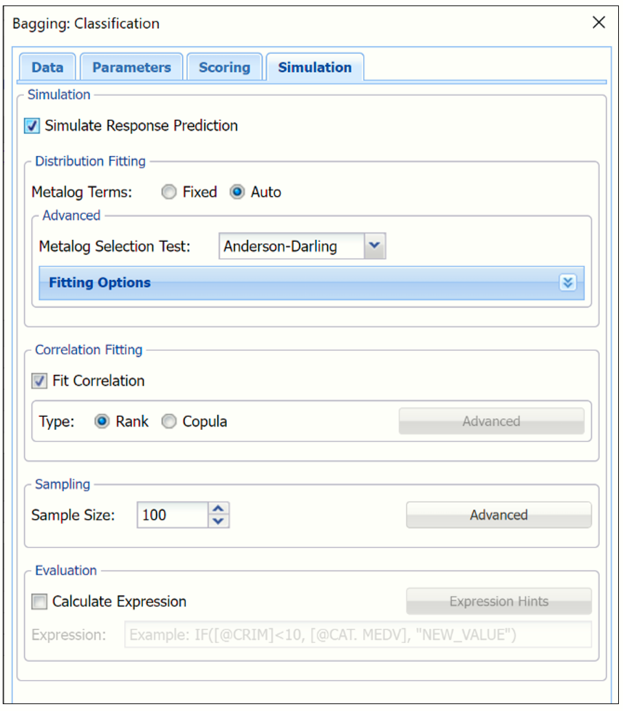
Evaluation: Select Calculate Expression to amend an Expression column onto the frequency chart displayed on the CBagging_Simulation output tab. Expression can be any valid Excel formula that references a variable and the response as [@COLUMN_NAME]. Click the Expression Hints button for more information on entering an expression.
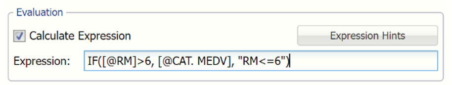
For the purposes of this example, leave all options at their defaults in the Distribution Fitting, Correlation Fitting and Sampling sections of the dialog. For Expression, enter the following formula to display if the patient sufferered catastrophic heart failure (@DEATH_EVENT) when his/her Ejection_Fraction was less than or equal to 20.
IF([@RM]>=6, [@CAT. MEDV], “RM<=6”)
Note that variable names are case sensitive.
For more information on the remaining options shown on this dialog in the Distribution Fitting, Correlation Fitting and Sampling sections, see the Generate Data chapter that appears earlier in this guide.
Click Finish.
Outputs
Output from the Bagging algorithm will be inserted to the right of the Data worksheet.
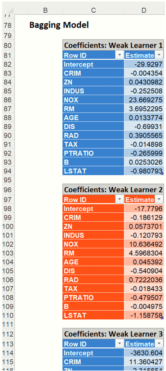
CBagging_Output
This result worksheet includes 4 segments: Output Navigator, Inputs and Bagging Model.
- Output Navigator: The Output Navigator appears at the top of all result worksheets. Use this feature to quickly navigate to all reports included in the output.

- Inputs: Scroll down to the Inputs section to find all inputs entered or selected on all tabs of the Bagging Classification dialog.
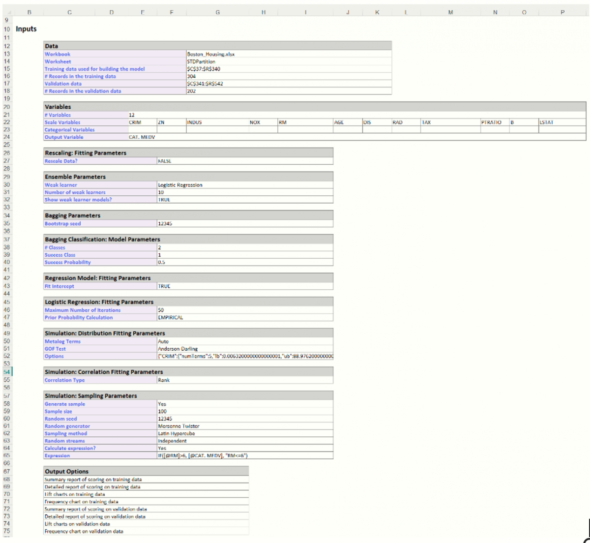
- The number of Weak Learners in the output is equal to 10 which matches our input on the Parameters dialog for the Number of Weak Learners option.
The Importance percentage for each Variable in each Learner is listed in each table. This percentage measures the variable’s contribution in reducing the total misclassification error.
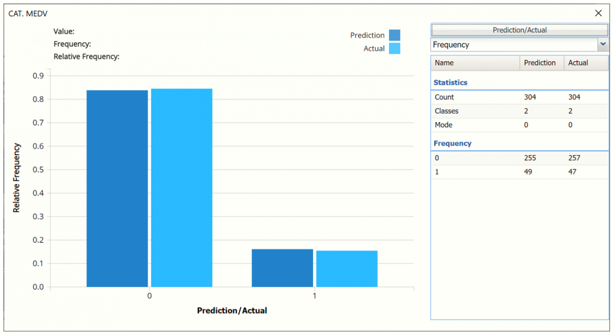
CBagging_TrainingScore
Click the CBagging_TrainingScore Scroll down to view the Classification Summary and Classification Details Reports for the Training partition as well as the Frequency charts. For detailed information on each of these components, see the Logistic Regression chapter that appears earlier in this guide.
- Frequency Chart: This chart shows the frequency for both the predicted and actual values of the output variable, along with various statistics such as count, number of classes and the mode.
Note: To view this frequency charts in the Cloud app, click the Charts icon on the Ribbon, select CBagging_TrainingScore for Worksheet and Frequency for Chart.
- Classification Summary and Classification Details: In the Classification Summary report, a Confusion Matrix is used to evaluate the performance of the classification method.
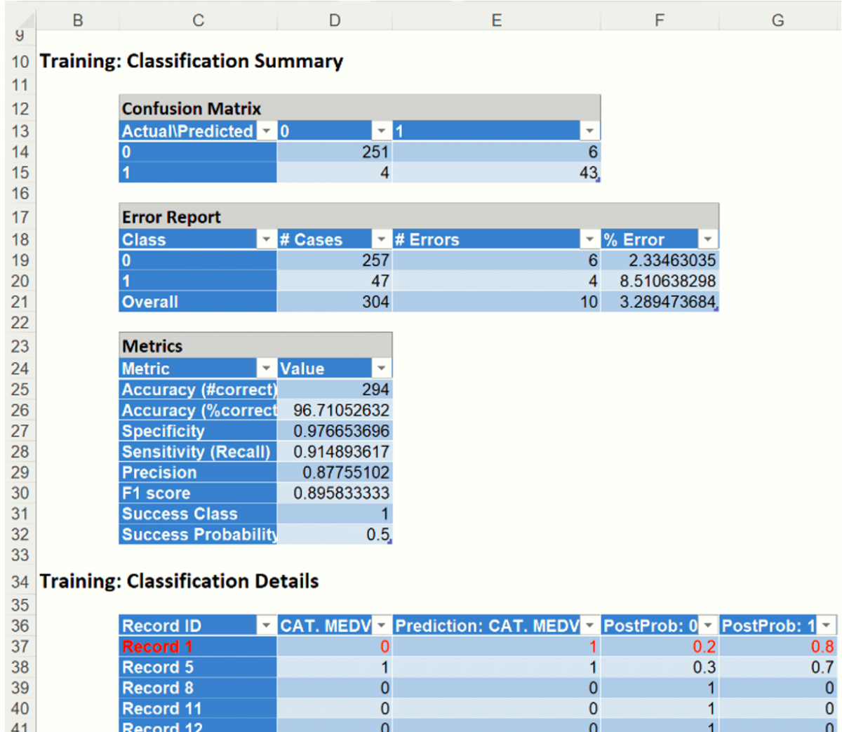
The Classification Summary displays the confusion matrix for the Training Partition.
- True Positive: 43 records belonging to the Success class were correctly assigned to that class.
- False Negative: 4 records belonging to the Success class were incorrectly assigned to the Failure class.
- True Negative: 251 records belonging to the Failure class were correctly assigned to this same class
- False Positive: 6 records belonging to the Failure class were incorrectly assigned to the Success class.
The total number of misclassified records was 10 (4 + 6) which results in an error equal to 3.29%.
Metrics
The following metrics are computed using the values in the confusion matrix.
Accuracy (#Correct and %Correct): 96.71% - Refers to the ability of the classifier to predict a class label correctly.
Specificity: 0.977 - Also called the true negative rate, measures the percentage of failures correctly identified as failures
- Specificity (SPC) or True Negative Rate =TN / (FP + TN)
Recall (or Sensitivity): 0.914 - Measures the percentage of actual positives which are correctly identified as positive (i.e. the proportion of people who experienced catastrophic heart failure who were predicted to have catastrophic heart failure).
- Sensitivity or True Positive Rate (TPR) = TP/(TP + FN)
Precision: 0.878 - The probability of correctly identifying a randomly selected record as one belonging to the Success class
- Precision = TP/(TP+FP)
F-1 Score: 0.896 - Fluctuates between 1 (a perfect classification) and 0, defines a measure that balances precision and recall.
- F1 = 2 * TP / (2 * TP + FP + FN)
Success Class and Success Probability: Selected on the Data tab of the Discriminant Analysis dialog.
Classification Details: This table displays how each observation in the training data was classified. The probability values for success in each record are shown after the predicted class and actual class columns. Records assigned to a class other than what was predicted are highlighted in red.
CBagging_ValidationScore
Click the CBagging_ValidationScore Scroll down to view the Classification Summary and Classification Details Reports for the Validation partition as well as the Frequency charts. For detailed information on each of these components, see the Logistic Regression chapter that appears earlier in this guide.
- Frequency Chart: This chart shows the frequency for both the predicted and actual values of the output variable, along with various statistics such as count, number of classes and the mode.
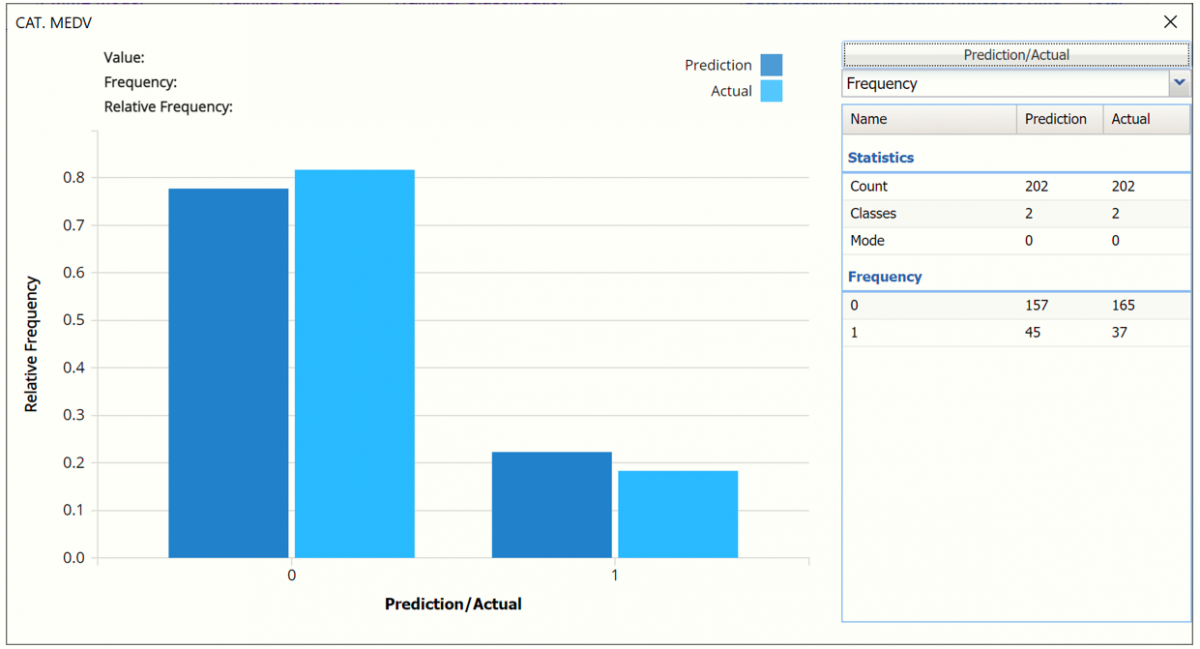
- Classification Summary and Classification Details: In the Classification Summary report, a Confusion Matrix is used to evaluate the performance of the fitted classification model on the validation partition.
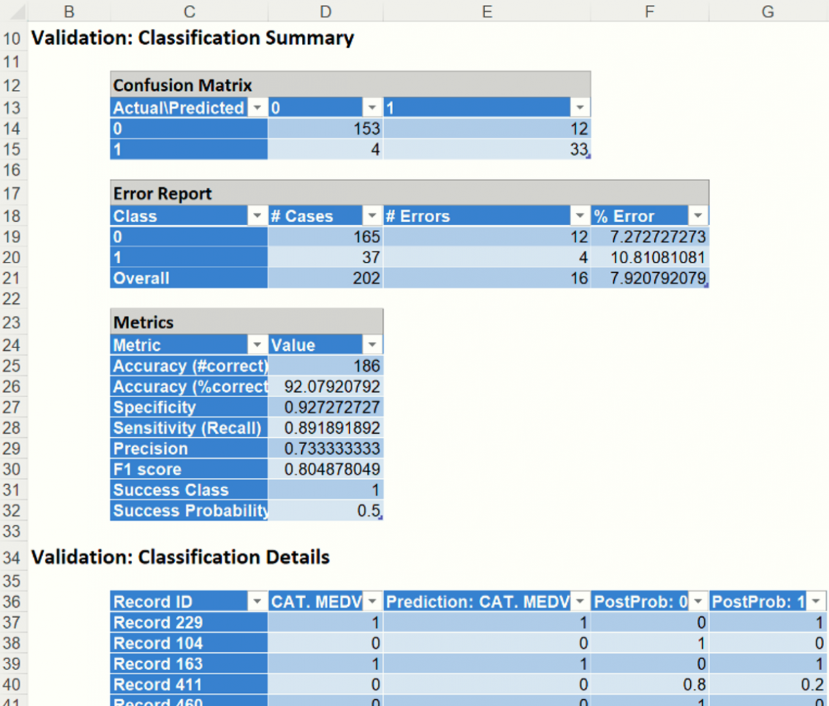
The Classification Summary displays the confusion matrix for the Training Partition.
- True Positive: 33 records belonging to the Success class were correctly assigned to that class.
- False Negative: 4 records belonging to the Success class were incorrectly assigned to the Failure class.
- True Negative: 153 records belonging to the Failure class were correctly assigned to this same class
- False Positive: 12 records belonging to the Failure class were incorrectly assigned to the Success class.
The total number of misclassified records was 16 (12 + 4) which results in an error equal to 7.92%.
Metrics
The following metrics are computed using the values in the confusion matrix.
Accuracy (#Correct and %Correct): 92.1% - Refers to the ability of the classifier to predict a class label correctly.
Specificity: 0.927 - Also called the true negative rate, measures the percentage of failures correctly identified as failures
- Specificity (SPC) or True Negative Rate =TN / (FP + TN)
Recall (or Sensitivity): 0.892 - Measures the percentage of actual positives which are correctly identified as positive (i.e. the proportion of people who experienced catastrophic heart failure who were predicted to have catastrophic heart failure).
- Sensitivity or True Positive Rate (TPR) = TP/(TP + FN)
Precision: 0.733 - The probability of correctly identifying a randomly selected record as one belonging to the Success class
- Precision = TP/(TP+FP)
F-1 Score: 0.805 - Fluctuates between 1 (a perfect classification) and 0, defines a measure that balances precision and recall.
- F1 = 2 * TP / (2 * TP + FP + FN)
Success Class and Success Probability: Selected on the Data tab of the Discriminant Analysis dialog.
Classification Details: This table displays how each observation in the training data was classified. The probability values for success in each record are shown after the predicted class and actual class columns. Records assigned to a class other than what was predicted are highlighted in red.
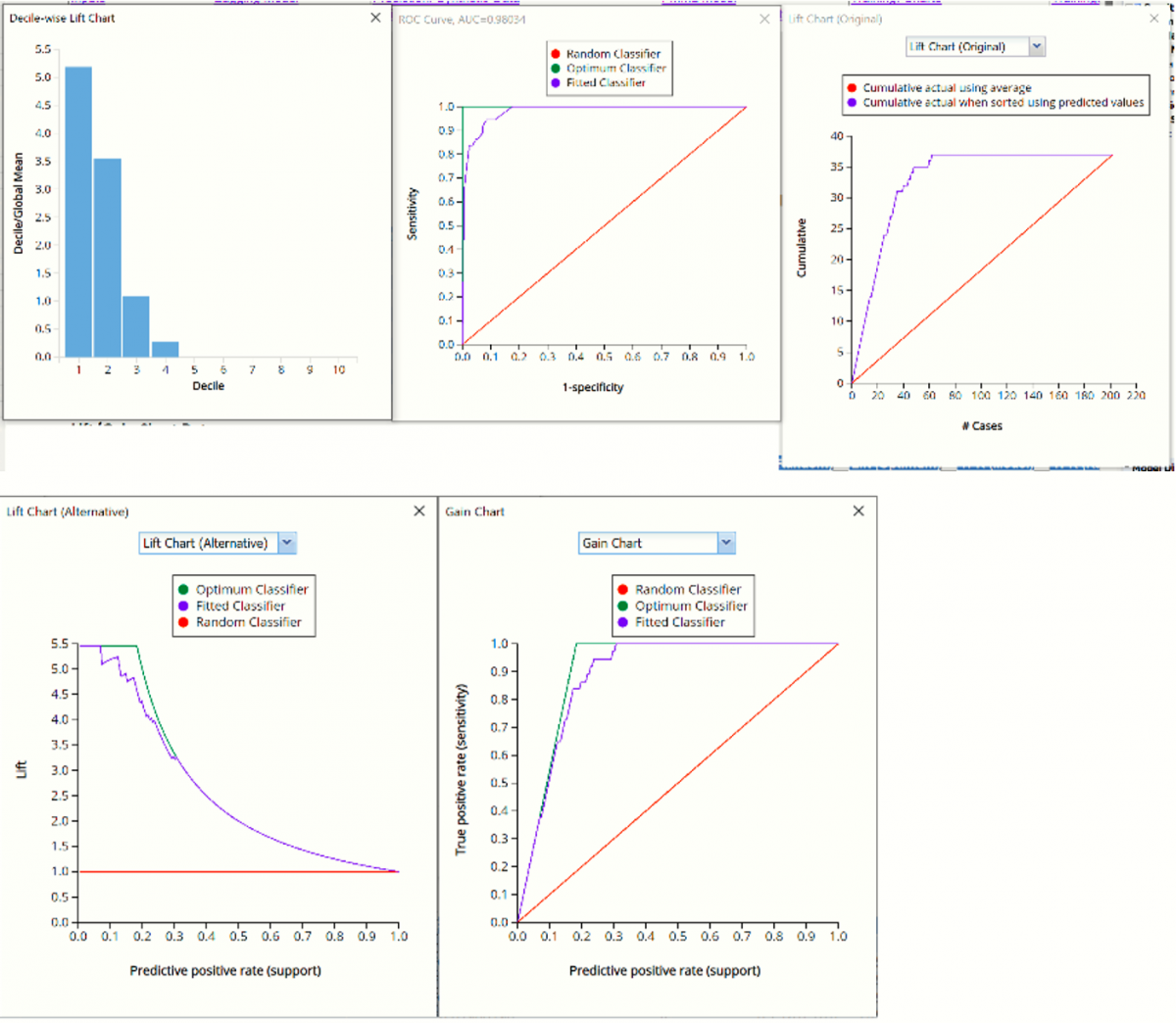
CBagging_TrainingLiftCharts & Bagging_ValidationLiftCharts
Click CBagging_TrainingLiftChart to navigate to the Lift Charts, shown below. For more information on lift charts, ROC curves, and Decile charts, please see the Logistic Regression chapter that appears previously in this guide.
Lift Charts and ROC Curves are visual aids that help users evaluate the performance of their fitted models. Charts found on the CBagging_Training LiftChart tab were calculated using the Training Data Partition. Charts found on the CBagging_ValidationLiftChart tab were calculated using the Validation Data Partition. It is good practice to look at both sets of charts to assess model performance on both datasets.
Note: To view these charts in the Cloud app, click the Charts icon on the Ribbon, select CBagging_TrainingLiftChart or CBagging_ValidationLiftChart for Worksheet and Decile Chart, ROC Chart or Gain Chart for Chart.
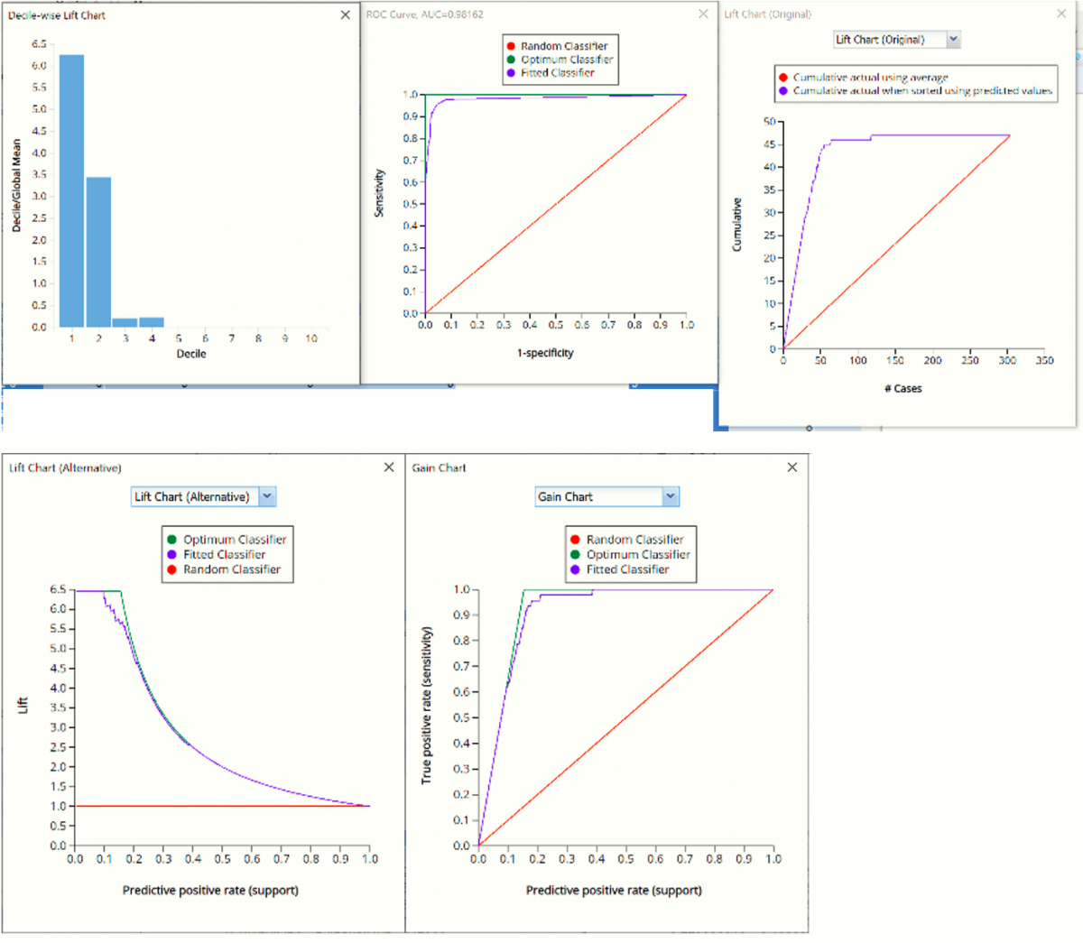
Click the CBagging_ValidationLiftChart to navigate to the charts, shown below.
CBagging_Simulation
As discussed above, Analytic Solver Data Science generates a new output worksheet, CBagging_Simulation, when Simulate Response Prediction is selected on the Simulation tab of the Bagging Classification dialog.
This report contains the synthetic data, the predictions for the training partition (using the fitted model) and the Excel – calculated Expression column, if populated in the dialog. Users can switch between the Predicted, Training, and Expression sources or a combination of two, as long as they are of the same type.
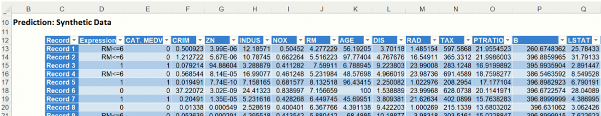
Note the first column in the output, Expression. This column was inserted into the Synthetic Data results because Calculate Expression was selected and an Excel function was entered into the Expression field, on the Simulation tab of the Bagging Classification dialog
IF([@RM]>6, [@CAT. MEDV], “RM<=6”)
The Expression column will contain each record’s predicted score for the CAT. MEDV variable or the string, “RM<=6”.
The remainder of the data in this report is synthetic data, generated using the Generate Data feature described in the chapter with the same name, that appears earlier in this guide.
The chart that is displayed once this tab is selected, contains frequency information pertaining to the predicted values for the output variable in the training partition, the synthetic data and the expression, if it exists.
In the screenshot below, the bars in the darker shade of blue are based on the Prediction, or synthetic, data as generated in the table above for the CAT. MEDV variable. The bars in the lighter shade of blue display the frequency of the predictions for the CAT. MEDV variable in the training partition.
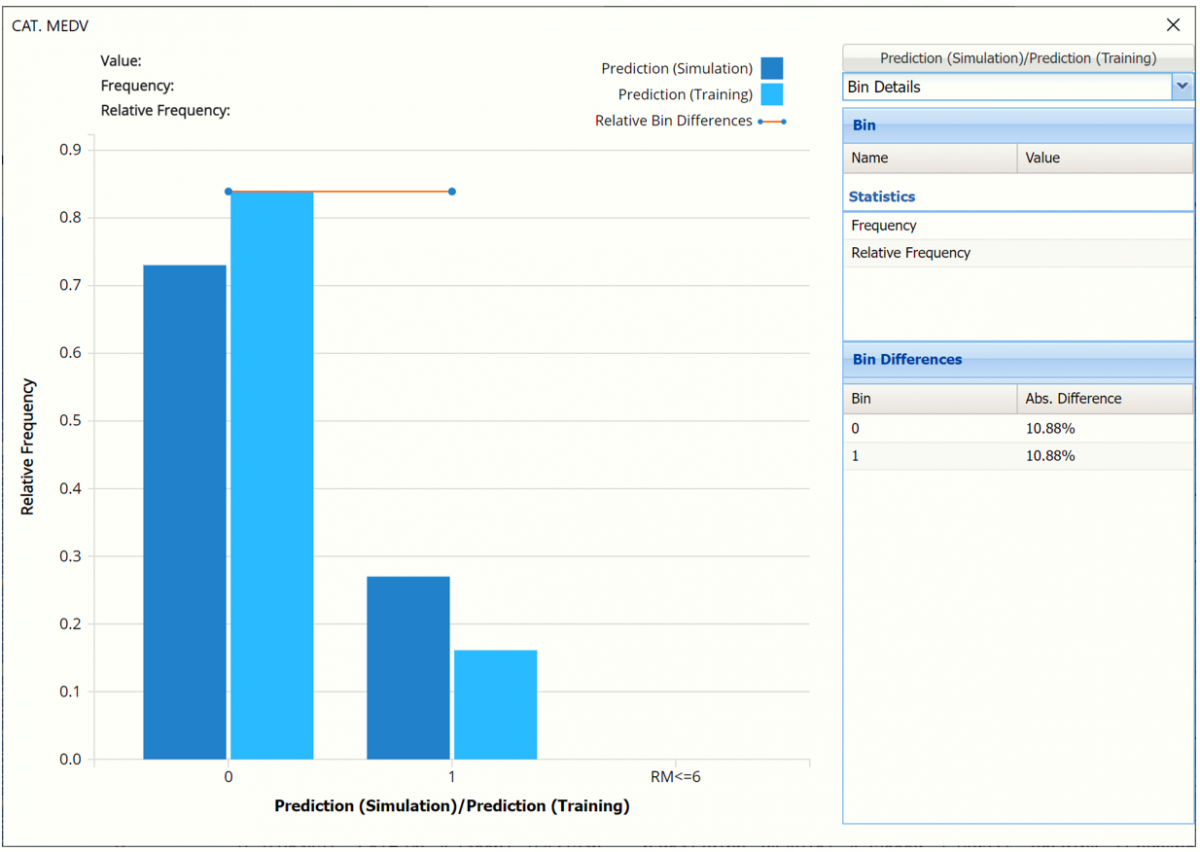
The red Relative Bin Differences curve indicate that the absolute difference for each bin are equal. Click the down arrow next to Frequency and select Bin Details to view.
The chart below displays frequency information from the synthetic data and the predictions for the training partition as evaluated by the expression, IF([@RM]>6, [@CAT. MEDV], “RM<=6”)
For example, the bars in the darker shade of blue display the results of the expression as applied to the synthetic data and the bars in the lighter shade of blue display the results of the expression when applied to the predictions for the training partition.

- In the synthetic data, 32 records with RM > 6 were classified as 0 and 27 records with RM > 6 were classified as 1 (expensive). The remaining records in the synthetic data are shown in the dark blue column on the far left labeled RM <= 6, or 41.
- In the training partition, 151 records with RM > 6 were classified as 0 and 48 records with RM > 6 were classified as 1 (expensive). The remaining records in the training partitiong are shown in the light blue column on the far left labeled RM <= 6, or 105.
- The Relative Bin Differences curve indicates the absolute differences in each bin.
Click the down arrow next to Frequency to change the chart view to Relative Frequency, to change the look by clicking Chart Options or to see details of each bin listed in the chart. Statistics on the right of the chart dialog are discussed earlier in the Logistic Regression chapter. For more information on the generated synthetic data, see the Generate Data chapter that appears earlier in this guide.
Analytic Solver Data Science generates CBagging_Stored along with the other output. Please refer to the “Scoring New Data” chapter in the Analytic Solver Data Science User Guide for details.