Boosting Ensemble Classification Method
Now let’s use the 2nd ensemble method, boosting. We’ll re-use the same dataset, Boston_Housing.xlsx, with the same partitions.
Inputs
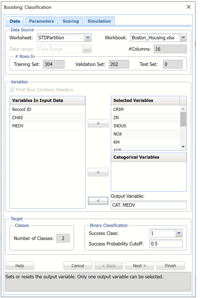
With the STDPartition worksheet selected, click Classify – Ensemble Methods – Boosting to open the Boosting Classification dialog.
Again, select CAT. MEDV as the Output variable. Then select all remaining variables except Record, ID, MEDV and CHAS as Selected Variables.
Keep the default selections for Binary Classification. (For more information on these options, see the Bagging Ensemble Method Example above.)
Boosting Classification dialog, Data tab
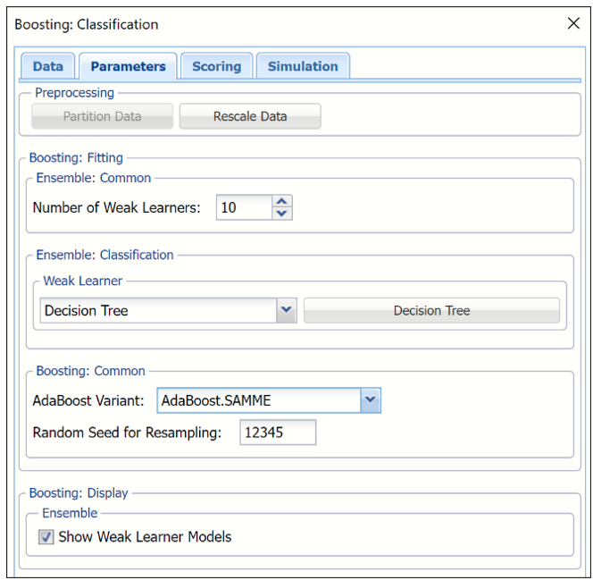
Click Next to advance to the Boosting Classifications Parameters tab.
For more information on the partitioning and rescaling data “on-the-fly” using the Partition Data and Rescale Data buttons, see the Bagging example above.
Leave the Number of weak learners at the default of 10. Recall that this option controls the number of “weak” classification models created.
Under Ensemble: Common, click the down arrow beneath Weak Learner to select one of the six featured classifiers. In this example, we will select Decision Tree.
Under Ensemble: Classification click the down arrow beneath Weak Leaner to select one of the six featured classifiers. For this example, select Decision Tree.
Options pertaining to the Decision Tree learner may be changed by clicking the Decision Tree button to the right of Weak Learner.
Weak Learner: Classification Tree
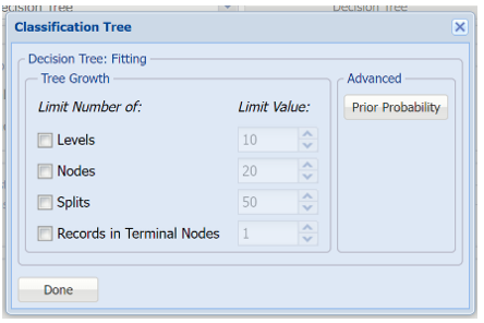
All options will be left at their default values. For more information on these options, see the Classification Tree chapter that occurs earlier in this guide.
Under Boosting: Common, leave AdaBoost.M1(Freund) for AdaBoost Variant. The difference between AdaBoost.M1 (Freund), AdaBoost.M1 (Breiman) and Adaboost.SAMME is the way in which the weights assigned to each observation or record are updated. In AdaBoost.M1 (Freund), the constant is calculated as: αb= ln((1-eb)/eb). (Please refer to the section Ensemble Methods in the Introduction to the chapter for more information.)
Leave Random Seed for Resampling at the default of “12345”. If an integer value appears for Random Seed for Resampling, Analytic Solver Data Science will use this value to specify the seed for random resampling of the training data for each weak learner. Setting the random number seed to a nonzero value (any number of your choice is OK) ensures that the same sequence of random numbers is used each time the dataset is chosen for the classifier.
To display the weak learner models in the output, select Show Weak Learner Models.
Boosting Classification dialog, Parameters tab
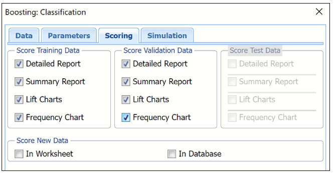
Click Next to advance to the Boosting Classification Scoring tab. Summary Report is selected by default under both Score Training Data and Score Validation Data.
- Select Detailed Report under both Score Training Data and Score Validation Data to produce a detailed assessment of the performance of the tree in both sets.
- Select Lift Charts to include Lift Charts, ROC Curves and Decile charts for both the Training and Validation datasets.
- Select Frequency Chart under Score Training/Validation Data to display a frequency chart on both the CBoosting_TrainingScore and CBoosting_ValidationScore worksheets. This chart will display an interactive application similar to the Analyze Data feature, explained in detail in the Analyze Data chapter that appears earlier in this guide. This chart will include frequency distributions of the actual and predicted responses individually, or side-by-side, depending on the user’s preference, as well as basic and advanced statistics for variables, percentiles, six sigma indices.
- Since we did not create a test partition, the options for Score test data are disabled. See the chapter “Data Science Partitioning” for information on how to create a test partition.
- See the “Scoring New Data” chapter within the Analytic Solver Data Science User Guide for information on the Score new data options.
Boosting Classification dialog, Scoring tab
Click Next to advance to the Simulation tab.
Select Simulation Response Prediction to enable all options on the Simulation tab.
Simulation tab: All supervised algorithms include a new Simulation tab. This tab uses the functionality from the Generate Data feature (described earlier in this guide) to generate synthetic data based on the training partition, and uses the fitted model to produce predictions for the synthetic data. The resulting report, CBoosting_Simulation, will contain the synthetic data, the predicted values and the Excel-calculated Expression column, if present. In addition, frequency charts containing the Predicted, Training, and Expression (if present) sources or a combination of any pair may be viewed, if the charts are of the same type.
Boosting Classification dialog, Simulation tab
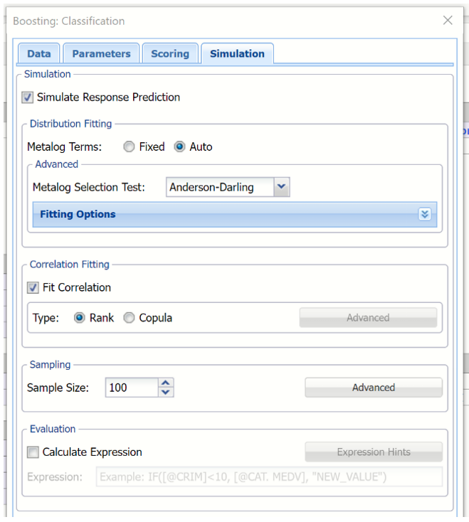
Evaluation: Select Calculate Expression to amend an Expression column onto the frequency chart displayed on the CBoosting_Simulation output tab. Expression can be any valid Excel formula that references a variable and the response as [@COLUMN_NAME]. Click the Expression Hints button for more information on entering an expression.
For the purposes of this example, leave all options at their defaults in the Distribution Fitting, Correlation Fitting and Sampling sections of the dialog. Leave Calculate Expression unchecked. See the example above to see this feature in use.
For more information on the rptions shown on this dialog in the Distribution Fitting, Correlation Fitting and Sampling sections, see the Generate Data chapter that appears earlier in this guide.
Click Finish to run the ensemble method.
Output
- Output from the Ensemble Methods algorithm will be inserted to the right.
CBoosting_Output
This result worksheet includes 4 segments: Output Navigator, Inputs and Boosting Model.
- Output Navigator: The Output Navigator appears at the top of all result worksheets. Use this feature to quickly navigate to all reports included in the output.
CBoosting_Output: Output Navigator

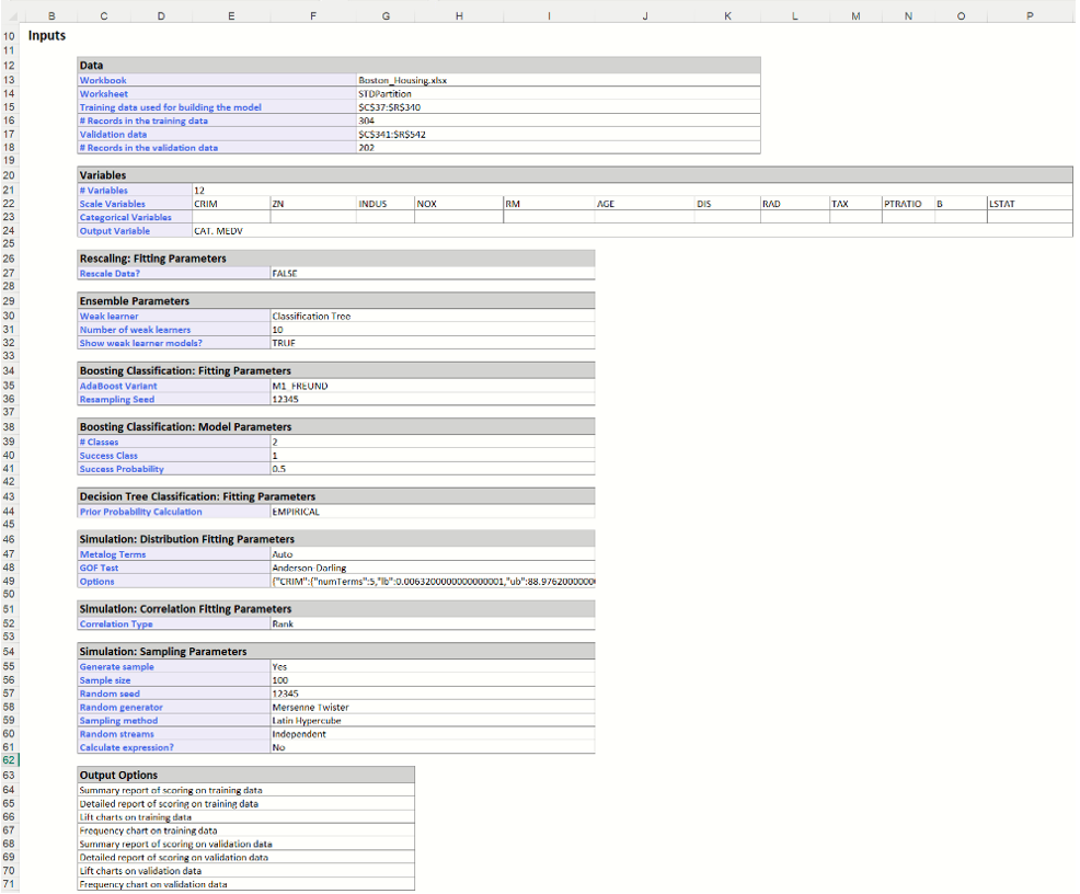
- Inputs: Scroll down to the Inputs section to find all inputs entered or selected on all tabs of the Bagging Classification dialog.
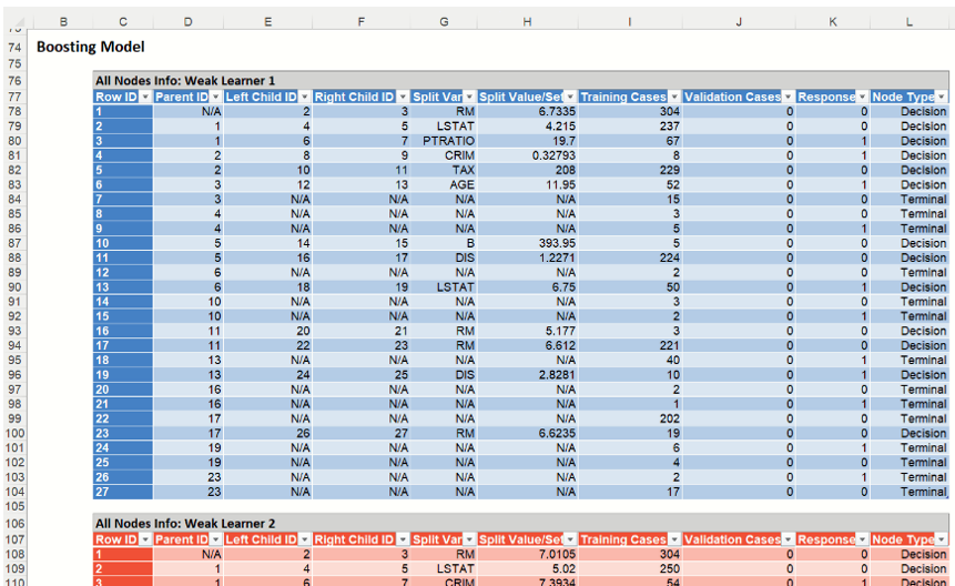
- Boosting Model: The number of Weak Learners in the output is equal to 10 which matches our input on the Parameters tab for the Number of Weak Learners option.
The Importance percentage for each Variable in each Learner is listed in each table. This percentage measures the variable’s contribution in reducing the total misclassification error.
CBoosting_TrainingScore
Click the CBoosting_TrainingScore Scroll down to view the Classification Summary and Classification Details Reports for the Training partition as well as the Frequency charts. For detailed information on each of these components, see the Classification Tree chapter that appears earlier in this guide.
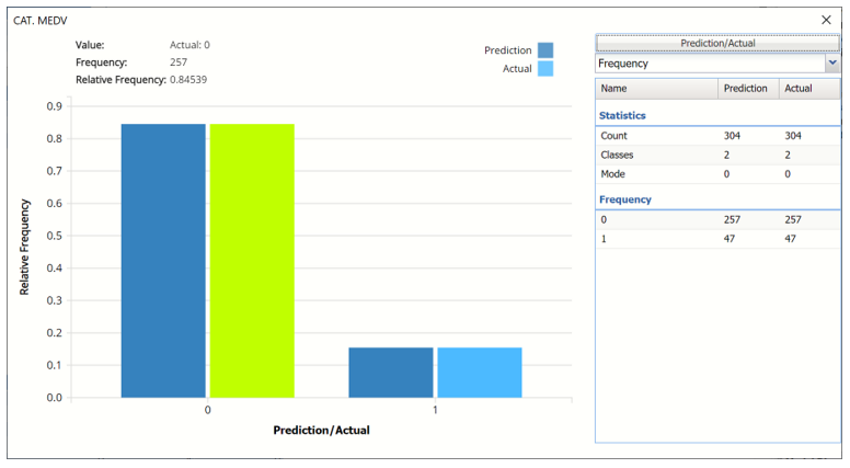
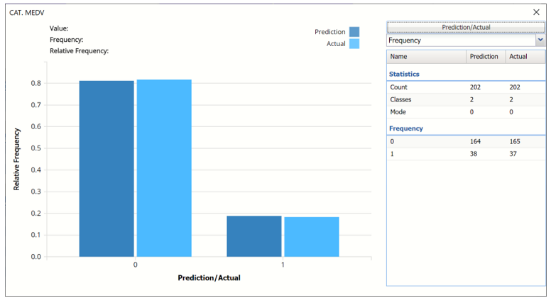
- Frequency Chart: This chart shows the frequency for both the predicted and actual values of the output variable, along with various statistics such as count, number of classes and the mode.
Note: To view this frequency charts in the Cloud app, click the Charts icon on the Ribbon, select CBoosting_TrainingScore for Worksheet and Frequency for Chart.
Frequency Chart for Training Partition
- Classification Summary and Classification Details: In the Classification Summary report, a Confusion Matrix is used to evaluate the performance of the classification method.
Classification Summary and Classification Details Reports
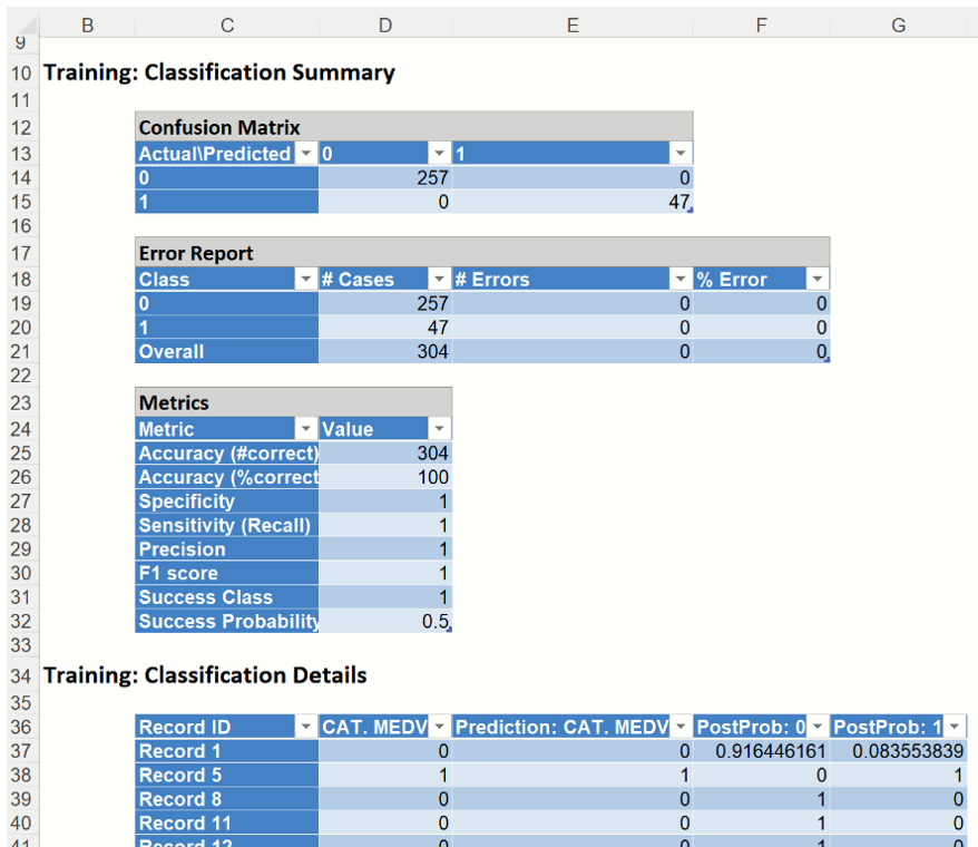
The Classification Summary displays the confusion matrix for the Training Partition.
- True Positive: 47 records belonging to the Success class were correctly assigned to that class.
- False Negative: 0 records belonging to the Success class were incorrectly assigned to the Failure class.
- True Negative: 257 records belonging to the Failure class were correctly assigned to this same class
- False Positive: 0 records belonging to the Failure class were incorrectly assigned to the Success class.
There were no misclassified records. The Boosting model was able to correctly classify each record in the training partition.
Metrics
The following metrics are computed using the values in the confusion matrix.
Accuracy (#Correct and %Correct): 100.00% - Refers to the ability of the classifier to predict a class label correctly.
Specificity: 1.0 - Also called the true negative rate, measures the percentage of failures correctly identified as failures
- Specificity (SPC) or True Negative Rate =TN / (FP + TN)
Recall (or Sensitivity): 1.0 - Measures the percentage of actual positives which are correctly identified as positive (i.e. the proportion of people who experienced catastrophic heart failure who were predicted to have catastrophic heart failure).
- Sensitivity or True Positive Rate (TPR) = TP/(TP + FN)
Precision: 1.0 - The probability of correctly identifying a randomly selected record as one belonging to the Success class
- Precision = TP/(TP+FP)
F-1 Score: 1.0 - Fluctuates between 1 (a perfect classification) and 0, defines a measure that balances precision and recall.
- F1 = 2 * TP / (2 * TP + FP + FN)
Success Class and Success Probability: Selected on the Data tab of the Discriminant Analysis dialog.
Classification Details: This table displays how each observation in the training data was classified. The probability values for success in each record are shown after the predicted class and actual class columns. Records assigned to a class other than what was predicted are highlighted in red.
CBoosting_ValidationScore
Click the CBagging_ValidationScore Scroll down to view the Classification Summary and Classification Details Reports for the Validation partition as well as the Frequency charts. For detailed information on each of these components, see the Classification Tree chapter that appears earlier in this guide.
- Frequency Chart: This chart shows the frequency for both the predicted and actual values of the output variable, along with various statistics such as count, number of classes and the mode.
Frequency Chart for Validation Partition
- Classification Summary and Classification Details: In the Classification Summary report, a Confusion Matrix is used to evaluate the performance of the fitted classification model on the validation partition.
Classification Summary and Classification Details Reports
The Classification Summary displays the confusion matrix for the Training Partition.
- True Positive: 33 records belonging to the Success class were correctly assigned to that class.
- False Negative: 4 records belonging to the Success class were incorrectly assigned to the Failure class.
- True Negative: 160 records belonging to the Failure class were correctly assigned to this same class
- False Positive: 5 records belonging to the Failure class were incorrectly assigned to the Success class.
The total number of misclassified records was 9 (5 + 4) which results in an error equal to 4.46%.
Metrics
The following metrics are computed using the values in the confusion matrix.
Accuracy (#Correct and %Correct): 95.5% - Refers to the ability of the classifier to predict a class label correctly.
Specificity: 0.970 - Also called the true negative rate, measures the percentage of failures correctly identified as failures
- Specificity (SPC) or True Negative Rate =TN / (FP + TN)
Recall (or Sensitivity): 0.892 - Measures the percentage of actual positives which are correctly identified as positive (i.e. the proportion of people who experienced catastrophic heart failure who were predicted to have catastrophic heart failure).
- Sensitivity or True Positive Rate (TPR) = TP/(TP + FN)
Precision: 0.868 - The probability of correctly identifying a randomly selected record as one belonging to the Success class
- Precision = TP/(TP+FP)
F-1 Score: 0.88 - Fluctuates between 1 (a perfect classification) and 0, defines a measure that balances precision and recall.
- F1 = 2 * TP / (2 * TP + FP + FN)
Success Class and Success Probability: Selected on the Data tab of the Discriminant Analysis dialog.
Classification Details: This table displays how each observation in the training data was classified. The probability values for success in each record are shown after the predicted class and actual class columns. Records assigned to a class other than what was predicted are highlighted in red.
CBoosting_TrainingLiftCharts & Boosting_ValidationLiftCharts
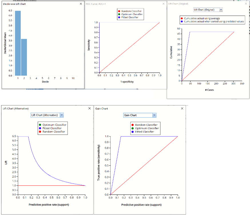
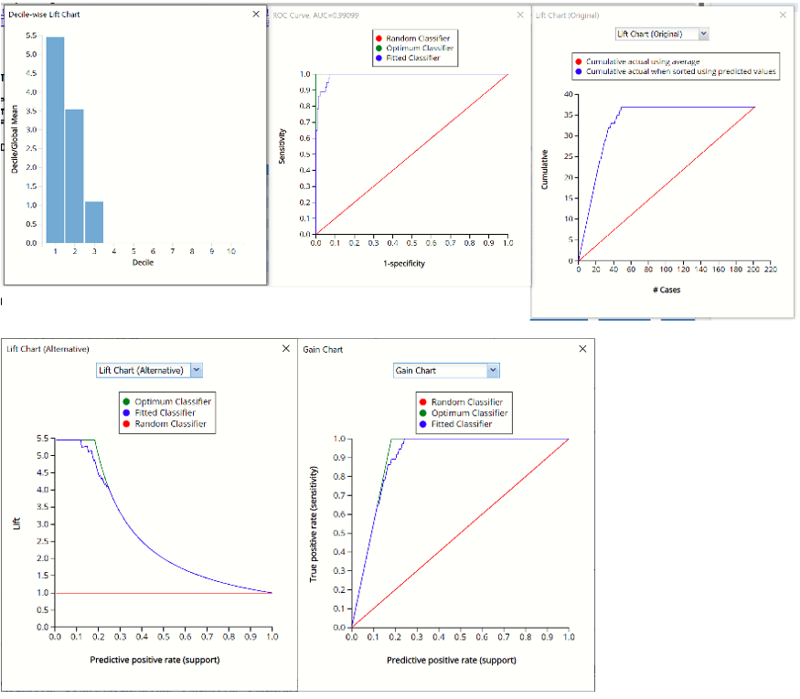
Click the CBoosting_TrainingLiftChart and CBoosting_ValidationLiftChart to navigate to the Lift Charts, shown below. For more information on lift charts, ROC curves, and Decile charts, please see the Classification Tree chapter that appears previously in this guide.
Lift Charts and ROC Curves are visual aids that help users evaluate the performance of their fitted models. Charts found on the CBoosting_TrainingLiftChart tab were calculated using the Training Data Partition. Charts found on the CBoosting_ValidationLiftChart tab were calculated using the Validation Data Partition. It is good practice to look at both sets of charts to assess model performance on both the Training and Validation partitions.
Note: To view these charts in the Cloud app, click the Charts icon on the Ribbon, select CBoosting_TrainingLiftChart or CBoosting_ValidationLiftChart for Worksheet and Decile Chart, ROC Chart or Gain Chart for Chart.
Boosting Training Partition Decile-wise, ROC, Lift and Gain Charts
Boosting Validation Partition Decile-wise, ROC, Lift and Gain Charts
CBoosting_Simulation
As discussed above, Analytic Solver Data Science generates a new output worksheet, CBoosting_Simulation, when Simulate Response Prediction is selected on the Simulation tab of the Boosting Classification dialog.
This report contains the synthetic data, the predictions for the training partition (using the fitted model) and the Excel – calculated Expression column, if populated in the dialog. Users can switch between the Predicted, Training, and Expression sources or a combination of two, as long as they are of the same type.
Synthetic Data
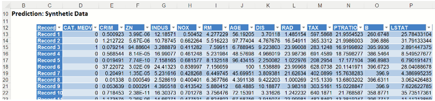
This data in this report is synthetic data, generated using the Generate Data feature described in the chapter with the same name, that appears earlier in this guide.
The chart that is displayed once this tab is selected, contains frequency information pertaining to the predictions for the output variable in the training partition, the synthetic data and the expression, if it exists.
In the screenshot below, the bars in the darker shade of blue are based on the Prediction, or synthetic, data as generated in the table above for the CAT. MEDV variable. The bars in the lighter shade of blue display the frequency of the predictions for the CAT. MEDV variable in the training partition.
Frequency Chart for CBoosting_Simulation output
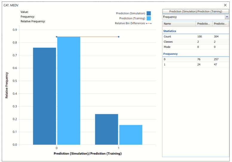
Click the down arrow next to Frequency to change the chart view to Relative Frequency, to change the look by clicking Chart Options or to see details of each bin listed in the chart. Statistics on the right of the chart dialog are discussed earlier in the Classification Tree chapter. For more information on the generated synthetic data, see the Generate Data chapter that appears earlier in this guide.