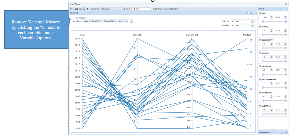
The example below illustrates the use of Analytic Solver Data Science’s chart wizard in drawing a Parallel Coordinates Plot using the dataset.
A parallel coordinates plot allows the exploration of high dimensional datasets, or datasets with a large number of features (variables). This type of graph starts with a set of vertically drawn parallel lines, equally spaced, which corresponds to the features included in the graph. Observations for each feature are recorded as dots on the vertical line. Observations that are contained within the same record are connected by a line.
Click Help – Example Models on the Data Science ribbon to open the example dataset, SportsTVRatings.xlsx under Forecasting/Data Science Example Models. Select a cell within the dataset, say A2, then click Explore – Chart Wizard on the Data Science ribbon. Select Parallel Coordinates.
Remove all variables from the chart except Indy500 and Daytona 500.
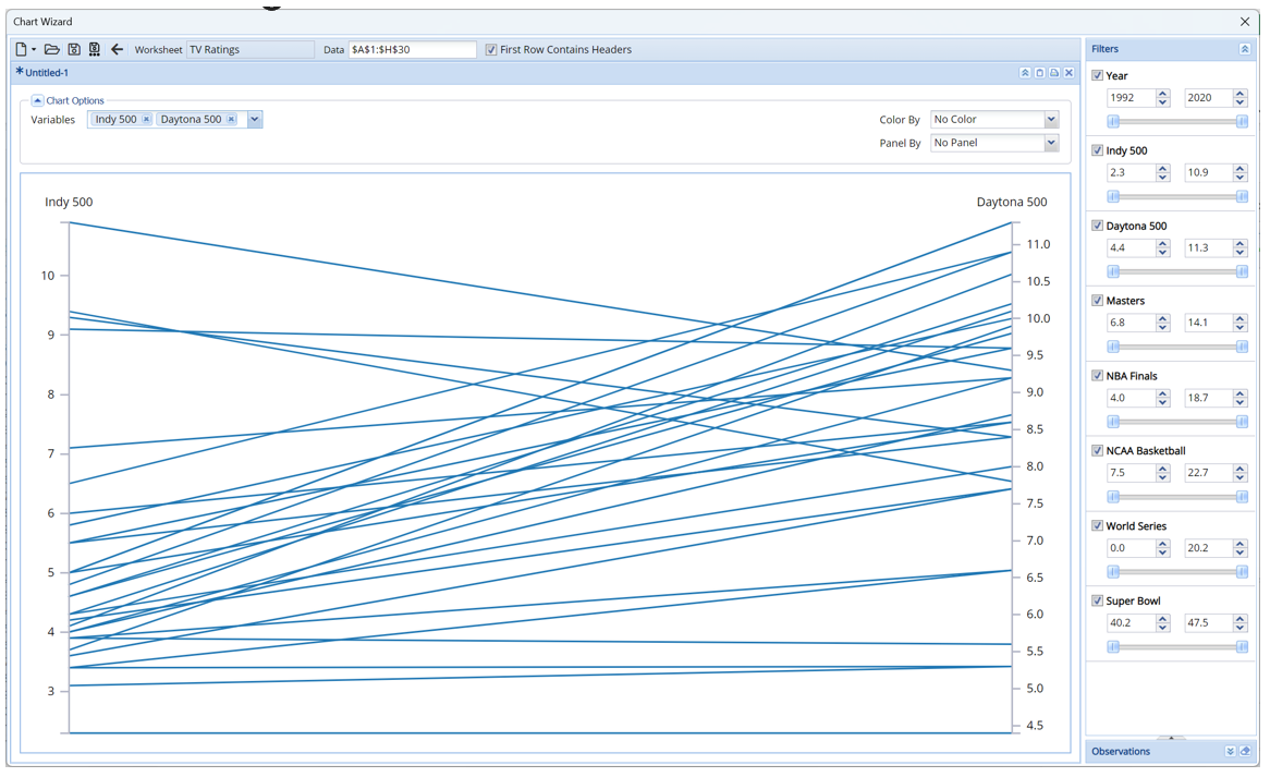
The first thing that we notice is the range of each of the races that are indicated at the top and bottom of each vertical line. The range of ratings for the Indy 500 has a high of 10.9 and a low of 2.3 whereas the range for the Daytona 500 is 11.3 to 4.4. As a result, this chart already conveys that the viewership for the Daytona 500 is larger than the viewship for the Indy 500.
When looking at the observations for each feature, this chart shows that in most years, the viewship of the Indy 500 was low whereas the viewship for the Daytona 500 was high. There are just four years wheree high ratings for the Indy 500 was recorded. In these same years, the ratings for the Daytona 500 was correspondingly lower.