The example below illustrates the use of Analytic Solver Data Science’s chart wizard in drawing a Variable plot using the Universal Bank Main.xlsx dataset. Click Help – Example Models on the Data Science ribbon to open the example dataset, Universal Bank Main.xlsx. Select a cell within the dataset, say A2, and then click Explore – Chart Wizard on the Data Science ribbon. Select Variable Chart.

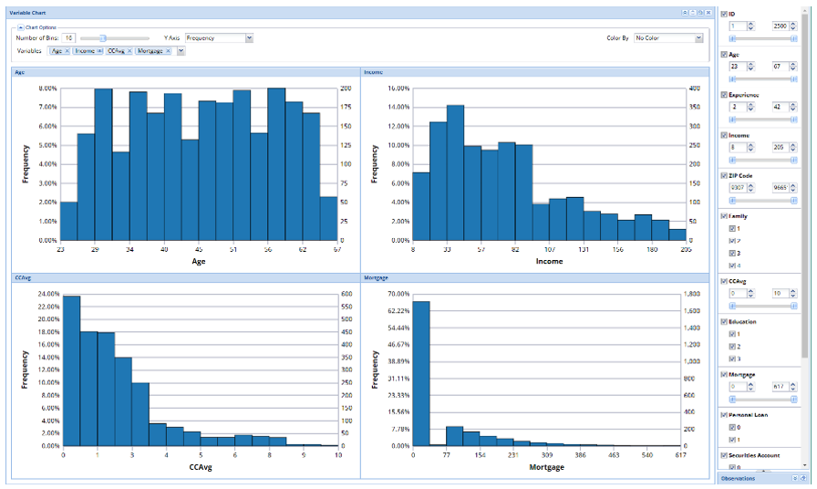
The first four continous varaibles in the dataset are included in the chart by default. (Note: Only continuous variables may be included in the Variable chart.)
The distributions of each variable are shown in separate histograms. To remove a variable from the matrix, click the “x” next to each included variable at the top of the chart. To add a variable to the matrix, click the down arrow next to Variables and select the desired variable under from the menu.
Remove Frequency and ID variables from the chart, leaving Age and Income. Then add the CCAvg and Mortgage variables to the chart. From looking at these charts, a user could immediately distinguish the range of values for each continuous variable included in the chart.