Charts and Graphs for Presentations
Often, you may be called up to present your results to others. With Risk Solver, one great way to do this is in Excel itself, live! But you can quickly create high-quality charts and graphs of your results, print them, or copy and paste them into PowerPoint or any Windows application. You can control chart color, dimensionality and transparency, bin density, titles and legends, axis labels and number formats, horizontal axis scaling, and more.
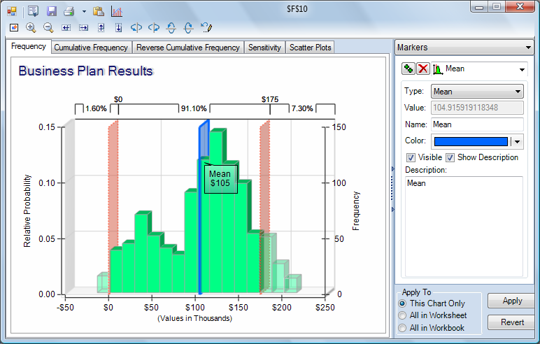
Just as Risk Solver charts update instantly when you change numbers on the spreadsheet, they also update instantly when you change colors, titles, gridlines, legends and other options. Once you have the chart formatted just the way you want, you can use the toolbar buttons in the title bar of the dialog to "export" the chart.
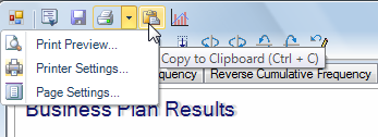
Click the Clipboard icon to copy the currently displayed chart to the Windows Clipboard. You can then choose Edit Paste in Word, Excel, PowerPoint and many other applications to paste the chart image into your document. Click the Print icon to immediately print the currently displayed chart on your default printer, or click the down arrow next to this icon to display the menu choices shown above. You can choose a printer and set printer options, set page margins, and preview your output using these menu choices.
< Back to: Monte Carlo Simulation Tutorial StartNext: Viewing a Summary of the Model >