Viewing the Full Range of Profit Outcomes
We've turned our spreadsheet model into a risk analysis model, and we've turned on Interactive Simulation. One immediate insight is that the mean or true average Net Profit, over 1,000 different simulated outcomes, is much less than we expected from our naïve “Flawed Average” model. We’ve also seen that in some outcomes, our Net Profit is actually a loss.
A quick look at the dropdown galleries for Statistic, Risk Measure and Range on the Risk Solver Ribbon suggests that we can easily compute and view many other statistics about Net Profit. But we’d really like to see the full range of outcomes in this model. This is very easy to do in Risk Solver. With Interactive Simulation turned on, simply move the mouse pointer to F10 and wait about 1 second. A miniature, live frequency distribution chart of the simulation trial values for cell F10 appears automatically:
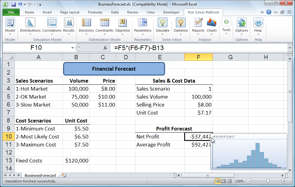
To see and do more, just double-click on F10, the cell calculating Net Profit, to display Risk Solver's Uncertain Function dialog, with a customizable frequency chart of these outcomes, shown below as a bar graph :
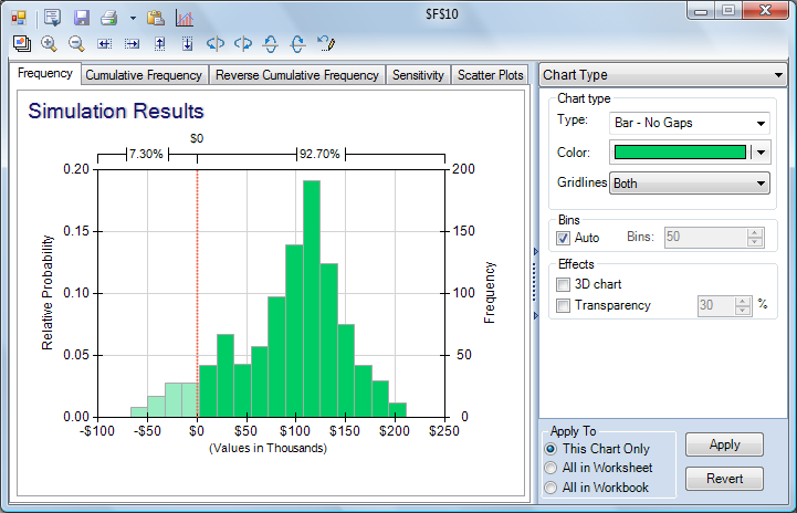
From this graph, we immediately see that in some cases we can lose alot of money -- more than $50,000! But we also see that we make a profit most of the time. The vertical red line at $0 (which we can click and drag to different positions on the chart) allows us to immediately determine the percentage of outcomes in our simulation that fell below and above the chosen value. So at the top of the chart, we see that 7.3% of the trials produced net profit values less than $0 while 92.7% of the trials resulted in positive net profits.
< Back to: Monte Carlo Simulation Tutorial Start Next: Statistics and Percentiles >