This example illustrates how to use the Discriminant Analysis classification algorithm using the Heart_failure_clinical_records.xlsx example dataset. Click Help – Example Models -- Forecasting/Data Science Examples. See the next example for a description of how to use the Quadratic Discriminant analysis algorithm.
A portion of the dataset is shown in the screenshot below. This dataset contains 13 characteristics pertaining to patients in a heart clinic. Each variable is listed below followed by a short description.
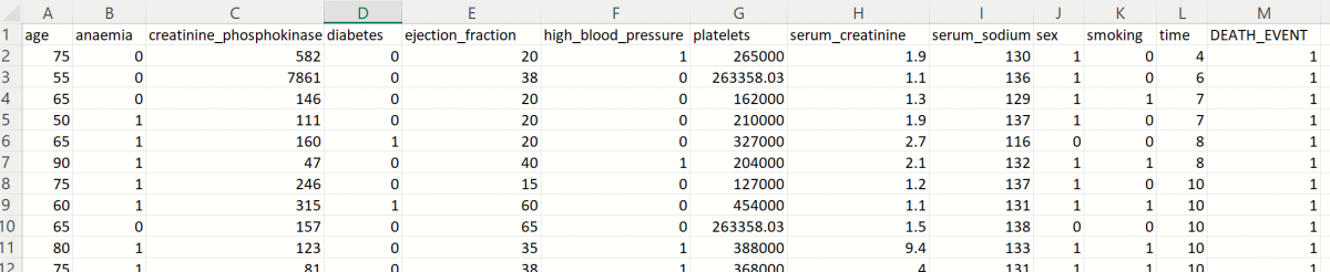
| Variable | Description |
|---|---|
| age | Age of patient |
| anaemia | Decrease of red blood cells or hemoglobin (boolean) |
| creatinine_phosphokinase | Level of the CPK enzyme in the blood (mcg/L) |
| diabetes | If the patient has diabetes (boolean) |
| ejection_fraction | Percentage of blood leaving the heart at each contraction (percentage) |
| high_blood_pressure | If the patient has hypertension (boolean) |
| platelets |
Platelets in the blood (kiloplatelets/mL) |
| serum_creatinine | Level of serum creatinine in the blood (mg/dL) |
| serum_sodium | Level of serum sodium in the blood (mEq/L) |
| sex | Female (0) or Male (1) |
| smoking | If the patient smokes or not (boolean) |
| time | Follow-up period (days) |
| DEATH_EVENT | If the patient was deceased during the follow-up period (boolean) |
V2023 New Simulation Feature: All supervised algorithms in V2023 include a new Simulation tab. This tab uses the functionality from the Generate Data feature (described in the What’s New section of the Analytic Solver Data Science User Guide) to generate synthetic data based on the training partition, and uses the fitted model to produce predictions for the synthetic data. The resulting report, DA_Simulation, will contain the synthetic data, the predicted values and the Excel-calculated Expression column, if present. In addition, frequency charts containing the Predicted, Training, and Expression (if present) sources or a combination of any pair may be viewed, if the charts are of the same type (scale or categorical). Since this new functionality does not support categorical variables, these types of variables will not be included in the model, only continuous variables.
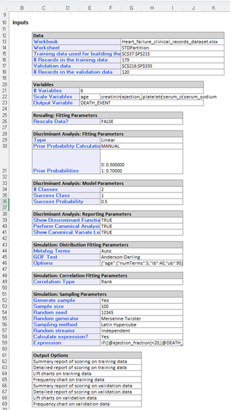
Inputs
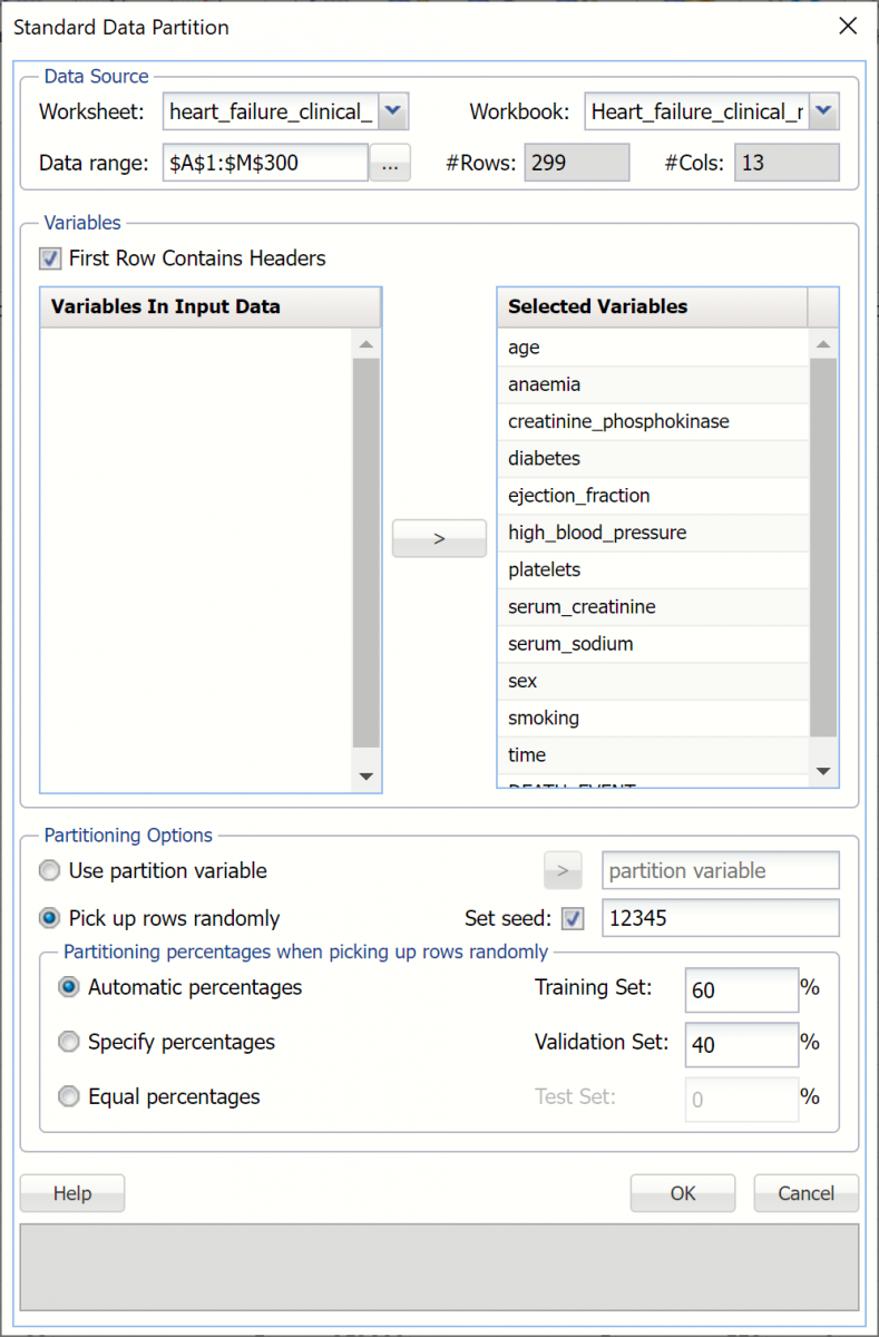
- First, we’ll need to perform a standard partition, as explained in the previous chapter, using percentages of 60% training and 40% validation. STDPartition will be inserted to the right of the Data worksheet. (For more information on how to partition a dataset, please see the previous Data Science Partitioning chapter.)
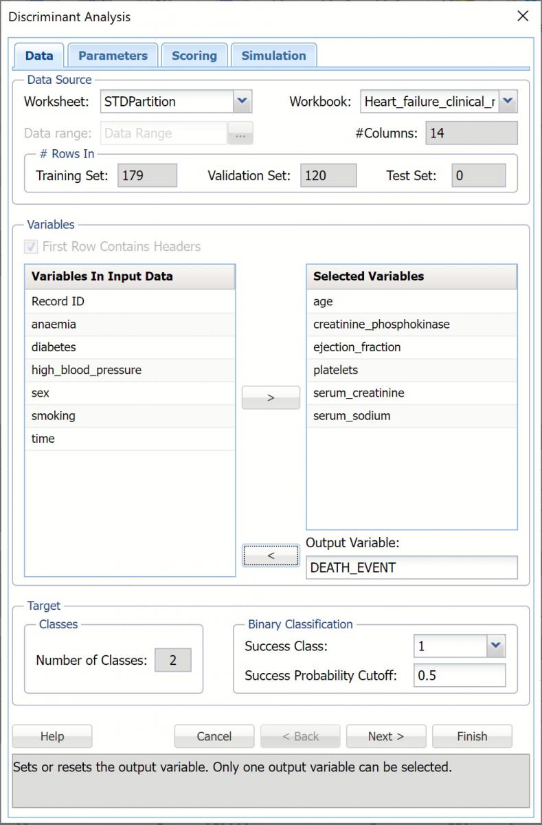
2. With the STDPartition worksheet displayed, click Classify – Discriminant Analysis to open the Discriminant Analysis – Data dialog. Select the DEATH_EVENT variable in the Variables in Input Data list box then click > to select as the Output Variable. Immediately, the options for Classes in the Output Variable are enabled. #Classes is prefilled as “2” since the output variable contains two classes, 0 and 1.
Success Class is selected by default and Class 1 is to be considered a “success” or the significant class in the Lift Chart. (Note: This option is enabled when the number of classes in the output variable is equal to 2.)
3. Enter a value between 0 and 1 for Success Probability Cutoff. If the calculated probability for success for an observation is greater than or equal to this value, than a “success” (or a 1) will be predicted for that observation. If the calculated probability for success for an observation is less than this value, then a “non-success” (or a 0) will be predicted for that observation. The default value is 0.5. (Note: This option is only enabled when the # of classes is equal to )
4. Select the following continuous variables (age, creatinine_phosphokinase, ejection_fraction, platelets, serum_creatinine and serum_sodium) in the Variables in Input Data list box, then click > to move to the Selected Variables list box.
Recall that categorical variables are not supported. Anaemia, diabetes, high_blood_pressure, sex, smoking and death_event are all categorical variables that will not be included in the example.
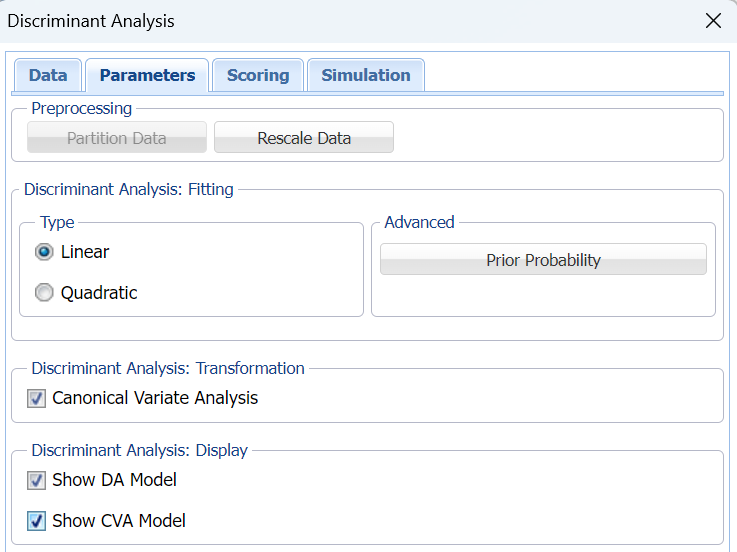
5. Click Next to advance to the Parameters dialog.
6. If you haven't already partitioned your dataset, you can do so from within the Discriminant Analysis method by selecting Partition Data on the Parameters tab. If this option is selected, Analytic Solver Data Science will partition your dataset (according to the partition options you set) immediately before running the prediction method. Note that a worksheet containing the partitioning results will not be inserted into the workbook. If partitioning has already occurred on the dataset, this option will be disabled. For more information on partitioning, please see the Data Science Partitioning chapter.
7. Click Rescale Data, to open the Rescaling Dialog. Rescaling is used to normalize one or more features in your data during the data preprocessing stage. Analytic Solver Data Science provides the following methods for feature scaling: Standardization, Normalization, Adjusted Normalization and Unit Norm. See the important note related to Rescale Data and the new Simulation dialog in the Options section (below) in this chapter.
For more information on rescaling, see the Rescale Continuous Data section within the Transform Continuous Data chapter, that occurs earlier in this guide.

Click Done to close this dialog without rescaling the data.
8. Click Prior Probability. Three options appear in the Prior Probability Dialog: Empirical, Uniform and Manual.
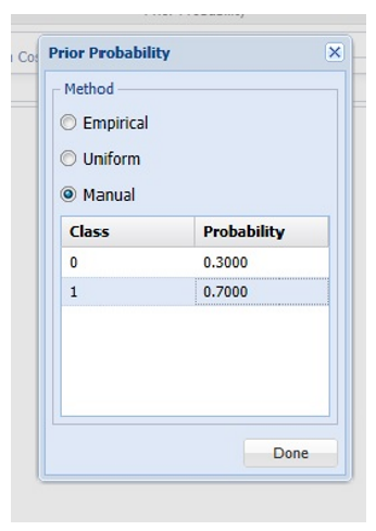
If the first option is selected, Empirical, Analytic Solver Data Science will assume that the probability of encountering a particular class in the dataset is the same as the frequency with which it occurs in the training data.
If the second option is selected, Uniform, Analytic Solver Data Science will assume that all classes occur with equal probability.
Select the third option, Manual, to manually enter the desired class and probability values of .3 for Class 0 and .7 for Class 1, as shown in the screenshot above.
Click Done to close the dialog.
9. Keep the default setting for Type under Discriminant Analysis: Fitting, to use linear discriminant analysis. See the options descriptions below for more information on linear vs quadratic Discriminant Analysis.
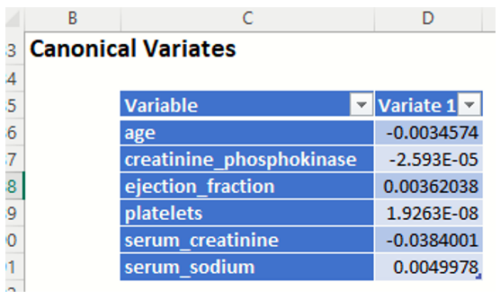
10. Select Canonical Variate Analysis. When this option is selected, Analytic Solver Data Science produces the canonical variates for the data based on an orthogonal representation of the original variates. This has the effect of choosing a representation which maximizes the distance between the different groups. For a k class problem there are k-1 Canonical variates. Typically, only a subset of the canonical variates is sufficient to discriminate between the classes. For this example, we have two canonical variates which means that if we replace the four original predictors by just two predictors, X1 and X2, (which are actually linear combinations of the four original predictors) the discrimination based on these two predictors will perform just as well as the discrimination based on the original predictors.
11. When Canonical Variate Analysis is selected, Show CVA Model is enabled. Select this option to produce the Canonical Variates in the output.
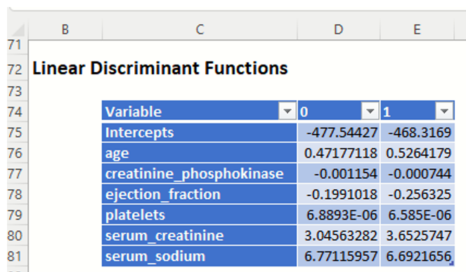
12. Select Show DA Model to print the Linear Discriminant Functions in the output.
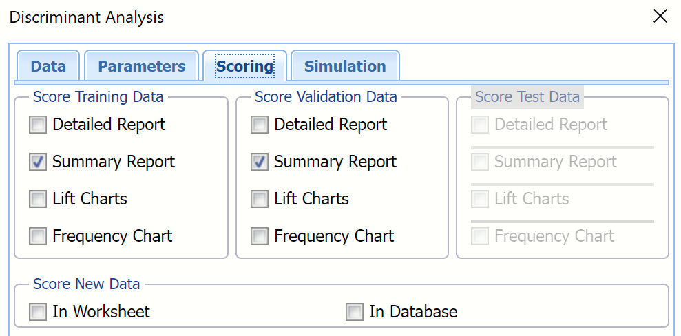
13. Click Next to advance to the Scoring dialog.
14. Select all four options for Score Training/Validation data.
When Detailed report is selected, Analytic Solver Data Science will create a detailed report of the Discriminant Analysis output.
When Summary report is selected, Analytic Solver Data Science will create a report summarizing the Discriminant Analysis output.
When Lift Charts is selected, Analytic Solver Data Science will include Lift Chart and ROC Curve plots in the output.
New in V2023: When Frequency Chart is selected, a frequency chart will be displayed when the DA_TrainingScore and DA_ValidationScore worksheets are selected. This chart will display an interactive application similar to the Analyze Data feature, explained in detail in the Analyze Data chapter that appears earlier in this guide. This chart will include frequency distributions of the actual and predicted responses individually, or side-by-side, depending on the user’s preference, as well as basic and advanced statistics for variables, percentiles, six sigma indices.
Since we did not create a test partition, the options for Score test data are disabled. See the chapter “Data Science Partitioning” for information on how to create a test partition.
See the Scoring New Data chapter within the Analytic Solver Data Science User Guide for more information on Score New Data in options.
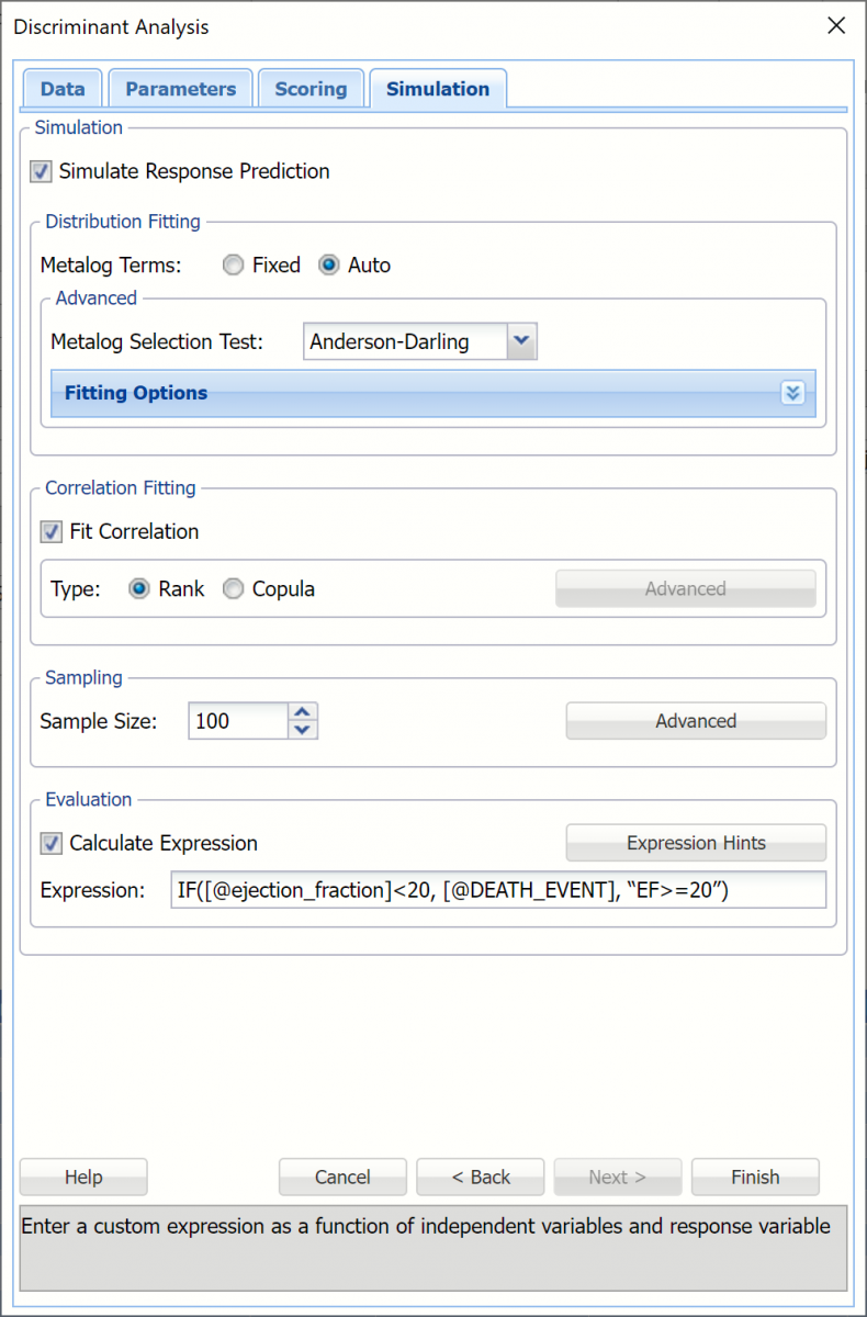
15. Click Next to advance to the Simulation dialog.
16. Select Simulation Response Prediction to enable all options on the Simulation tab of the Discriminant Analysis dialog.
Simulation tab: All supervised algorithms in V2023 include a new Simulation tab. This tab uses the functionality from the Generate Data feature (described earlier in this guide) to generate synthetic data based on the training partition, and uses the fitted model to produce predictions for the synthetic data. The resulting report, DA_Simulation, will contain the synthetic data, the predicted values and the Excel-calculated Expression column, if present. In addition, frequency charts containing the Predicted, Training, and Expression (if present) sources or a combination of any pair may be viewed, if the charts are of the same type (scale or categorical).
Evaluation: Select Calculate Expression to amend an Expression column onto the frequency chart displayed on the DA_Simulation output tab. Expression can be any valid Excel formula that references a variable and the response as [@COLUMN_NAME]. Click the Expression Hints button for more information on entering an expression.
For the purposes of this example, leave all options at their defaults in the Distribution Fitting, Correlation Fitting and Sampling sections of the dialog. For Expression, enter the following formula to display if the patient suffered catastrophic heart failure (@DEATH_EVENT) when his/her Ejection_Fraction was less than or equal to 20.
IF([@ejection_fraction]<20, [@DEATH_EVENT], “EF>=20”)
Note that variable names are case sensitive.
For more information on the remaining options shown on this dialog in the Distribution Fitting, Correlation Fitting and Sampling sections, see the Generate Data chapter that appears earlier in this guide.
17. Click Finish to run Discriminant Analysis on the example dataset.
Output Worksheets
Output sheets containing the Discriminant Analysis results will be inserted into your active workbook to the right of the STDPartition worksheet.
DA_Output
This result worksheet includes 4 segments: Output Navigator, Inputs, Linear Discriminate Functions and Canonical Variates.
Output Navigator: The Output Navigator appears at the top of all result worksheets. Use this feature to quickly navigate to all reports included in the output.
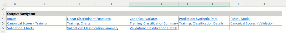
Inputs: Scroll down to the Inputs section to find all inputs entered or selected on all tabs of the Discriminant Analysis dialog.
Linear Discriminant Functions: In this example, there are 2 functions -- one for each class. Each variable is assigned to the class that contains the higher value.
Canonical Variates: These functions give a representation of the data that maximizes the separation between the classes. The number of functions is one less than the number of classes (so in this case there is just one function). If we were to plot the cases in this example on a line where xi is the ith case's value for variate1, you would see a clear separation of the data. This output is useful in illustrating the inner workings of the discriminant analysis procedure, but is not typically needed by the end-user analyst.
DA_TrainingScore
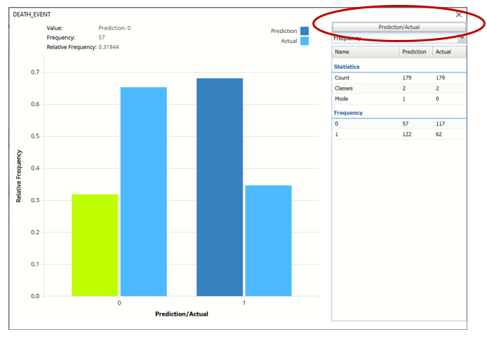
Click the DA_TrainingScore tab to view the newly added Output Variable frequency chart, the Training: Classification Summary and the Training: Classification Details report. All calculations, charts and predictions on this worksheet apply to the Training data.
Note: To view charts in the Cloud app, click the Charts icon on the Ribbon, select a worksheet under Worksheet and a chart under Chart.
Frequency Charts: The output variable frequency chart opens automatically once the DA_TrainingScore worksheet is selected. To close this chart, click the “x” in the upper right hand corner of the chart. To reopen, click onto another tab and then click back to the DA_TrainingScore tab.
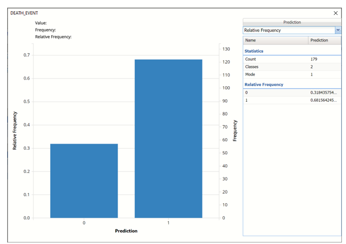
Frequency: This chart shows the frequency for both the predicted and actual values of the output variable, along with various statistics such as count, number of classes and the mode.
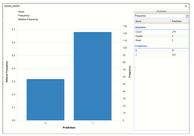
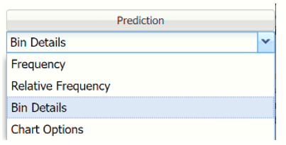
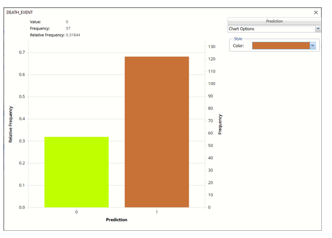
Click the down arrow next to Frequency to switch to Relative Frequency, Bin Details or Chart Options view.
Relative Frequency: Displays the relative frequency chart.
Bin Details: Displays pertinent information pertaining to each bin in the chart.
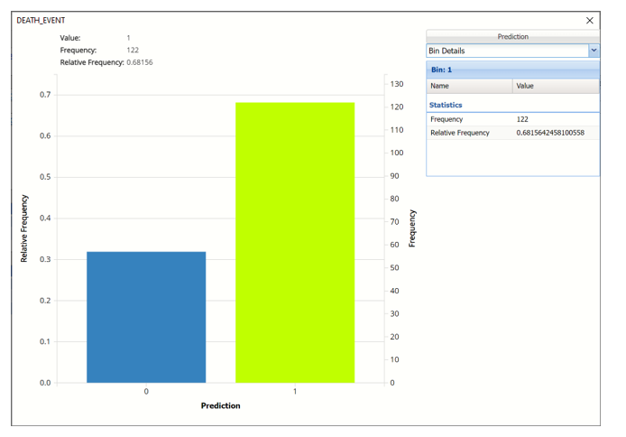
Chart Options: Use this view to change the color of the bars in the chart.
To see both the actual and predicted frequency, click Prediction and select Actual. This change will be reflected on all charts.
Classification Summary: In the Classification Summary report, a Confusion Matrix is used to evaluate the performance of the classification method.
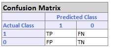
- TP stands for True Positive. These are the number of cases classified as belonging to the Success class that actually were members of the Success class.
- FN stands for False Negative. These are the number of cases that were classified as belonging to the Failure class when they were actually members of the Success class
- FP stands for False Positive. These cases were assigned to the Success class but were actually members of the Failure group
- TN stands for True Negative. These cases were correctly assigned to the Failure group.
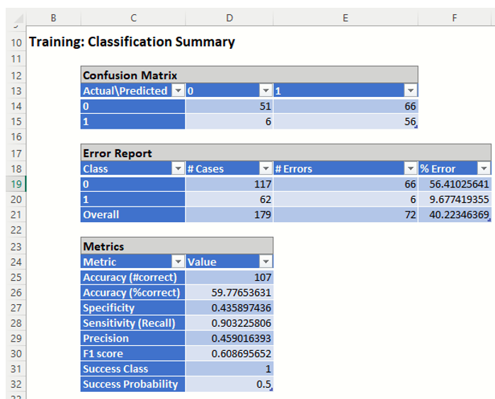
- True Positive: 56 records belonging to the Success class were correctly assigned to that class
- False Negative: 6 records belonging to the Success class were incorrectly assigned to the Failure class.
- True Negative: 51 records belonging to the Failure class were correctly assigned to this same class
- False Positive: 66 records belonging to the Failure class were incorrectly assigned to the Success class.
The total number of misclassified records was 72 (66 + 6) which results in an error equal to 40.22%.
Metrics
The following metrics are computed using the values in the confusion matrix.
Accuracy (#Correct and %Correct): 59.78% - Refers to the ability of the classifier to predict a class label correctly.
Specificity: 0.44 - Also called the true negative rate, measures the percentage of failures correctly identified as failures
Specificity (SPC) or True Negative Rate =TN / (FP + TN)
Recall (or Sensitivity): 0.90 - Measures the percentage of actual positives which are correctly identified as positive (i.e. the proportion of people who experienced catastrophic heart failure who were predicted to have catastrophic heart failure).
- Sensitivity or True Positive Rate (TPR) = TP/(TP + FN)
Precision: 0.46 - The probability of correctly identifying a randomly selected record as one belonging to the Success class
- Precision = TP/(TP+FP)
F-1 Score: 0.61 - Fluctuates between 1 (a perfect classification) and 0, defines a measure that balances precision and recall.
- F1 = 2 * TP / (2 * TP + FP + FN)
Success Class and Success Probability: Selected on the Data tab of the Discriminant Analysis dialog.
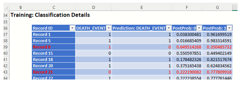
Classification Details: This table displays how each observation in the training data was classified. The probability values for success in each record are shown after the predicted class and actual class columns. Records assigned to a class other than what was predicted are highlighted in red.
DA_ValidationScore
Click the DA_ValidationScore tab to view the newly added Output Variable frequency chart, the Validation: Classification Summary and the Validation: Classification Details report. All calculations, charts and predictions on this worksheet apply to the Validation data.
Frequency Charts: The output variable frequency chart opens automatically once the DA_ValidationScore worksheet is selected. To close this chart, click the “x” in the upper right hand corner. To reopen, click onto another tab and then click back to the DA_ValidationScore tab.
Click the Frequency chart to display the frequency for both the predicted and actual values of the output variable, along with various statistics such as count, number of classes and the mode. Selective Relative Frequency from the drop down menu, on the right, to see the relative frequencies of the output variable for both actual and predicted. See above for more information on this chart.
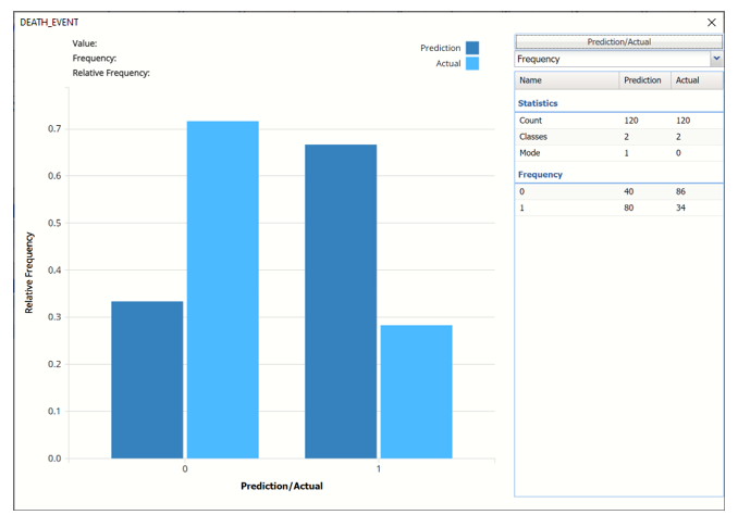
Classification Summary: This report contains the confusion matrix for the validation data set.
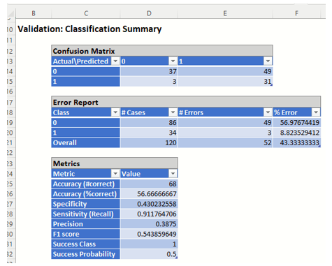
- True Positive: 31 records belonging to the Success class were correctly assigned to that class
- False Negative: 3 records belonging to the Success class were incorrectly assigned to the Failure class.
- True Negative: 37 records belonging to the Failure class were correctly assigned to this same class
- False Positive: 49 records belonging to the Failure class were incorrectly assigned to the Success class.
The total number of misclassified records was 52 (49 + 3) which results in an error equal to 43.33%.
Metrics
The following metrics are computed using the values in the confusion matrix.
Accuracy (#Correct and %Correct): 56.67% - Refers to the ability of the classifier to predict a class label correctly.
Specificity: 0.430 - Also called the true negative rate, measures the percentage of failures correctly identified as failures
- Specificity (SPC) or True Negative Rate =TN / (FP + TN)
Recall (or Sensitivity): 0.912 - Measures the percentage of actual positives which are correctly identified as positive (i.e. the proportion of people who experienced catastrophic heart failure who were predicted to have catastrophic heart failure).
- Sensitivity or True Positive Rate (TPR) = TP/(TP + FN)
Precision: 0.388 - The probability of correctly identifying a randomly selected record as one belonging to the Success class
- Precision = TP/(TP+FP)
F-1 Score: 0.544 - Fluctuates between 1 (a perfect classification) and 0, defines a measure that balances precision and recall.
- F1 = 2 * TP / (2 * TP + FP + FN)
Success Class and Success Probability: Selected on the Data tab of the Discriminant Analysis dialog.
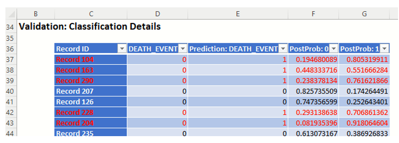
Classification Details: This table displays how each observation in the validation data was classified. The probability values for success in each record are shown after the predicted class and actual class columns. Records assigned to a class other than what was predicted are highlighted in red.
DA_TrainingLiftChart and DA_ValidationLiftChart
Click DA_TrainingLiftChart and DA_ValidationLiftChart tabs to navigate to the Training and Validation Data Lift, Decile, ROC Curve and Cumulative Gain Charts.
Lift Charts and ROC Curves are visual aids that help users evaluate the performance of their fitted models. Charts found on the DA_TrainingLiftChart tab were calculated using the Training Data Partition. Charts found on the DA_ValidationLiftChart tab were calculated using the Validation Data Partition. It is good practice to look at both sets of charts to assess model performance on both Training and Validation partitions.
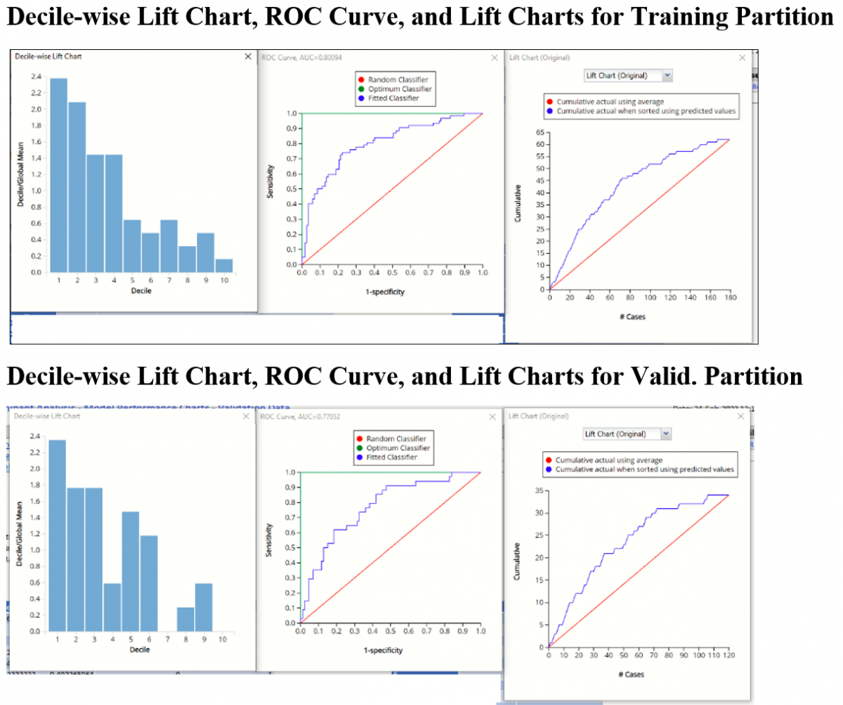
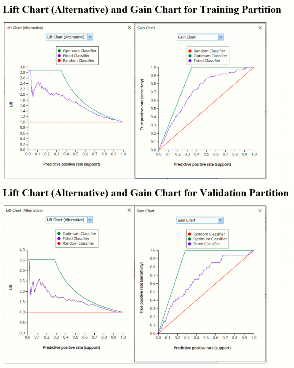
After the model is built using the training data set, the model is used to score on the training data set and the validation data set (if one exists). Then the data set(s) are sorted in decreasing order using the predicted output variable value. After sorting, the actual outcome values of the output variable are cumulated and the lift curve is drawn as the cumulative number of cases in decreasing probability (on the x-axis) vs the cumulative number of true positives on the y-axis. The baseline (red line connecting the origin to the end point of the blue line) is a reference line. For a given number of cases on the x-axis, this line represents the expected number of successes if no model existed, and instead cases were selected at random. This line can be used as a benchmark to measure the performance of the fitted model. The greater the area between the lift curve and the baseline, the better the model. In the Training Lift chart, if we selected 100 cases as belonging to the success class and used the fitted model to pick the members most likely to be successes, the lift curve tells us that we would be right on about 52 of them. Conversely, if we selected 100 random cases, we could expect to be right on about 35 (34.63) of them. In the Validation Lift chart, if we selected 50 cases as belonging to the success class and used the fitted model to pick the members most likely to be successes, the lift curve tells us that we would be right on about 23 of them. Conversely, if we selected 50 random cases, we could expect to be right on about 14 (14.167) of them.
The decilewise lift curve is drawn as the decile number versus the cumulative actual output variable value divided by the decile's mean output variable value. This bars in this chart indicate the factor by which the model outperforms a random assignment, one decile at a time. Records are sorted by their predicted values (scores) and divided into ten equal-sized bins or deciles. The first decile contains 10% of patients that are most likely to experience catastrophic heart failure. The 10th or last decile contains 10% of the patients that are least likely to experience catastrophic heart failure. Ideally, the decile wise lift chart should resemble a stair case with the 1st decile as the tallest bar, the 2nd decile as the 2nd tallest, the 3rd decile as the 3rd tallest, all the way down to the last or 10th decile as the smallest bar. This “staircase” conveys that the model “binned” the records, or in this case patients, correctly from most likely to experience catastrophic heart failure to least likely to experience catastrophic heart failure.
In this particular example, neither chart exhibits the desired “stairstep” effect. Rather, in the training partition, bars 3 and 4 are “even” and bars 7 and 9 are larger than bars 8 and 10. The decile wise validation chart is not much better as the heights for bars 2 and 3 are “even”, bars 5 and 6 are both larger than 4 and bar 9 is larger than 8. In other words, the model appears to do a decent job of identifying the patients at most risk of experiencing catastrophic heart failure but the predictive power of the model begins to fade for patients not exhibiting strong symptoms of heart failure.
The Regression ROC curve was updated in V2017. This new chart compares the performance of the regressor (Fitted Classifier) with an Optimum Classifier Curve and a Random Classifier curve. The Optimum Classifier Curve plots a hypothetical model that would provide perfect classification results. The best possible classification performance is denoted by a point at the top left of the graph at the intersection of the x and y axis. This point is sometimes referred to as the “perfect classification”. The closer the AUC is to 1, the better the performance of the model. In the Validation Partition, AUC = .77052 which suggests that this fitted model is not a good fit to the data.
In V2017, two new charts were introduced: a new Lift Chart and the Gain Chart. To display these new charts, click the down arrow next to Lift Chart (Original), in the Original Lift Chart, then select the desired chart.
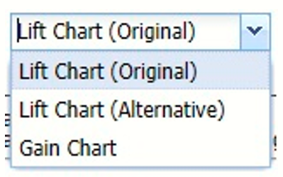
Select Lift Chart (Alternative) to display Analytic Solver Data Science's new Lift Chart. Each of these charts consists of an Optimum Classifier curve, a Fitted Classifier curve, and a Random Classifier curve. The Optimum Classifier curve plots a hypothetical model that would provide perfect classification for our data. The Fitted Classifier curve plots the fitted model and the Random Classifier curve plots the results from using no model or by using a random guess (i.e. for x% of selected observations, x% of the total number of positive observations are expected to be correctly classified).
The Alternative Lift Chart plots Lift against the Predictive Positive Rate or Support.
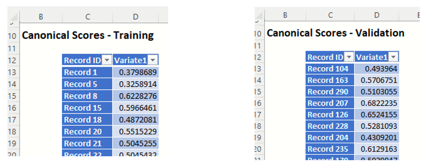
DA_TrainingCanScores and DA_ValidationCanScores
Click the Canonical Scores – Training link in the Output Navigator to navigate to the DA_TrainingCanScores worksheet. Canonical Scores are the values of each case for the function. These are intermediate values useful for illustration but are not usually required by the end-user analyst. Canonical Scores are also available for the Validation dataset on the DA_ValidationCanScores sheet.
DA_Simulation
As discussed above, Analytic Solver Data Science V2023 generates a new output worksheet, DA_Simulation, when Simulate Response Prediction is selected on the Simulation tab of the Discriminant Analysis dialog.
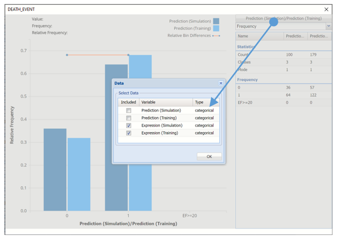
This report contains the synthetic data (with or without correlation fitting), the prediction (using the fitted model) and the Excel – calculated Expression column, if populated in the dialog. Users can switch between the Predicted (Simulation)/Predicted (Training) or Expression (Simulation)/Expression (Training) or a combination of two, as long as they are of the same type.
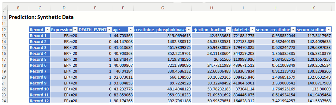
Note the first column in the output, Expression. This column was inserted into the Synthetic Data results because Calculate Expression was selected and an Excel function was entered into the Expression field, on the Simulation tab of the Discriminant Analysis dialog
IF([@ejection_fraction]<20, [@DEATH_EVENT], “EF>=20”)
The results in this column are either 0, 1, or EF > 20.
- DEATH_EVENT = 0 indicates that the patient had an ejection_fraction <= 20 but did not suffer catastrophic heart failure.
- DEATH_EVENT = 1 in this column indicates that the patient had an ejection_fraction <= 20 and did suffer catastrophic heart failure.
- EF>20 indicates that the patient had an ejection fraction of greater than 20.
The remainder of the data in this report is synthetic data, generated using the Generate Data feature described in the chapter with the same name, that appears earlier in this guide. Note: If the data had been rescaled, i.e. Rescale Data was selected on the Parameters dialog, the data shown in this table would have been fit using the rescaled data.
Note: If the data had been scaled, i.e. Rescale Data was selected on the Parameters tab, the data shown in this table would have been fit using the rescaled data.
The chart that is displayed once this tab is selected, contains frequency information pertaining to the output variable in the actual data, the synthetic data and the expression, if it exists. In the screenshot below, the bars in the darker shade of blue are based on the synthetic data. The bars in the lighter shade of blue are based on the training data.
In the synthetic data (the columns in the darker shade of blue), 36% patients survived while 64% patients succumbed to the complications of heart failure and in the training partition, about 32% patients survived while about 68% of the patients did not.
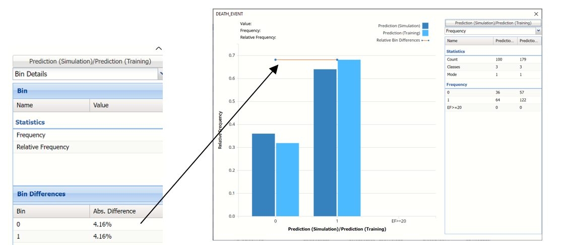
Notice that the Relative Bin Difference curve is flat. Click the down arrow next to Frequency and select Bin Details. This view explains why the curve is flat. Notice that the absolute difference for both bins is 4.16%.
Click Prediction (Simulation)/Prediction (Training) and uncheck Prediction (Simulation)/Prediction (Training) and select Expression (Simulation)/Expression (Training) to change the chart view.
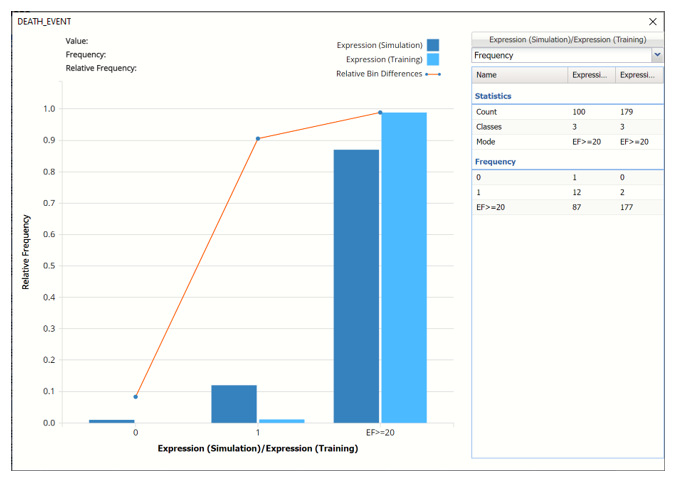
The chart displays the results of the expression in both datasets. This chart shows that 2 patients with an ejection fraction less than 20 are predicted to survive and 1 patient is not.
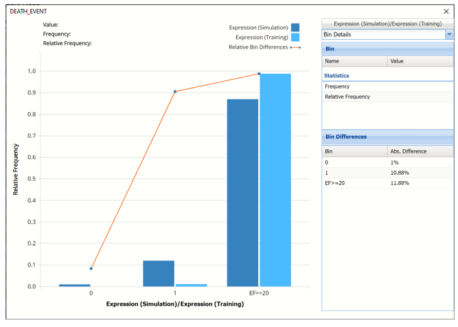
Click the down arrow next to Frequency to change the chart view to Bin Details.
Click the down arrow next to Frequency to change the chart view to Relative Frequency or to change the look by clicking Chart Options. Statistics on the right of the chart dialog are discussed earlier in this section. For more information on the generated synthetic data, see the Generate Data chapter that appears earlier in this guide.
For information on Stored Model Sheets, in this example DA_Stored, please refer to the “Scoring New Data” chapter within the Analytic Solver Data Science User Guide.