Easily Define Uncertain Results with Charts and Statistics
Analytic Solver Simulation's Uncertain Function dialog provides everything you need to define "outputs" -- uncertain functions -- and work with simulation results. You can view frequency, cumulative frequency, and sensitivity charts of results, and examine statistics and percentiles.
You can customize, print or copy and paste charts of simulation results, and automatically fit an analytic distribution to the sampled results:
The Uncertain Function dialog appears when you double-click a worksheet cell containing an uncertain function, or the cell address of such a function in the Model Outline window. A cell becomes an "uncertain function" when you:
- Append + PsiOutput() to its cell formula
- Write =PsiOutput(cell) in another cell
- Refer to it in any PSI Statistics function
Any of these steps can be easily accomplished via the Analytic Solver Simulation Ribbon, or simply by typing formulas in cells. As with uncertain variables, Analytic Solver Simulation's uncertain functions are always visible and editable in the worksheet -- unlike some other risk analysis products for Excel.
And unlike other risk analysis products, charts in Analytic Solver Simulation are live -- they update instantly based on new simulation results, each time you change a number in your spreadsheet!
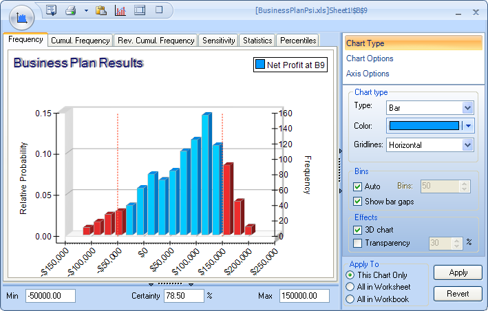
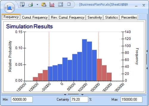
By simply clicking the appropriate tab, you can display a Frequency chart or Cumulative Frequency (forward or reverse) chart, as shown below. By moving the mouse over the chart and right-clicking, or by entering values in the Min and Max fields, you can "exclude" portions of the frequency distribution, and instantly see the Certainty (estimated probability) that an actual outcome will fall in the included area.
|
Frequency |
Cumulative Frequency |

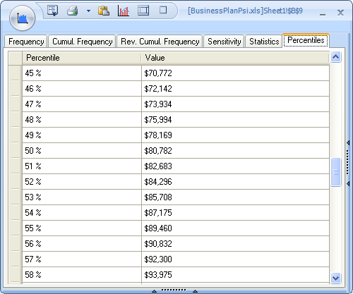
Also by just clicking the appropriate tab, you can view a full range of statistics and risk measures, and percentile values from 1% to 99% for this uncertain function. Besides classical statistics such as the Mean, Variance, Skewness and Kurtosis, you can view the Mean Absolute Deviation, SemiVariance and SemiDeviation, Value at Risk, and Conditional Value at Risk for this function.
You can also obtain these statistics, risk measures and percentiles in cell formulas: Just type them in, use the Excel Function Wizard, or drag and drop these functions from the Analytic Solver Simulation Ribbon Statistics dropdown gallery.
|
Statistics tab |
Percentiles tab |

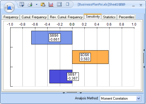
By clicking the Sensitivity tab, you can view a Tornado chart that shows you, at a glance, which uncertain variables have the greatest impact -- positive or negative -- on the value of this uncertain function. You can compute the sensitivity via either Moment Correlation or Rank Correlation.
Like other Analytic Solver Simulation charts, the Tornado chart is live -- it updates instantly each time you change a number in your spreadsheet!
Analytic Solver Simulation charts appear automatically with default formatting, but in just seconds you can change chart colors, titles, gridlines, legends and other options.
You can apply your chart settings to this uncertain function, all functions in this worksheet, or all functions in the workbook. Charts also remember their size and position, so you can close and reopen them at will.