This example utilizes the Wine dataset to display the various features of the Analyze Data application embedded in Analytic Solver.
1. Open the Wine dataset by clicking Help – Example Models – Forecasting/Data Science Examples -- Wine (at the bottom of the list). This example dataset contains information pertaining to wine from three different wineries located in the same region. Thirteen variables describe various characteristics among three classes of wine: A, B, and C.
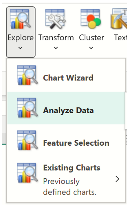
2. Confirm that the Data tab is selected, and click Data Analysis – Explore – Analyze Data to bring up the Analyze Data dialog
Explore menu
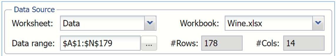
3. The top of the dialog displays the information for the Data Source: worksheet name, Data, the workbook name, Wine.xlsx, the data range, A1:N179 and the number of rows and columns in the dataset.
Data Source section on the Analyze Data dialog
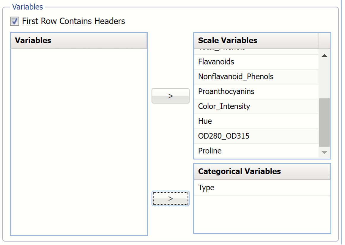
4. Select the variables to be included in the analysis.
A. Select Type as a Category Variable.
B. Select the remaining variables, except Partition Variable, as Scale Variables. Variables section on the Analyze Data dialog.
5. Click Write report to write all computed statistics for each variable to the Statistics worksheet. (The Statistics worksheet will be inserted to the right of the Data tab.) If this checkbox is left unchecked, no report will be inserted into the workbook. The preview dialog will be displayed, and detailed charts will be available if double-clicked. Once the dialog is closed, it will not persist in the workbook. (The application would have to be re-run to re-open the chart.)
Options section on the Analyze Data dialog
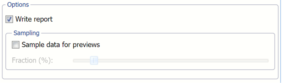
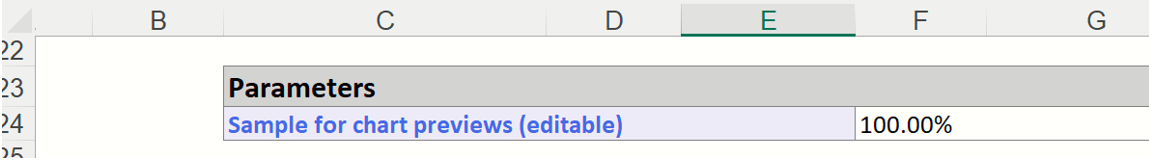
6. If the worksheet contains an extremely large dataset, users can select Sample data for previews and use the Fraction % slider to limit the amount of data utilized when creating the chart previews. This option has no bearing on the amount of data included in the detailed charts. Detailed charts always use the full amount of data to produce the interactive chart and statistics. The Fraction % may be changed after the report is created by editing the Sample for chart previews cell. For more information see below.
Parameters section as shown on the Statistics Report.
Analyze Data dialog as shown with all variables included in the analysis.
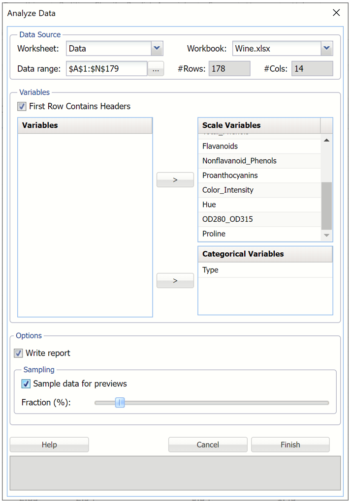
7. Click Finish.
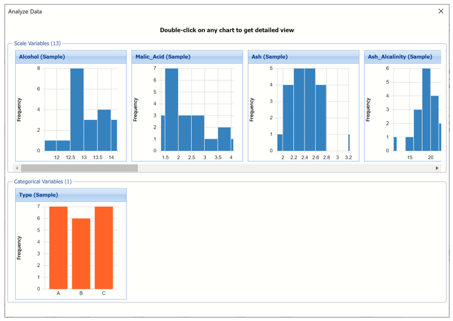
Results
After Finish is clicked in the Analyze Data dialog. A new Statistics worksheet is inserted to the left of the Data tab and an Analyze Data Results dialog appears displaying a bar chart (for categorical variables) or histogram (for continuous or scale variables) for each variable included in the analysis.
Analyze Data: Multivariate chart dialog
Double - click any chart to display a more detailed view of the chart and various computed statistics, including Six Sigma, and percentiles.
Display Placement: Click the title bar of the multivariate dialog to drag to a new location.
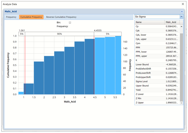
Malic_Acid chart view
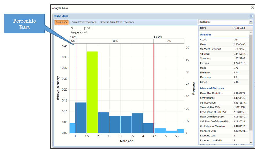
Tabs: The Analyze Data dialog contains three tabs: Frequency, Cumulative Frequency, and Reverse Cumulative Frequency. Each tab displays different information about the distribution of variable values.
Hovering over a bar in either of the three charts will populate the Bin and Frequency headings at the top of the chart. In the Frequency chart above, the bar for the [1.5, 2] Bin is selected. This bar has a frequency of 67 and a relative frequency of about 38%.
By default, red vertical lines will appear at the 5% and 95% percentile values in all three charts, effectively displaying the 90th confidence interval. The middle percentage is the percentage of all the variable values that lie within the ‘included’ area, i.e. the darker shaded area. The two percentages on each end are the percentage of all variable values that lie outside of the ‘included’ area or the “tails”. i.e. the lighter shaded area. Percentile values can be altered by moving either red vertical line to the left or right.
Click the “X” in the upper right corner of the detailed chart dialog to return to the Preview dialog. Click the “X” in the upper right corner of the preview chart dialog to close the dialog. To re-open the preview dialog, click a new tab, say the Data tab in this example, and then click the Statistics tab. The preview dialog will be displayed.
Frequency Tab: When the Analyze Data dialog is first displayed, the Frequency tab is selected by default.
For continuous variables, this tab displays a histogram of the variable’s values.
For categorical variables, this tab displays a bar chart.
Bins containing the range of values for the variable appear on the horizontal axis, the relative frequency of occurrence of the bin values appears on the left vertical axis while the actual frequency of the bin values appear on the right vertical axis.
Cumulative Frequency / Reverse Cumulative Frequency
The Cumulative Frequency tab displays a chart of the cumulative form of the frequency chart, as shown below. Hover over each bar to populate the Bin and Frequency headings at the top of the chart. In this screenshot below, the bar for the [2.0, 2.5] Bin is selected in the Cumulative Frequency Chart. This bar has a frequency of 117 and a relative frequency of about 68%.
Cumulative Frequency Chart Reverse Cumulative Frequency Chart
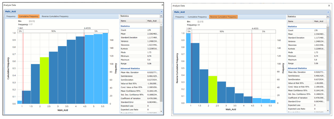
Cumulative Frequency Chart: Bins containing the range of values for the variable appear on the horizontal axis, the cumulative frequency of occurrence of the bin values appear on the left vertical axis while the actual cumulative frequency of the bin values appear on the right vertical axis.
Reverse Cumulative Frequency Chart: Bins containing the range of values for the variable appear on the horizontal axis, similar to the Cumulative Frequency Chart. The reverse cumulative frequency of occurrence of the bin values appear on the left vertical axis while the actual reverse cumulative frequency of the bin values appear on the right vertical axis.
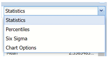
Click the drop down menu on the upper right of the dialog to display additional panes: Statistics, Six Sigma and Percentiles.
Drop down menu
Statistics View
The Statistics tab displays numeric values for several summary statistics,
computed from all values for the specified variable. The statistics shown on the pane below were computed for the Malic Acid variable.
Statistics Pane
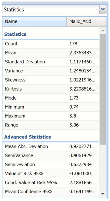
All statistics appearing on the Statistics pane are briefly described below.
Statistics
- Mean, the average of all the values.
- Standard Deviation, the square root of variance.
- Variance, describes the spread of the distribution of values.
- Skewness, which describes the asymmetry of the distribution of values.
- Kurtosis, which describes the peakedness of the distribution of values.
- Mode, the most frequently occurring single value.
- Minimum, the minimum value attained.
- Maximum, the maximum value attained.
- Range, the difference between the maximum and minimum values.
Advanced Statistics
- Mean Abs. Deviation, returns the average of the absolute deviations.
- SemiVariance, measure of the dispersion of values.
- SemiDeviation, one-sided measure of dispersion of values.
- Value at Risk 95%, the maximum loss that can occur at a given confidence level.
- Cond. Value at Risk, is defined as the expected value of a loss given that a loss at the specified percentile occurs.
- Mean Confidence, returns the confidence “half-interval” for the estimated mean value (returned by the PsiMean() function.
- Std. Dev. Confidence 95%, returns the confidence ‘half-interval’ for the estimated standard deviation of the simulation trials (returned by the PsiStdDev() function).
- Coefficient of Variation, is defined as the ratio of the standard deviation to the mean.
- Standard Error, defined as the standard deviation of the sample mean.
- Expected Loss, returns the average of all negative data multiplied by the percentrank of 0 among all data.
- Expected Loss Ratio, returns the expected loss ratio.
- Expected Gain returns the average of all positive data multiplied by 1 - percentrank of 0 among all data.
- Expected Gain Ratio, returns the expected gain ratio.
- Expected Value Margin, returns the expected value margin.
Percentiles View
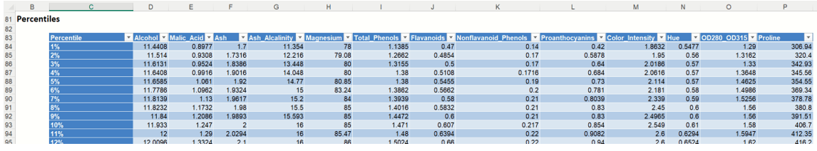
Selecting Percentiles from the menu displays numeric percentile values (from 1% to 99%) computed using all values for the variable. The percentiles shown below were computed using the values for the Malic_Acid variable.
Percentiles Pane
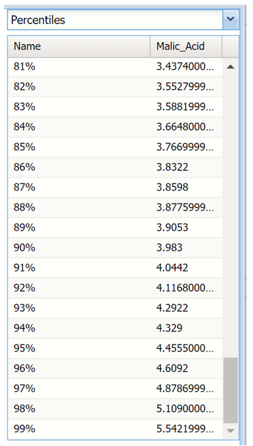
The values displayed here represent 99 equally spaced points on the Cumulative Frequency chart: In the Percentile column, the numbers rise smoothly on the vertical axis, from 0 to 1.0, and in the Value column, the corresponding values from the horizontal axis are shown. For example, the 75th Percentile value is a number such that three-quarters of the values occurring in the last simulation are less than or equal to this value.
Six Sigma View
Selecting Six Sigma from the menu displays various computed Six Sigma measures. In this display, the red vertical lines on the chart are the Lower Specification Limit (LSL) and the Upper Specification Limit (USL) which are initially set equal to the 5th and 95th percentile values, respectively.
These functions compute values related to the Six Sigma indices used in manufacturing and process control. For more information on these functions, see the Appendix located at the end of this guide.
- SigmaCP calculates the Process Capability.
- SigmaCPK calculates the Process Capability Index.
- SigmaCPKLower calculates the one-sided Process Capability Index based on the Lower Specification Limit.
- SigmaCPKUpper calculates the one-sided Process Capability Index based on the Upper Specification Limit.
- SigmaCPM calculates the Taguchi Capability Index.
- SigmaDefectPPM calculates the Defect Parts per Million statistic.
- SigmaDefectShiftPPM calculates the Defective Parts per Million statistic with a Shift.
- SigmaDefectShiftPPMLower calculates the Defective Parts per Million statistic with a Shift below the Lower Specification Limit.
- SigmaDefectShiftPPMUpper calculates the Defective Parts per Million statistic with a Shift above the Upper Specification Limit.
- SigmaK calculates the Measure of Process Center.
- SigmaLowerBound calculates the Lower Bound as a specific number of standard deviations below the mean.
- SigmaProbDefectShift calculates the Probability of Defect with a Shift outside the limits.
- SigmaProbDefectShiftLower calculates the Probability of Defect with a Shift below the lower limit.
- SigmaProbDefectShiftUpper calculates the Probability of Defect with a Shift above the upper limit.
- SigmaSigmaLevel calculates the Process Sigma Level with a Shift.
- SigmaUpperBound calculates the Upper Bound as a specific number of standard deviations above the mean.
- SigmaYield calculates the Six Sigma Yield with a shift, i.e. the fraction of the process that is free of defects.
- SigmaZLower calculates the number of standard deviations of the process that the lower limit is below the mean of the process.
- SigmaZMin calculates the minimum of ZLower and ZUpper.
- SigmaZUpper calculates the number of standard deviations of the process that the upper limit is above the mean of the process.
Six Sigma Pane
Bin Details View
Click the down arrow next to Statistics to view Bin Details for each bin in the chart.
Frequency chart for scale (continuous) variable Frequency chart for categorical variable

- Frequency is the number of observations assigned to the bin. (Scale and categorical variables)
- Relative Frequency is the number of observations assigned to the bin divided by the total number of observations. (Scale and categorical variables)
- Sum is the sum of all observations assigned to the bin. (Scale variables)
- Absolute Sum is the sum of the absolute value of all observations assigned to the bin, i.e. |observation 1| + |observation 2| + |observation 3| + … (Scale variables)
Chart Settings View
The Chart Options view contains controls that allow you to customize the appearance of the charts that appear in the dialog. When you change option selections or type numerical values in these controls, the chart area is instantly updated.
Chart Options Pane
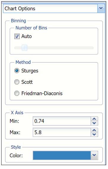
The controls are divided into three groups: Binning, Method and Style.
- Binning: Applies to the number of bins in the chart.
- Auto: Select Auto to allow Analytic Solver to automatically select the appropriate number of bins to be included in the frequency charts. See Method below for information on how to change the bin generator used by Analytic Solver when this option is selected.
- Manually select # of Bins: To manually select the number of bins used in the frequency charts, uncheck “Auto” and drag the slider to the right to increase the number of bins or to the left to decrease the number of bins.
- Method: Three generators are included in the Analyze Data application to generate the “optimal” number of bins displayed in the chart. All three generators implicitly assume a normal distribution. Sturges is the default setting. The Scott generator should be used with random samples of normally distributed data. The Freedman-Diaconis’ generator is less sensitive than the standard deviation to outliers in the data.
- X Axis: Analytic Solver allows users to manually set the Min and Max values for the X Axis. Simply type the desired value into the appropriate text box.
- Style:
- Color: Select a color, to apply to the entire variable graph, by clicking the down arrow next to Color and then selecting the desired hue.
Analyze Data Report
Click the “X” in the upper right hand corner to return to the preview dialog and then again to exit to the Statistics worksheet. This worksheet contains all computed statistics, percentiles and Six Sigma indices for each variable included in the report.
The top of the report contains the Output Navigator and the Inputs sections of the report.
Analyze Data Report: Inputs
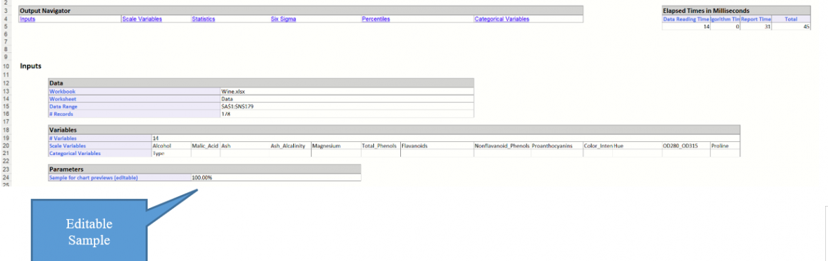
Output Navigator: Click any of the links to jump to that section of the report.
Inputs: This section contains information pertaining to the data source and the variables included in the data analysis.
Parameters: If you find that the Preview dialog is taking a long time to open, you can edit the Sample Data Fraction % here. Simply enter a smaller percentage to speed up the opening of the dialog.
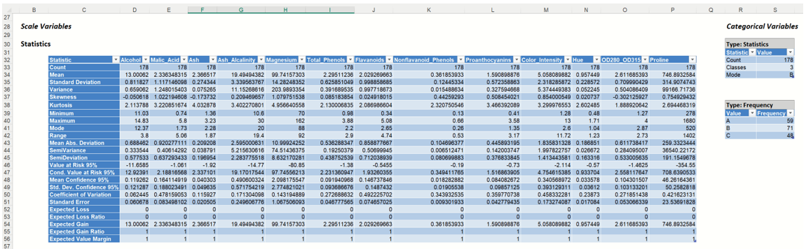
The next section, Statistics, lists each computed statistic found in the detailed chart view for each variable included in the analysis, scale and categorical.
Analyze Data Report: Statistics
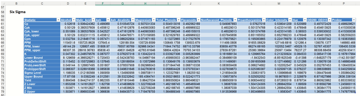
Scroll down to the Six Sigma section of the report to see all 19 Six Sigma statistics and indices.
Analyze Data Report: Six Sigma
Finally, scroll down to Percentiles to view all 99 percentile values from 0.01 to .99.