Multiple Linear Regression Example
This example focuses on the boosting ensemble method using linear regression as the weak learner. We will use the Boston_Housing.xlsx example dataset. This dataset contains 14 variables, a description of each is given in the Description tab in the example workbook. The dependent variable MEDV is the median value of a dwelling. This objective of this example is to predict the value of this variable.
Input
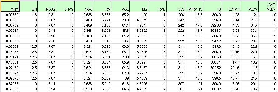
Open the example dataset by clicking Help – Example Models – Forecasting / Data Science Examples – Boston Housing. A portion of the dataset is shown below. Neither the CHAS variable nor the CAT. MEDV variable will be utilized in this example.
Boston Housing Dataset
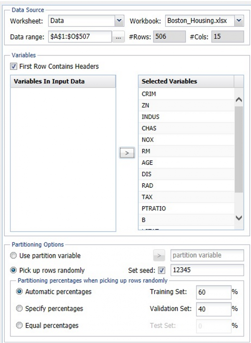
First, we partition the data into training and validation sets using the Standard Data Partition defaults with percentages of 60% of the data randomly allocated to the Training Set and 40% of the data randomly allocated to the Validation Set. For more information on partitioning a dataset, see Partitioning.
Standard Data Partitioning dialog
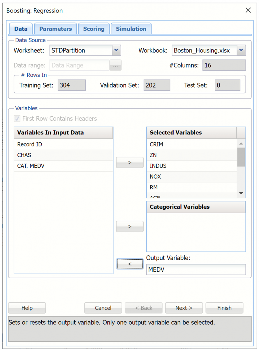
Click Predict – Ensemble – Boosting on the Data Science ribbon. The Boosting – Data tab appears. Confirm that STDPartition is selected for Worksheet under Data Source.
Select MEDV as the Output variable and the remaining variables as Selected Variables (except the CAT.MEDV, CHAS and Record ID variables).
Boosting Regression dialog, Data tab
Click Next to advance to the next tab.
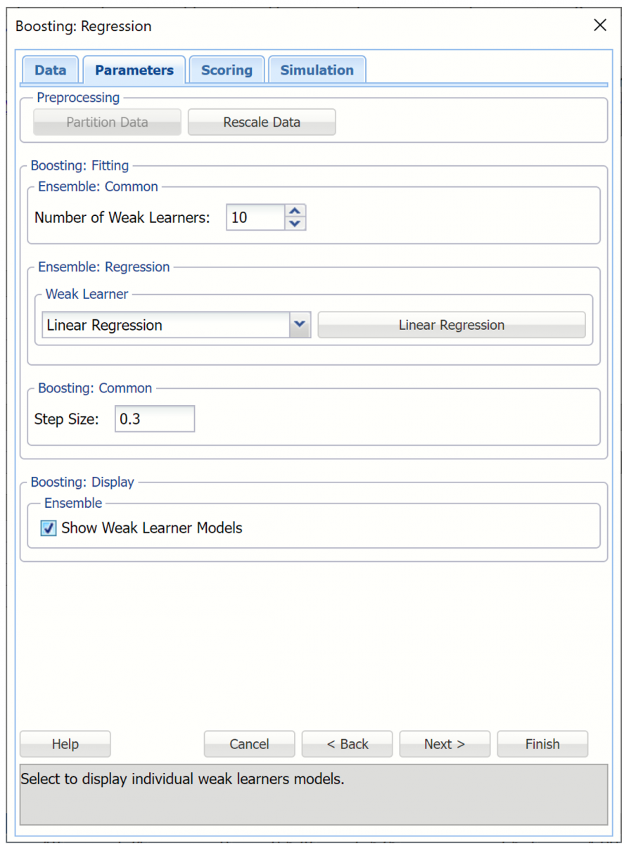
Select the down arrow beneath Weak Learner and selct Linear Regression from the menu. A command button will appear to the right of the Weak Learner menu labeled Linear Regression. Click here to change any options related to this weak leaner. For more information on any of these options, see Linear Regression.
Select Show Weak Learner Models to include this information in the output.
Boosting Regression dialog, Parameters tab
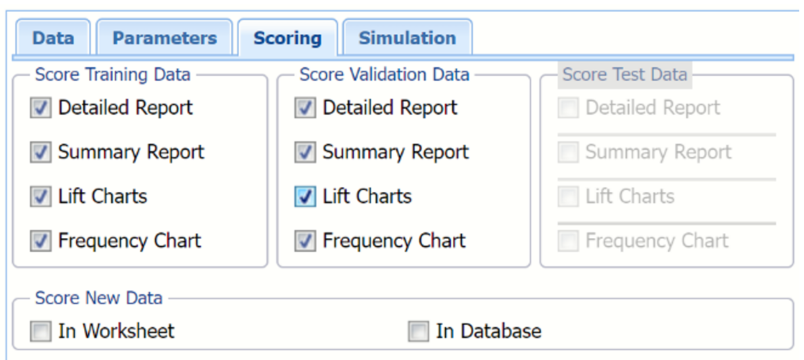
Click Next to advance to the Boosting – Scoring tab.
Select all four options for Score Training/Validation data.
When Detailed report is selected, Analytic Solver Data Science will create a detailed report of the Regression Trees output.
When Summary report is selected, Analytic Solver Data Science will create a report summarizing the Regression Trees output.
When Lift Charts is selected, Analytic Solver Data Science will include Lift Chart and ROC Curve plots in the output.
When Frequency Chart is selected, a frequency chart will be displayed when the RBoosting_TrainingScore and RBoosting_ValidationScore worksheets are selected. This chart will display an interactive application similar to the Analyze Data feature, explained in detail in the Analyze Data chapter that appears earlier in this guide. This chart will include frequency distributions of the actual and predicted responses individually, or side-by-side, depending on the user’s preference, as well as basic and advanced statistics for variables, percentiles, six sigma indices.
Since we did not create a test partition, the options for Score test data are disabled. See Partitioning for information on how to create a test partition.
See Scoring New Data for more information on Score New Data in options.
Boosting Regression dialog, Scoring tab
Click Next to advance to the Simulation tab.
Select Simulation Response Prediction to enable all options on the Simulation tab of the Regression Tree dialog.
Simulation tab: All supervised algorithms include a new Simulation tab. This tab uses the functionality from the Generate Data feature (described earlier in this guide) to generate synthetic data based on the training partition, and uses the fitted model to produce predictions for the synthetic data. The resulting report, RBoosting_Simulation, will contain the synthetic data, the predicted values and the Excel-calculated Expression column, if present. In addition, frequency charts containing the Predicted, Training, and Expression (if present) sources or a combination of any pair may be viewed, if the charts are of the same type.
Boosting Regression dialog, Simulation tab
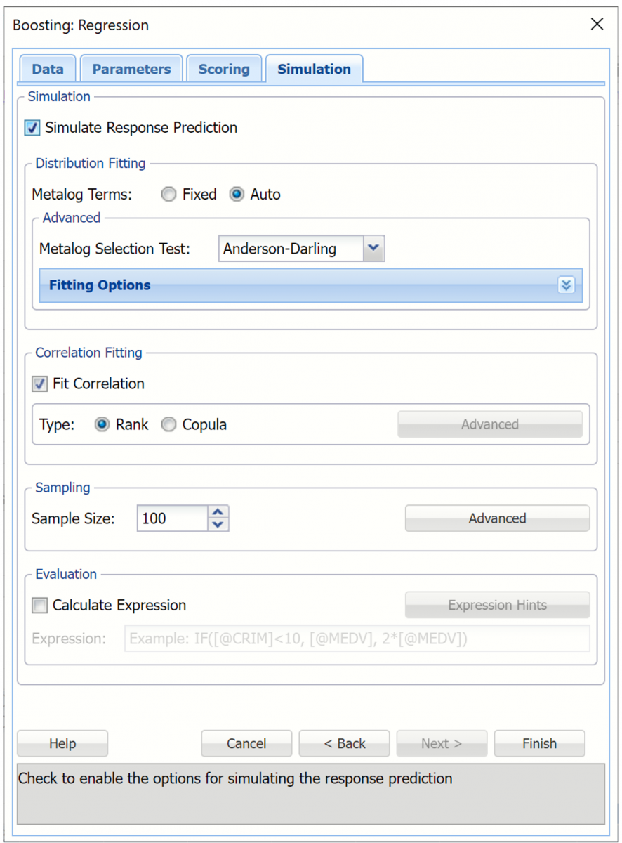
Evaluation: Select Calculate Expression to amend an Expression column onto the frequency chart displayed on the Boosting_Simulation output tab. Expression can be any valid Excel formula that references a variable and the response as [@COLUMN_NAME]. Click the Expression Hints button for more information on entering an expression. Note that variable names are case sensitive. See any of the prediction methods to see the Expression field in use.
For more information on the remaining options shown on this dialog in the Distribution Fitting, Correlation Fitting and Sampling sections, see Generate Data.
Click Finish to run Regression Tree on the example dataset.
Output
Output sheets containing the results of the Boosting Regression method will be inserted into the active workbook, to the right of the STDPartition worksheet.
RBoosting_Output
This result worksheet includes 3 segments: Output Navigator, Inputs and Boosting Model.
Output Navigator: The Output Navigator appears at the top of all result worksheets. Use this feature to quickly navigate to all reports included in the output.
RBoosting_Output: Output Navigator

Inputs: Scroll down to the Inputs section to find all inputs entered or selected on all tabs of the Boosting Regression dialog.
RBoosting_Output, Inputs Report
Boosting Model: Click the Boosting Model link on the Output Naviagator to view the Boosting model for each weak learner. Recall that the default is "10" on the Parameters tab.
RBoosting_TrainingScore
Click the RBoosting_TrainingScore tab to view the newly added Output Variable frequency chart, the Training: Prediction Summary and the Training: Prediction Details report. All calculations, charts and predictions on this worksheet apply to the Training data.
Note: To view charts in the Cloud app, click the Charts icon on the Ribbon, select a worksheet under Worksheet and a chart under Chart.
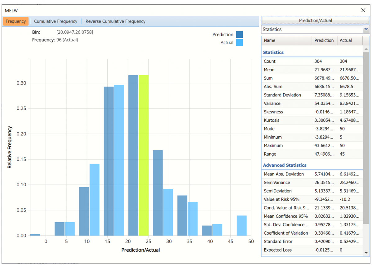
Frequency Charts: The output variable frequency chart opens automatically once the RBoosting_TrainingScore worksheet is selected. To close this chart, click the “x” in the upper right hand corner of the chart. To reopen, click onto another tab and then click back to the RBoosting_TrainingScore tab.
Frequency chart displaying prediction data
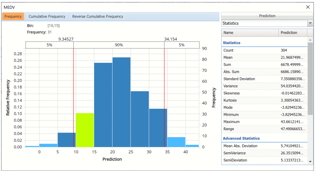
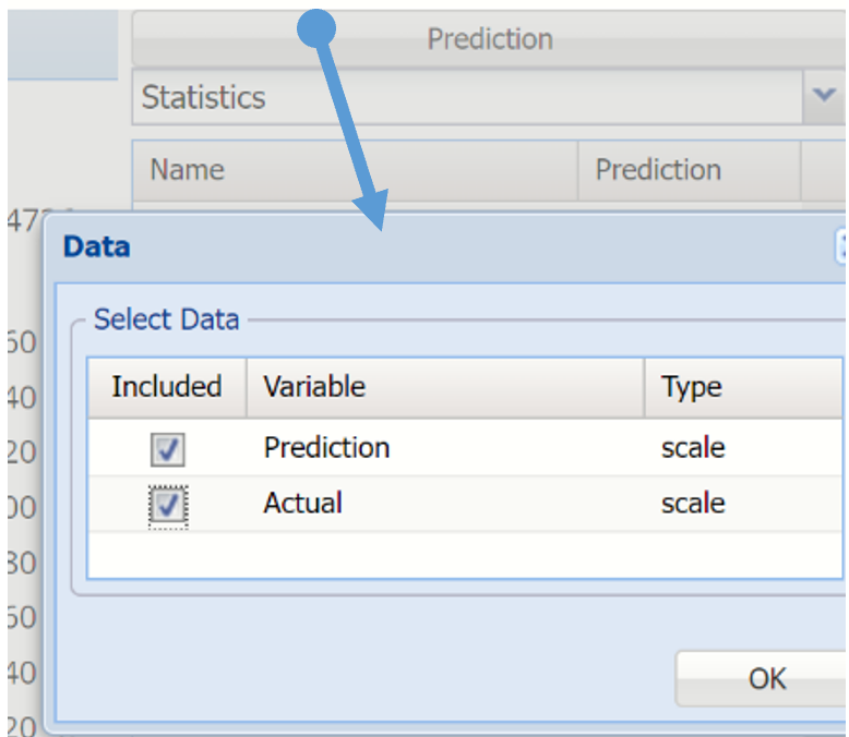
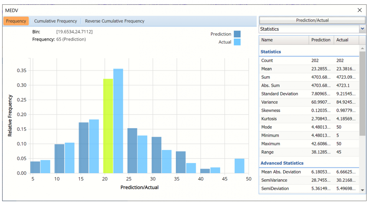
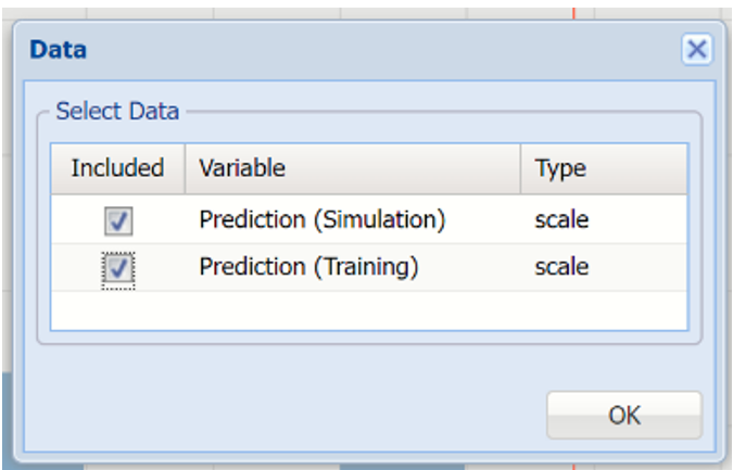
To add the Actual data to the chart, click Prediction in the upper right hand corner and select both checkboxes in the Data dialog.
Click Prediction to add Actual data to the interactive chart.
Notice in the screenshot below that both the Prediction and Actual data appear in the chart together, and statistics for both appear on the right.
MEDV Frequency Chart
To remove either the Original or the Synthetic data from the chart, click Original/Synthetic in the top right and then uncheck the data type to be removed.
This chart behaves the same as the interactive chart in the Analyze Data feature found on the Explore menu.
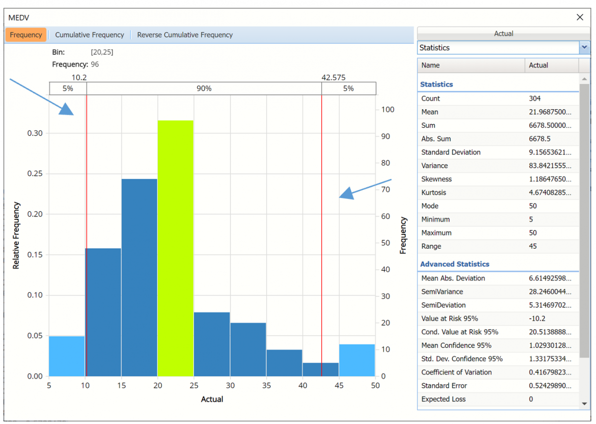
- Use the mouse to hover over any of the bars in the graph to populate the Bin and Frequency headings at the top of the chart.
- When displaying either Prediction or Actual data (not both), red vertical lines will appear at the 5% and 95% percentile values in all three charts (Frequency, Cumulative Frequency and Reverse Cumulative Frequency) effectively displaying the 90th confidence interval. The middle percentage is the percentage of all the variable values that lie within the ‘included’ area, i.e. the darker shaded area. The two percentages on each end are the percentage of all variable values that lie outside of the ‘included’ area or the “tails”. i.e. the lighter shaded area. Percentile values can be altered by moving either red vertical line to the left or right.
Frequency chart with percentage markers moved
Click Cumulative Frequency and Reverse Cumulative Frequency tabs to see the Cumulative Frequency and Reverse Cumulative Frequency charts, respectively.
Cumulative Frequency chart and Percentiles displayed
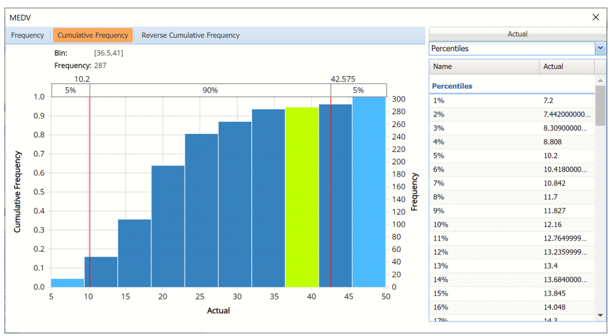
Click the down arrow next to Statistics to view Percentiles for each type of data along with Six Sigma indices.
Reverse Cumulative Frequency chart and Six Sigma indices displayed.
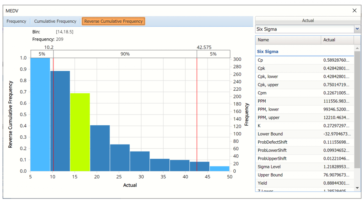
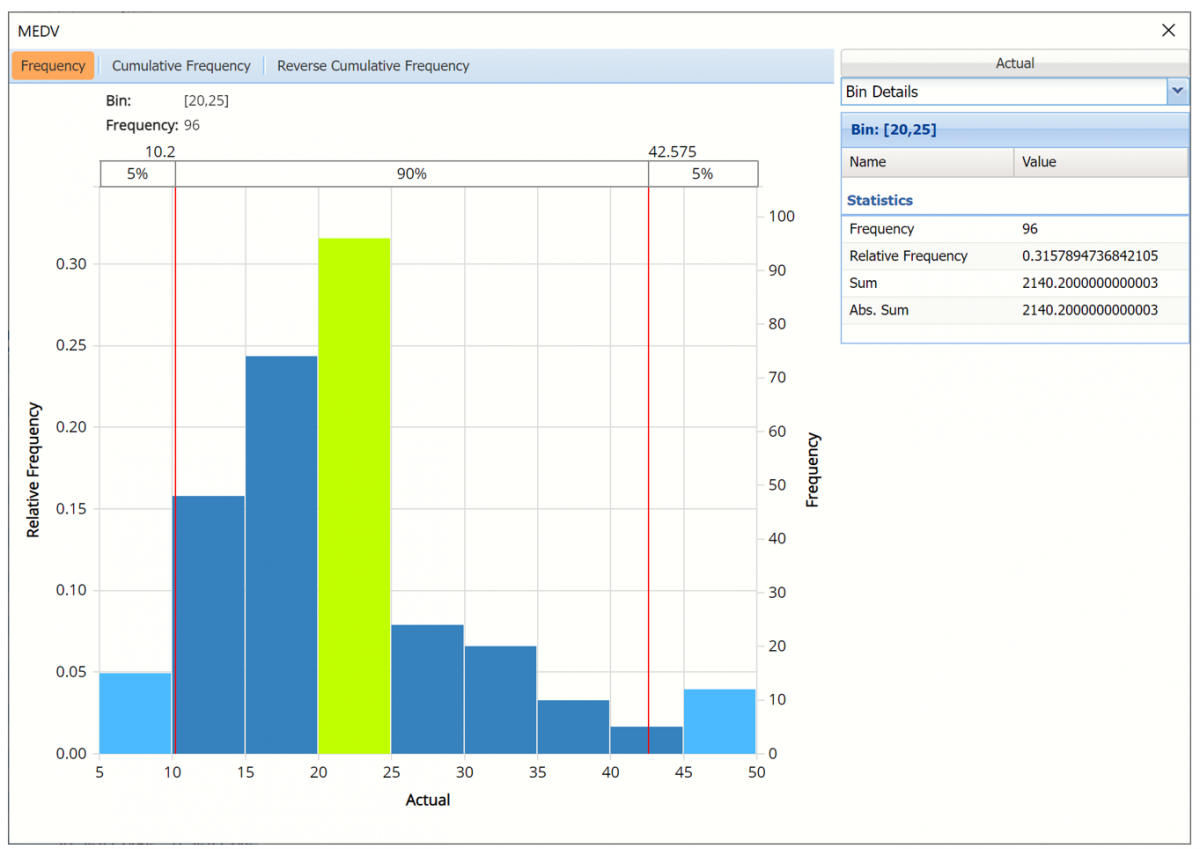
Click the down arrow next to Statistics to view Bin Details to display information related to each bin in the chart.
Bin Details view
Use the Chart Options view to manually select the number of bins to use in the chart, as well as to set personalization options.
As discussed above, see Analyze Data for an in-depth discussion of this chart as well as descriptions of all statistics, percentiles, bin metrics and six sigma indices.
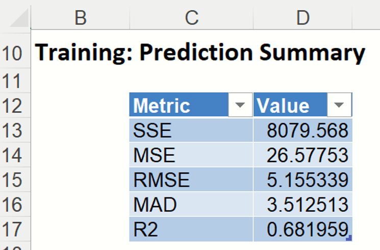
Training: Prediction Summary: Click the Training: Prediction Summary link on the Output Navigator to open the Training Summary. This data table displays various statistics to measure the performance of the trained network: Sum of Squared Error (SSE), Mean Squared Error (MSE), Root Mean Squared Error (RMSE), the Median Absolute Deviation (MAD) and the Coefficient of Determination (R2).
Training Prediction Summary
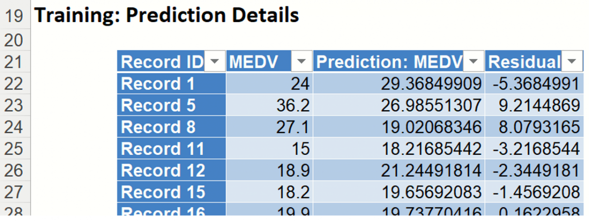
Training: Prediction Details: Scroll down to view the Prediction Details data table. This table displays the Actual versus Predicted values, along with the Residuals, for the training dataset.
Training Prediction Details
RBoosting_ValidationScore
Another key interest in a data-mining context will be the predicted and actual values for the MEDV variable along with the residual (difference) for each predicted value in the Validation partition.
RBoosting_ValidationScore displays the newly added Output Variable frequency chart, the Validation: Prediction Summary and the Validation: Prediction Details report. All calculations, charts and predictions on the RBoosting_ValidationScore output sheet apply to the Validation partition.
Frequency Charts: The output variable frequency chart for the validation partition opens automatically once the RBoosting_ValidationScore worksheet is selected. This chart displays a detailed, interactive frequency chart for the Actual variable data and the Predicted data, for the validation partition. For more information on this chart, see the RBoosting_TrainingScore explanation above.
Validation Partition Frequency Chart
Prediction Summary: In the Prediction Summary report, Analytic Solver Data Science displays the total sum of squared errors summaries for the Validation partition.
Validation Prediction Summary
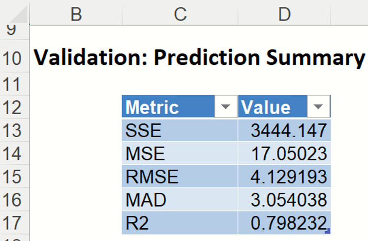
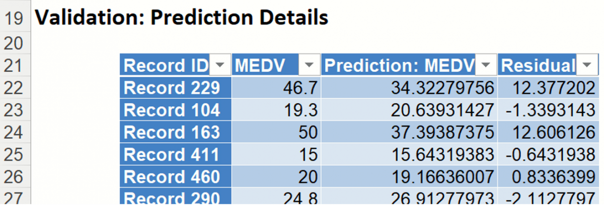
Prediction Details: Scroll down to the Validation: Prediction Details report to find the Prediction value for the MEDV variable for each record in the Validation partition, as well as the Residual value.
Validation Prediction Details
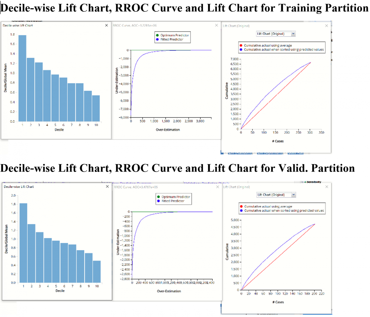
RROC charts, shown below, are better indicators of fit. Read on to view how these more sophisticated tools can tell us about the fit of the neural network to our data.
RBoosting_TrainingLiftChart & RBoosting_ValidationLiftChart
Click the RBoosting_TrainLiftChart and RBoosting_ValidLiftChart tabs to navigate to the Lift Charts and Regression RROC curves for both the training and validation datasets. For more information on how to interpret these charts, see Mulitple Linear Regression.
Note: To view these charts in the Cloud app, click the Charts icon on the Ribbon, select RBoosting_TrainingLiftChart or RBoosting_ValidationLiftChart for Worksheet and Decile Chart, ROC Chart or Gain Chart for Chart.
RBoosting_Simulation
As discussed above, Analytic Solver Data Science generates a new output worksheet, RBoosting_Simulation, when Simulate Response Prediction is selected on the Simulation tab of the Boosting Regression dialog.
This report contains the synthetic data, the predicted values for the training data (using the fitted model) and the Excel – calculated Expression column, if populated in the dialog. Users can switch between the Predicted, Training, and Expression sources or a combination of two, as long as they are of the same type.
Synthetic Data
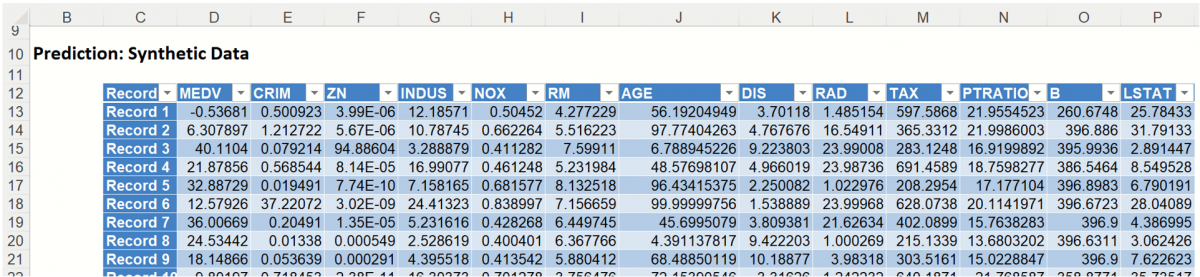
The data contained in the Synthetic Data report is syntethic data, generated using the Generate Data feature described in the chapter with the same name, that appears earlier in this guide.
The chart that is displayed once this tab is selected, contains frequency information pertaining to the output variable in the training data, the synthetic data and the expression, if it exists. (Recall that no expression was entered in this example.)
Frequency Chart for Prediction (Simulation) data
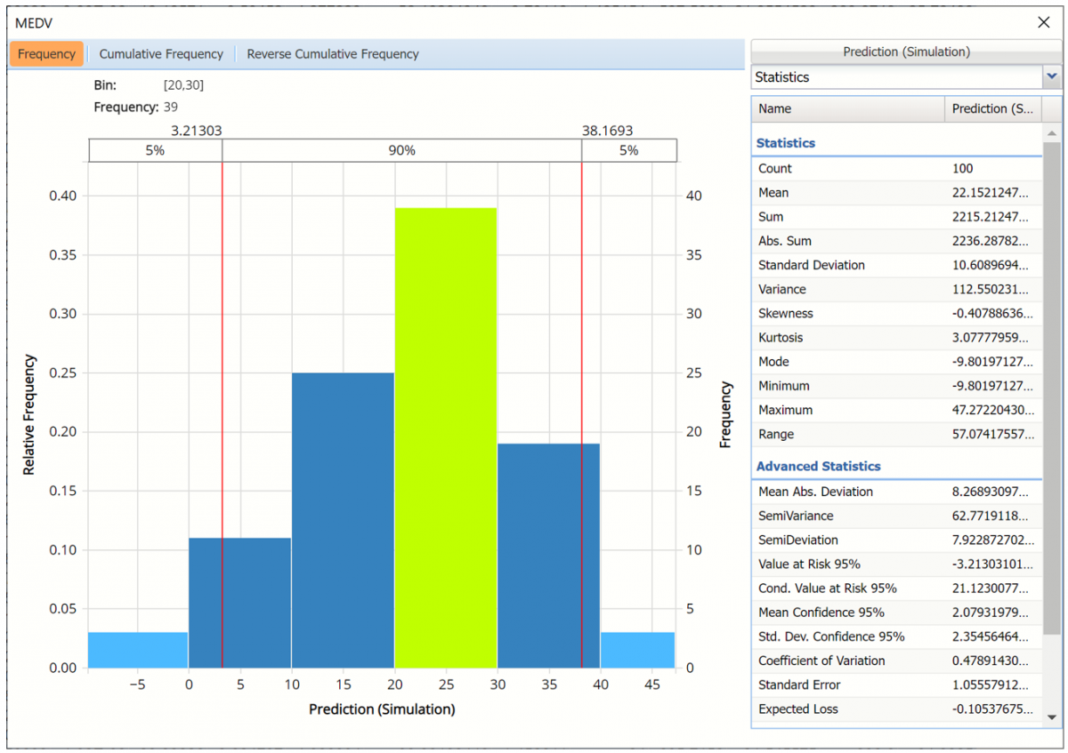
Click Prediction (Simulation) to add the training data to the chart.
Click Prediction(Simulation) and Prediction (Training) to change the Data view.
In the chart below, the dark blue bars display the frequencies for the synthetic data and the light blue bars display the frequencies for the predicted values in the Training partition.
Prediction (Simulation) and Prediction (Training) Frequency chart for MEDV variable
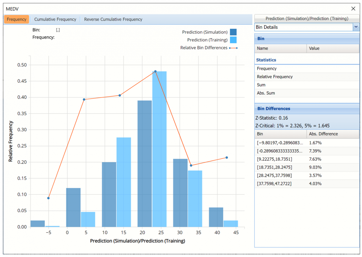
The Relative Bin Differences curve charts the absolute differences between the data in each bin. Click the down arrow next to Statistics to view the Bin Details pane to display the calculations.
Click the down arrow next to Frequency to change the chart view to Relative Frequency or to change the look by clicking Chart Options. Statistics on the right of the chart dialog are discussed earlier in this section. For more information on the generated synthetic data, see Generate Data.
See Scoring New Data for information on the Stored Model Sheet, RBoosting_Stored.
Continue on with the Bagging Neural Network Regression Example to compare the results between the two ensemble methods.