Manual Neural Network Prediction Example
This example focuses on creating a Neural Network Manual Architecture. See the Ensemble Methods chapter that appears later on in this guide to see an example on creating a Neural Network using the boosting and bagging ensemble methods.
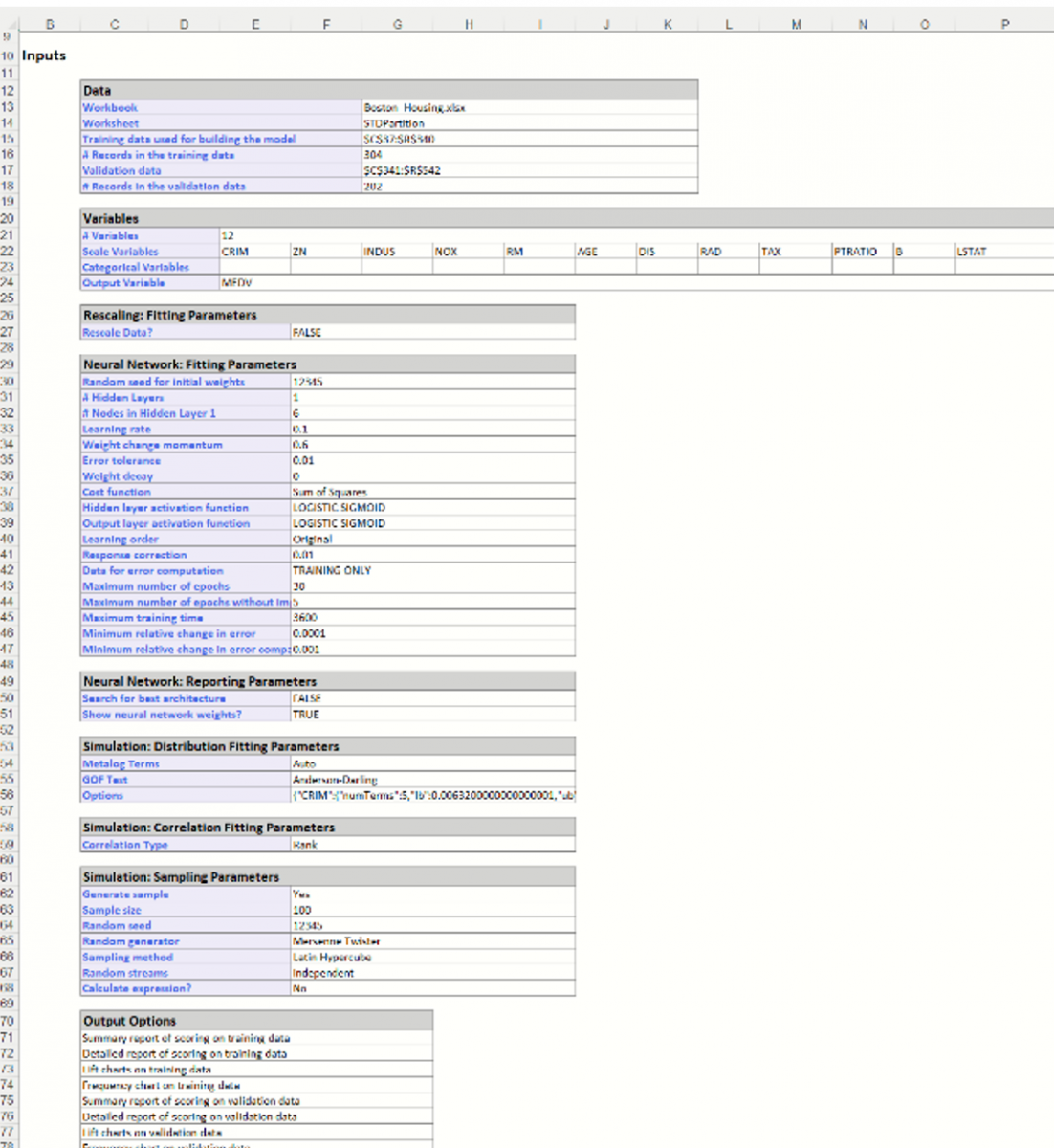
Inputs
This example will use the same partitioned dataset to illustrate the use of the Manual Network Architecture selection.
Click back to the STDPartition sheet and then click Predict – Neural Network – Manual Network on the Data Science ribbon.
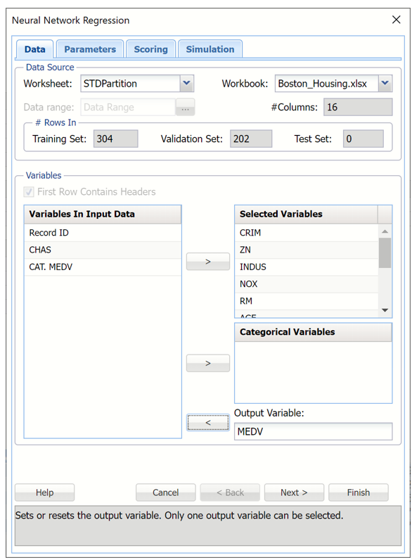
Select MEDV as the Output variable and the remaining variables as Selected Variables (except the CAT.MEDV, CHAS and Record ID variables).
The last variable, CAT.MEDV, is a discrete classification of the MEDV variable and will not be used in this example. CHAS is a categorial variable which will also not be used in this example.
Neural Network Regression dialog, Data tab
Click Next to advance to the next tab.
As discussed in the previous sections, Analytic Solver Data Science includes the ability to partition a dataset from within a classification or prediction method by clicking Partition Data on the Parameters tab. Analytic Solver Data Science will partition your dataset (according to the partition options you set) immediately before running the regression method. If partitioning has already occurred on the dataset, this option will be disabled. For more information on partitioning, please see the Data Science Partitioning chapter.
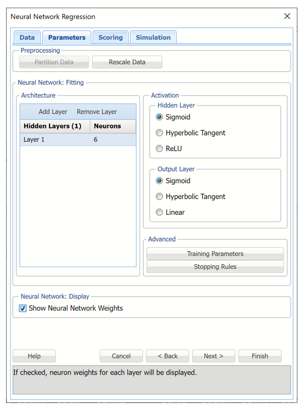
Click Add Layer to add a hidden layer to the Neural Network. Enter 6 for Neurons for this layer. To remove a layer, select the layer to be removed, then click Remove Layer.
To change the Training Parameters and Stopping Rules for the Neural Network, click Training Parameters and Stopping Rules, respectively. For this example, we will use the defaults. See the Neural Network Regression Options below for more information on these parameters.
Leave Sigmoid selected for Hidden Layer and output Layer. See the Neural Network Regression Options section below for more information on these options.
Select Show Neural Network Weights to display this information in the output.
Neural Network Regression dialog, Parameters tab
Click Next to advance to the Scoring tab.
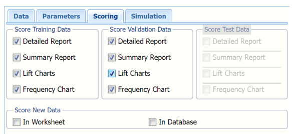
Select all four options for Score Training/Validation data.
When Detailed report is selected, Analytic Solver Data Science will create a detailed report of the Regression Trees output.
When Summary report is selected, Analytic Solver Data Science will create a report summarizing the Regression Trees output.
When Lift Charts is selected, Analytic Solver Data Science will include Lift Chart and ROC Curve plots in the output.
When Frequency Chart is selected, a frequency chart will be displayed when the NNP_TrainingScore and NNP_ValidationScore worksheets are selected. This chart will display an interactive application similar to the Analyze Data feature, explained in detail in the Analyze Data chapter that appears earlier in this guide. This chart will include frequency distributions of the actual and predicted responses individually, or side-by-side, depending on the user’s preference, as well as basic and advanced statistics for variables, percentiles, six sigma indices.
Since we did not create a test partition, the options for Score test data are disabled. See the chapter “Data Science Partitioning” for information on how to create a test partition.
See the Scoring New Data chapter within the Analytic Solver Data Science User Guide for more information on Score New Data in options.
Neural Network Regression dialog, Scoring tab
Click Next to advance to the Simulation tab.
Select Simulation Response Prediction to enable all options on the Simulation tab of the Regression Tree dialog.
Simulation tab: All supervised algorithms include a new Simulation tab. This tab uses the functionality from the Generate Data feature (described earlier in this guide) to generate synthetic data based on the training partition, and uses the fitted model to produce predictions for the synthetic data. The resulting report, NNP_Simulation, will contain the synthetic data, the predicted values and the Excel-calculated Expression column, if present. In addition, frequency charts containing the Predicted, Training, and Expression (if present) sources or a combination of any pair may be viewed, if the charts are of the same type.
Regression Tree dialog, Simulation tab
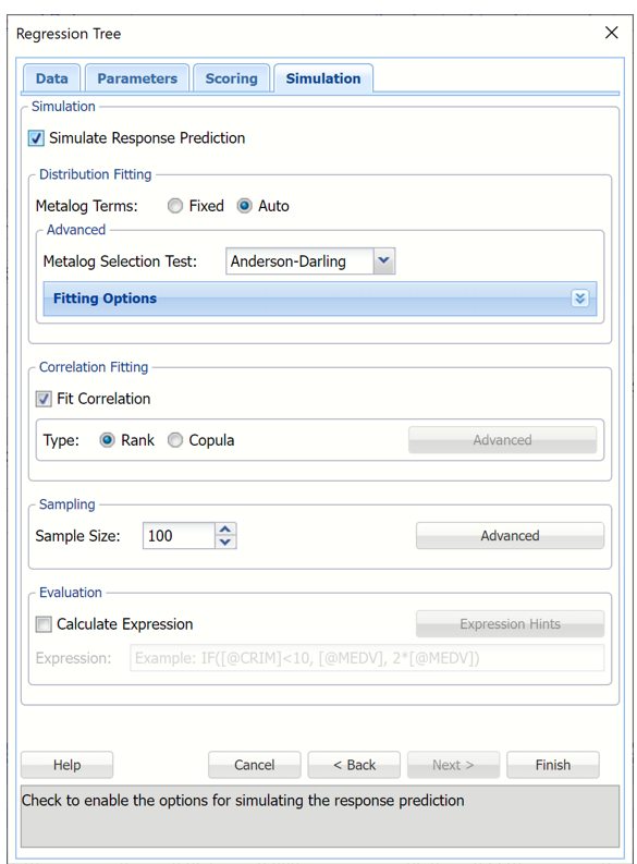
Evaluation: Select Calculate Expression to amend an Expression column onto the frequency chart displayed on the RT_Simulation output tab. Expression can be any valid Excel formula that references a variable and the response as [@COLUMN_NAME]. Click the Expression Hints button for more information on entering an expression. Note that variable names are case sensitive. See any of the prediction methods to see the Expressison field in use.
For more information on the remaining options shown on this dialog in the Distribution Fitting, Correlation Fitting and Sampling sections, see the Generate Data chapter that appears earlier in this guide.
Click Finish to run Regression Tree on the example dataset.
Output
Output sheets containing the results of the Neural Network will be inserted into your active workbook to the right of the STDPartition worksheet.
NNP_Output
This result worksheet includes 3 segments: Output Navigator, Inputs and Nueron Weights.
Output Navigator: The Output Navigator appears at the top of all result worksheets. Use this feature to quickly navigate to all reports included in the output.
NNP_Output: Output Navigator

Inputs: Scroll down to the Inputs section to find all inputs entered or selected on all tabs of the Discriminant Analysis dialog.
NNP_Output, Inputs Report
Neuron Weights: Analytic Solver Data Science provides intermediate information produced during the last pass through the network. Scroll down the NNP_Output worksheet to the Interlayer connections' weights table.
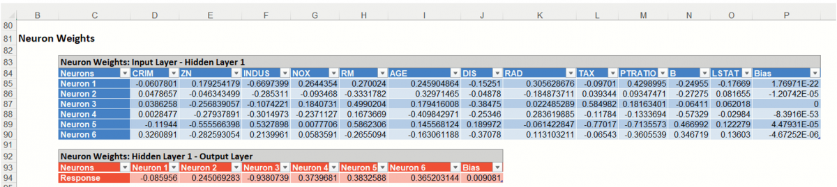
Recall that a key element in a neural network is the weights for the connections between nodes. In this example, we chose to have one hidden layer with 6 neurons. The Inter-Layer Connections Weights table contains the final values for the weights between the input layer and the hidden layer, between hidden layers, and between the last hidden layer and the output layer. This information is useful at viewing the “insides” of the neural network; however, it is unlikely to be of utility to the data analyst end-user. Displayed above are the final connection weights between the input layer and the hidden layer for our example and also the final weights between the hidden layer and the output layer.
NNP_TrainLog
Click the Training Log link on the Output Navigator or the NNP_TrainLog worksheet tab to display the following log.
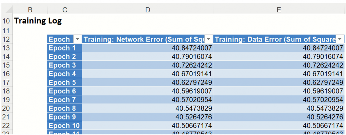
During an epoch, each training record is fed forward in the network and classified. The error is calculated and is back propagated for the weights correction. Weights are continuously adjusted during the epoch. The sum of squares error is computed as the records pass through the network but does not report the sum of squares error after the final weight adjustment. Scoring of the training data is performed using the final weights so the training classification error may not exactly match with the last epoch error in the Epoch log.
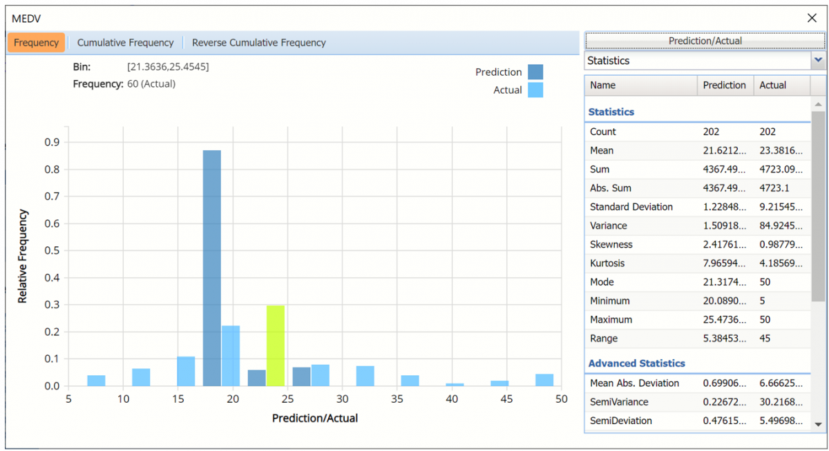
NNP_TrainingScore
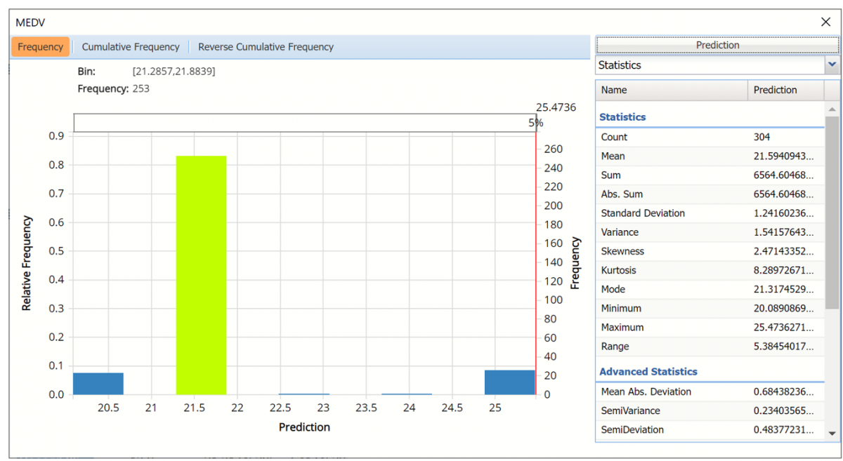
Click the NNP_TrainingScore tab to view the newly added Output Variable frequency chart, the Training: Prediction Summary and the Training: Prediction Details report. All calculations, charts and predictions on this worksheet apply to the Training data.
Note: To view charts in the Cloud app, click the Charts icon on the Ribbon, select a worksheet under Worksheet and a chart under Chart.
Frequency Charts: The output variable frequency chart opens automatically once the NNP_TrainingScore worksheet is selected. To close this chart, click the “x” in the upper right hand corner of the chart. To reopen, click onto another tab and then click back to the NNP_TrainingScore tab.
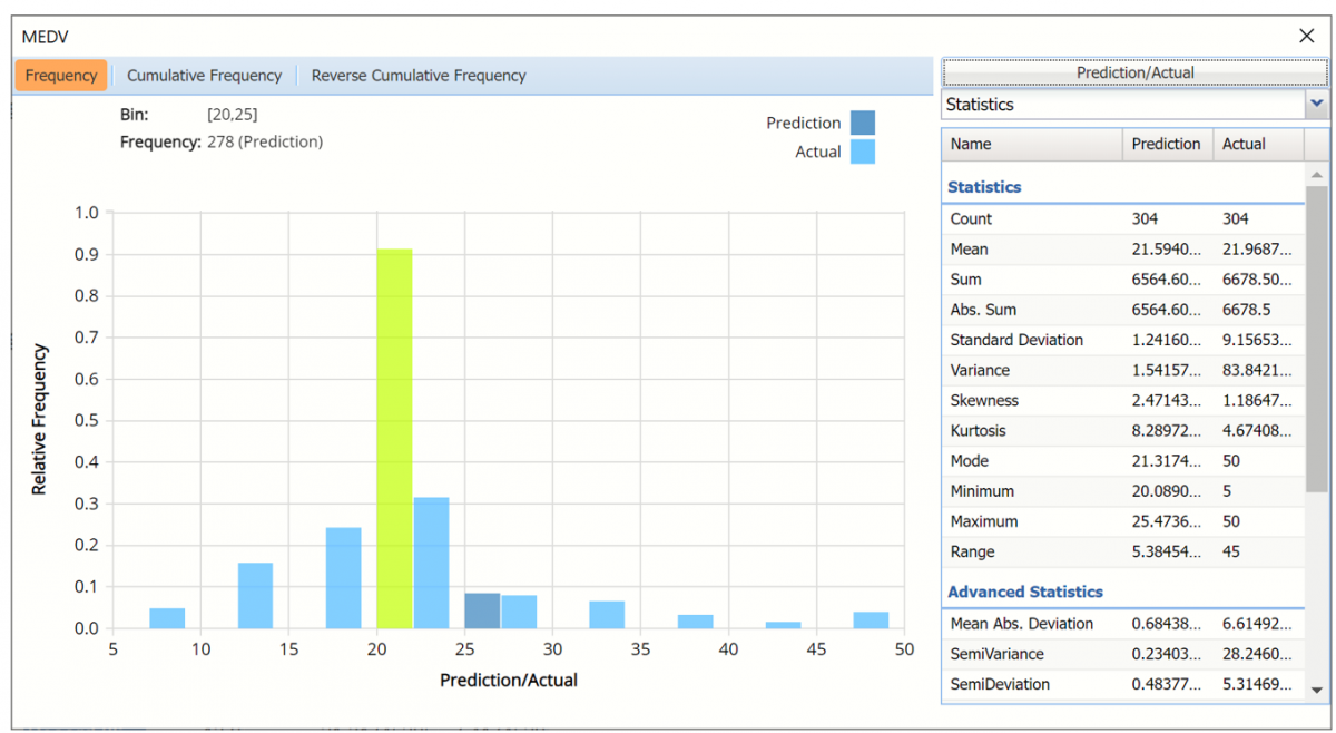
Frequency chart displaying prediction data
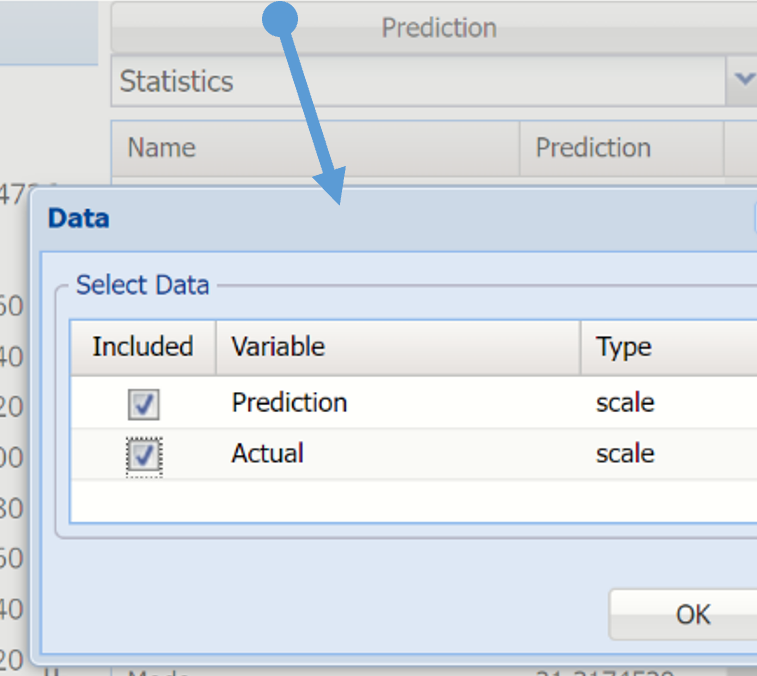
To add the Actual data to the chart, click Prediction in the upper right hand corner and select both checkboxes in the Data dialog.
Click Prediction to add Actual data to the interactive chart.
Notice in the screenshot below that both the Prediction and Actual data appear in the chart together, and statistics for both appear on the right.
To remove either the Original or the Synthetic data from the chart, click Original/Synthetic in the top right and then uncheck the data type to be removed.
This chart behaves the same as the interactive chart in the Analyze Data feature found on the Explore menu.
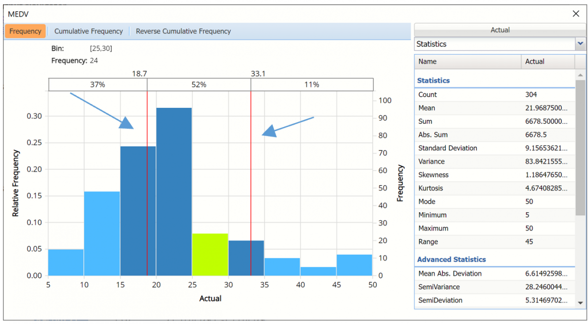
Use the mouse to hover over any of the bars in the graph to populate the Bin and Frequency headings at the top of the chart.
When displaying either Prediction or Actual data (not both), red vertical lines will appear at the 5% and 95% percentile values in all three charts (Frequency, Cumulative Frequency and Reverse Cumulative Frequency) effectively displaying the 90th confidence interval. The middle percentage is the percentage of all the variable values that lie within the ‘included’ area, i.e. the darker shaded area. The two percentages on each end are the percentage of all variable values that lie outside of the ‘included’ area or the “tails”. i.e. the lighter shaded area. Percentile values can be altered by moving either red vertical line to the left or right.
Frequency chart with percentage markers moved
Click Cumulative Frequency and Reverse Cumulative Frequency tabs to see the Cumulative Frequency and Reverse Cumulative Frequency charts, respectively.
Cumulative Frequency chart and Percentiles displayed
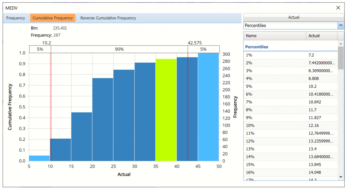
Click the down arrow next to Statistics to view Percentiles for each type of data along with Six Sigma indices.
Reverse Cumulative Frequency chart and Six Sigma indices displayed.
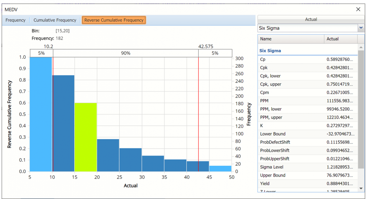
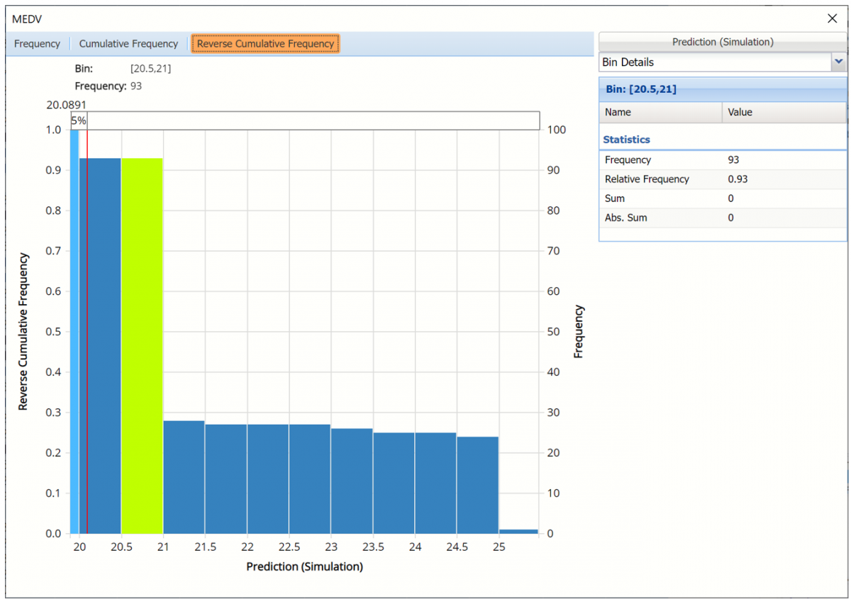
Click the down arrow next to Statistics to view Bin Details to display information related to each bin.
Reverse Cumulative Frequency chart and Bin Details pane displayed
Use the Chart Options view to manually select the number of bins to use in the chart, as well as to set personalization options.
As discussed above, see Analyze Data for an in-depth discussion of this chart as well as descriptions of all statistics, percentiles, bin metrics and six sigma indices.
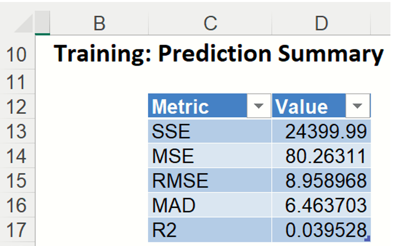
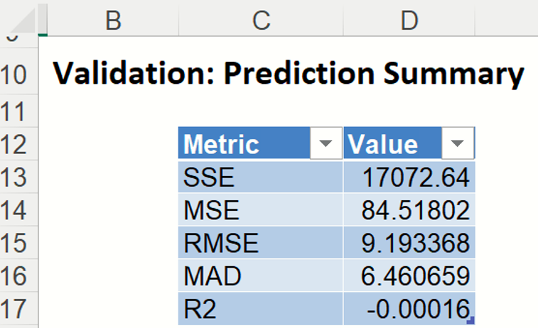
Training: Prediction Summary: Click the Training: Prediction Summary link on the Output Navigator to open the Training Summary. This data table displays various statistics to measure the performance of the trained network: Sum of Squared Error (SSE), Mean Squared Error (MSE), Root Mean Squared Error (RMSE), the Median Absolute Deviation (MAD) and the Coefficient of Determination (R2).
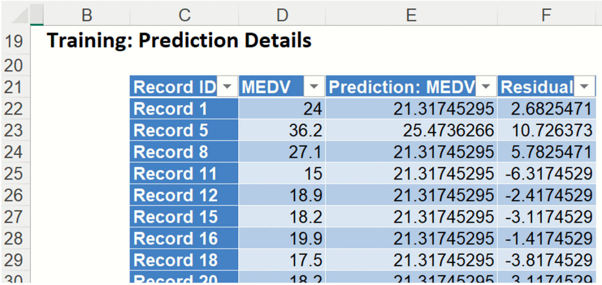
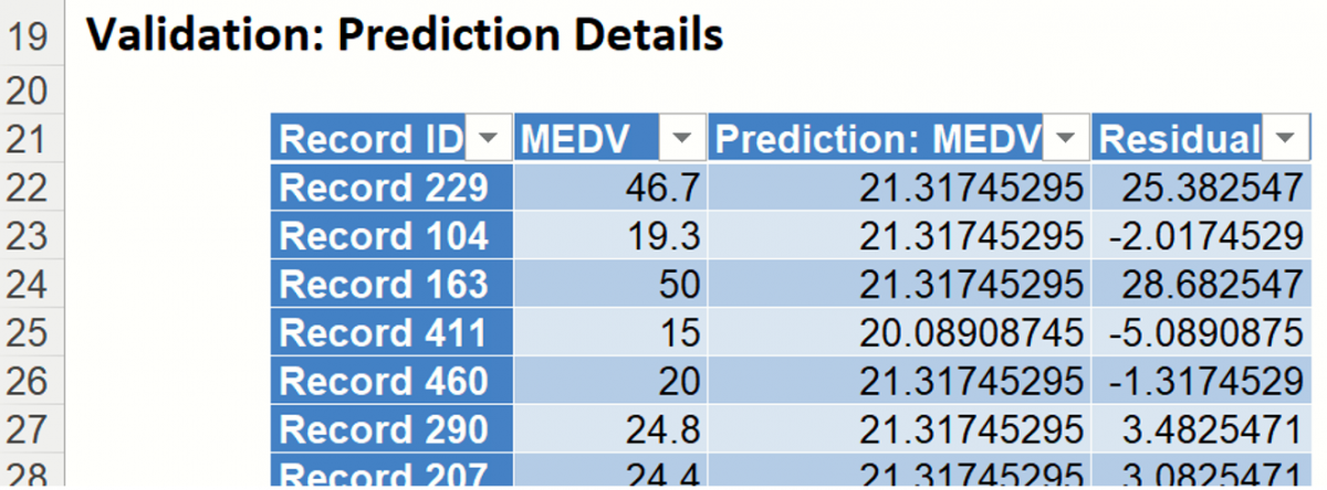
Training: Prediction Details: Scroll down to view the Prediction Details data table. This table displays the Actual versus Predicted values, along with the Residuals, for the training dataset.
NNP_ValidationScore
Another key interest in a data-mining context will be the predicted and actual values for the MEDV variable along with the residual (difference) for each predicted value in the Validation partition.
NNP_ValidationScore displays the newly added Output Variable frequency chart, the Validation: Prediction Summary and the Validation: Prediction Details report. All calculations, charts and predictions on the NNP_ValidationScore output sheet apply to the Validation partition.
Frequency Charts: The output variable frequency chart for the validation partition opens automatically once the NNP_ValidationScore worksheet is selected. This chart displays a detailed, interactive frequency chart for the Actual variable data and the Predicted data, for the validation partition. For more information on this chart, see the NNP_TrainingScore explanation above.
Prediction Summary: In the Prediction Summary report, Analytic Solver Data Science displays the total sum of squared errors summaries for the Validation partition.
Prediction Details: Scroll down to the Validation: Prediction Details report to find the Prediction value for the MEDV variable for each record in the Validation partition, as well as the Residual value.
RROC charts, shown below, are better indicators of fit. Read on to view how these more sophisticated tools can tell us about the fit of the neural network to our data.
NNP_TrainingDataLiftChart & NNP_ValidationDataLiftChart
Click the NNP_TrainingLiftChart and NNP_ValidationLiftChart tabs to view the lift charts and Regression ROC charts for both the training and validation datasets.
Lift charts and Regression ROC Curves are visual aids for measuring model performance. Lift Charts consist of a lift curve and a baseline. The greater the area between the lift curve and the baseline, the better the model. RROC (regression receiver operating characteristic) curves plot the performance of regressors by graphing over-estimations (or predicted values that are too high) versus underestimations (or predicted values that are too low.) The closer the curve is to the top left corner of the graph (in other words, the smaller the area above the curve), the better the performance of the model.
Note: To view these charts in the Cloud app, click the Charts icon on the Ribbon, select NNP_TrainingLiftChart or NNP_ValidationLiftChart for Worksheet and Decile Chart, ROC Chart or Gain Chart for Chart.
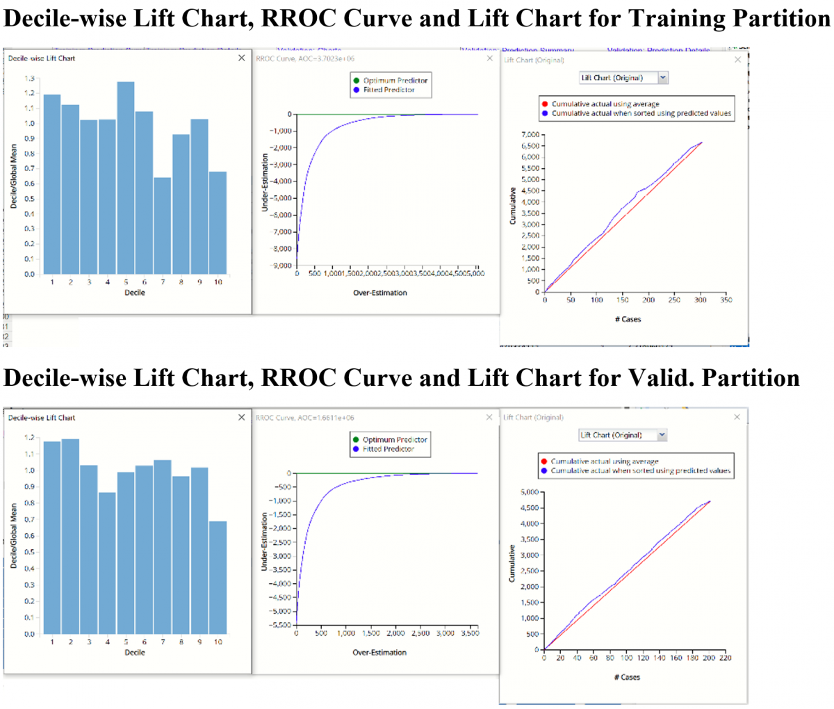
After the model is built using the training data set, the model is used to score on the training data set and the validation data set (if one exists). Then the data set(s) are sorted using the predicted output variable value. After sorting, the actual outcome values of the output variable are cumulated and the lift curve is drawn as the number of cases versus the cumulated value. The baseline (red line connecting the origin to the end point of the blue line) is drawn as the number of cases versus the average of actual output variable values multiplied by the number of cases.
The decilewise lift curve is drawn as the decile number versus the cumulative actual output variable value divided by the decile's mean output variable value. This bars in this chart indicate the factor by which the NNP model outperforms a random assignment, one decile at a time. Typically, this graph will have a "stairstep" appearance - the bars will descend in order from left to right. This means that the model is "binning" the records correctly, from highest priced to lowest. However, in this example, the left most bars are shorter than bars appearing to the right. This type of graph indicates that the model might not be a good fit to the data. Additional analysis is required.
The Regression ROC curve (RROC) was updated in V2017. This new chart compares the performance of the regressor (Fitted Classifier) with an Optimum Classifier Curve. The Optimum Classifier Curve plots a hypothetical model that would provide perfect prediction results. The best possible prediction performance is denoted by a point at the top left of the graph at the intersection of the x and y axis. This point is sometimes referred to as the “perfect classification”. Area Over the Curve (AOC) is the space in the graph that appears above the ROC curve and is calculated using the formula: sigma2 * n2/2 where n is the number of records The smaller the AOC, the better the performance of the model.
In V2017, two new charts were introduced: a new Lift Chart and the Gain Chart. To display these new charts, click the down arrow next to Lift Chart (Original), in the Original Lift Chart, then select the desired chart.
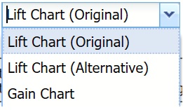
Select Lift Chart (Alternative) to display Analytic Solver Data Science's new Lift Chart. Each of these charts consists of an Optimum Classifier curve, a Fitted Classifier curve, and a Random Classifier curve. The Optimum Classifier curve plots a hypothetical model that would provide perfect classification for our data. The Fitted Classifier curve plots the fitted model and the Random Classifier curve plots the results from using no model or by using a random guess (i.e. for x% of selected observations, x% of the total number of positive observations are expected to be correctly classified).

Click the down arrow and select Gain Chart from the menu. In this chart, the Gain Ratio is plotted against the % Cases.
NNP_Simulation
As discussed above, Analytic Solver Data Science generates a new output worksheet, NNP_Simulation, when Simulate Response Prediction is selected on the Simulation tab of the Neural Network Regression dialog.
This report contains the synthetic data, the predicted values for the training data (using the fitted model) and the Excel – calculated Expression column, if populated in the dialog. Users can switch between the Predicted, Training, and Expression sources or a combination of two, as long as they are of the same type.
Synthetic Data
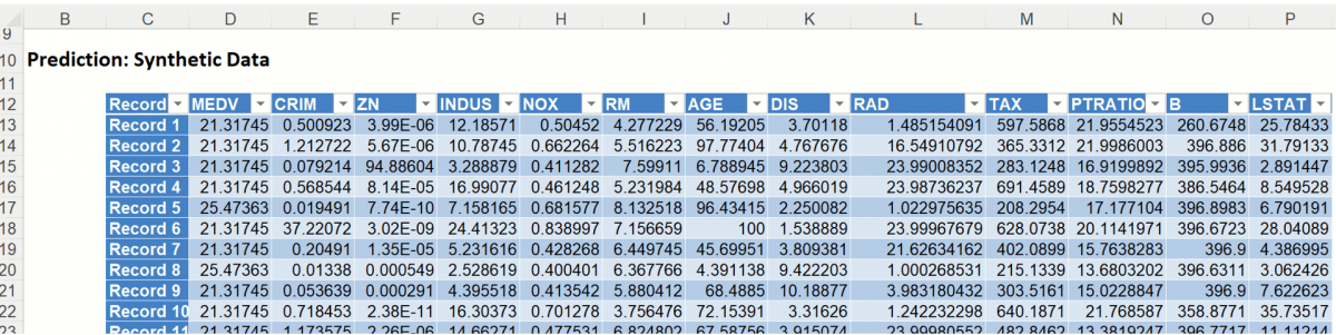
The data contained in the Synthetic Data report is syntethic data, generated using the Generate Data feature described in the chapter with the same name, that appears earlier in this guide.
The chart that is displayed once this tab is selected, contains frequency information pertaining to the output variable in the training data, the synthetic data and the expression, if it exists. (Recall that no expression was entered in this example.)
Frequency Chart for Prediction (Simulation) data
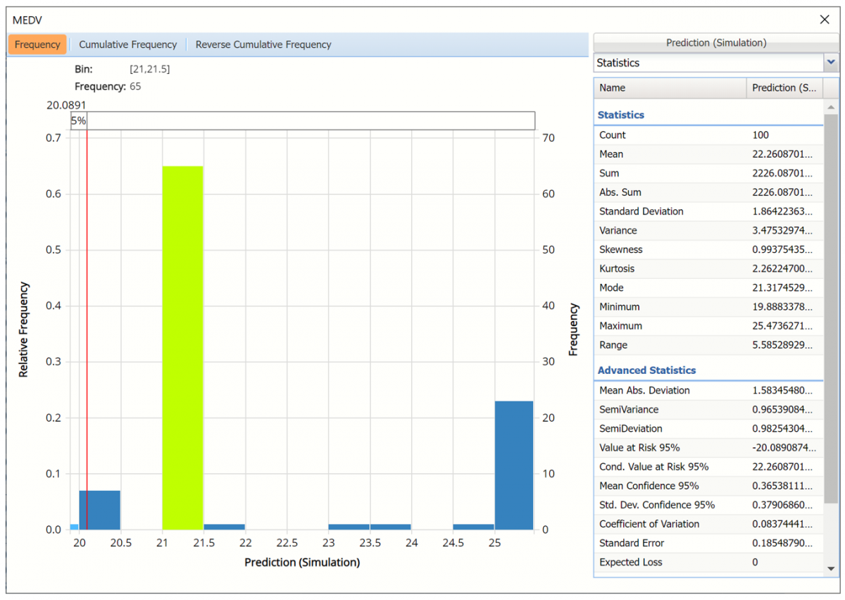
Click Prediction (Simulation) to add the training data to the chart.
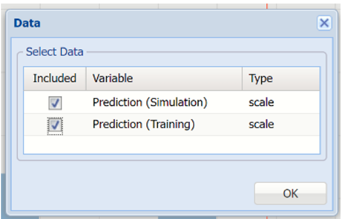
Click Prediction(Simulation) and Prediction (Training) to change the Data view.
Data Dialog
In the chart below, the dark blue bars display the frequencies for the synthetic data and the light blue bars display the frequencies for the predicted values in the Training partition.
Prediction (Simulation) and Prediction (Training) Frequency chart for MEDV variable
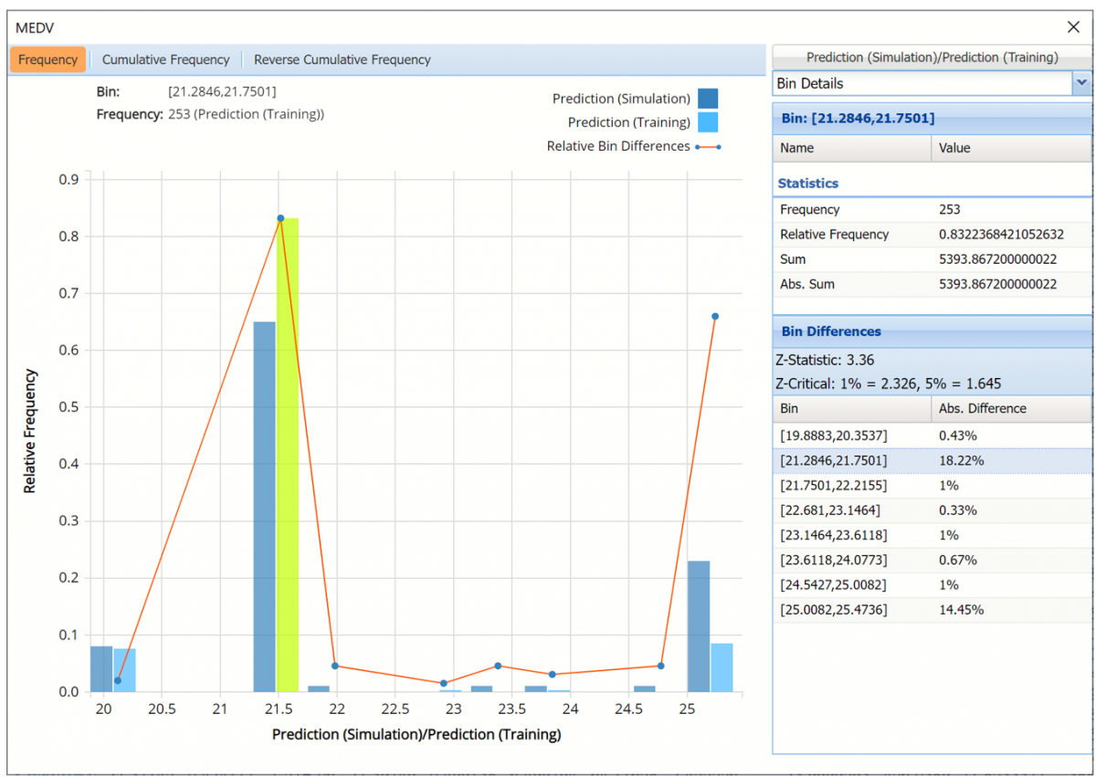
The Relative Bin Differences curve charts the absolute differences between the data in each bin. Click the down arrow next to Statistics to view the Bin Details pane to display the calculations.
Click the down arrow next to Frequency to change the chart view to Relative Frequency or to change the look by clicking Chart Options. Statistics on the right of the chart dialog are discussed earlier in this section. For more information on the generated synthetic data, see the Generate Data chapter that appears earlier in this guide.
For information on NNP_Stored, please see the Scoring New Data.