This example describes the use of the Boxplot chart to illustrate the characteristics of the dataset.
Click Help – Example Models on the Data Science ribbon to open the BoxPlot.xlsx example file under Forecasting/ Data Science Example Models.
Select on a cell within the data (say A2), then click Explore – Chart Wizard to bring up the first dialog of the Chart Wizard. Select BoxPlot.
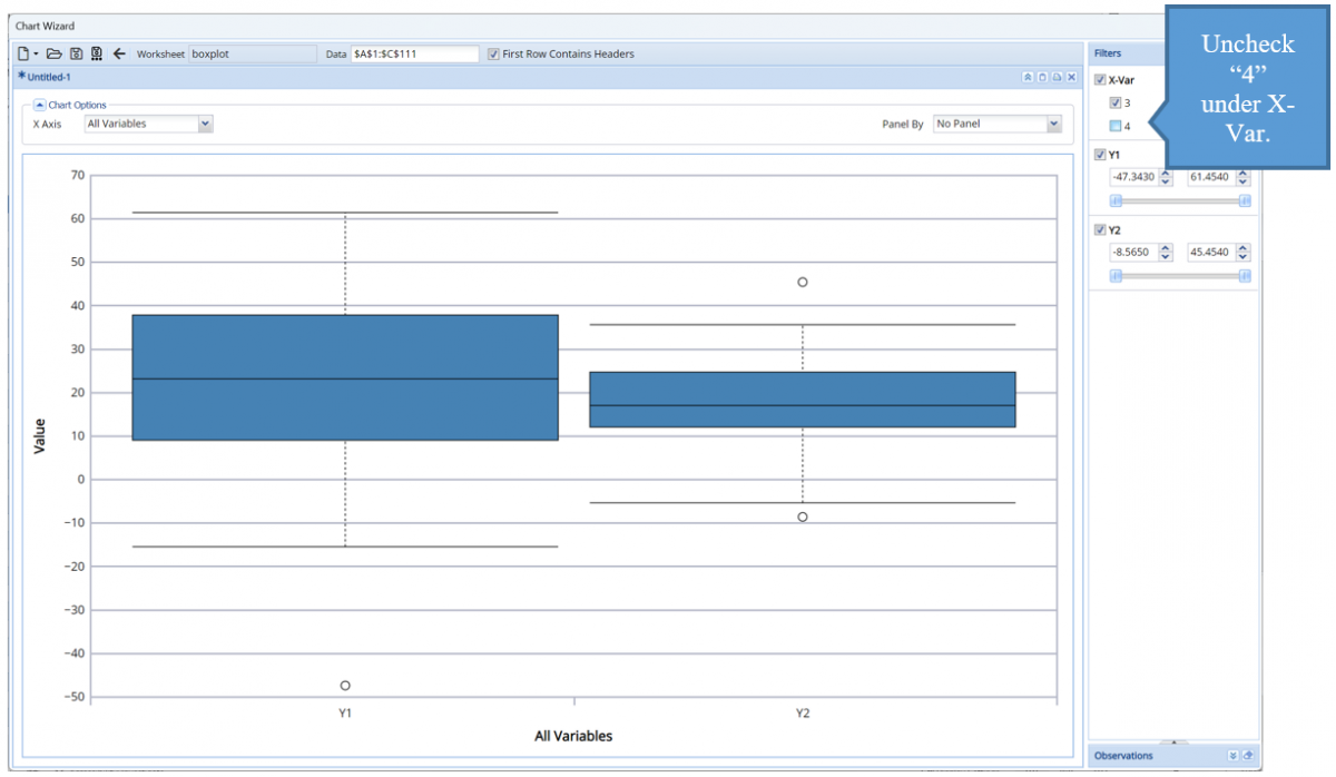
Uncheck class 4 under the X-Var filter to remove this class from the plot.
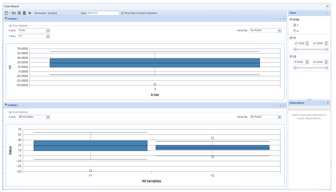
- To select a different variable on the X-axis, click the down arrow net to X-Axis and select the desired variable from the menu, say X-Var.
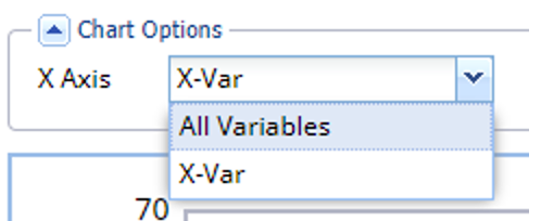
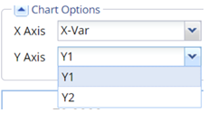
- Once a specific variable is selcted for X Axis, a new menu, Y Axis, appears. Click the down arrow next to Y Axis and select Y1 from the menu. The graph changes to display the range of values in the Y1 column for X variable 3.
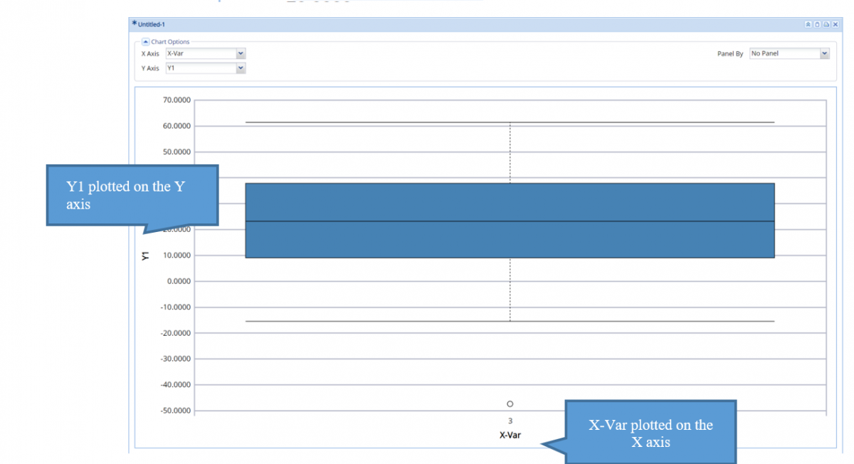
The solid line denotes the Median. The box reaches from the 25th Percentile to the 75th Percentile. The upper “whiskers” denote the extreme minimum and maximum values, excluding outliers. In this example, there is one outlier below the minimum “whisker”. Outliers are values that fall outside of the ranges:
- Min: 25th Percentile – 1.5 * IQR – Any data points falling below this limit is considered an outlier. In this example, there is one outlier, shown above.
- Max: 75th Percentile + 1.5 * IQR – Any data points appearing above this limit is considered an outlier.
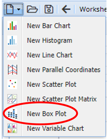
To add a 2nd boxplot, click the New File icon, top, left, and select New Box Plot from the menu.
A second chart is added to the Chart Wizard dialog.
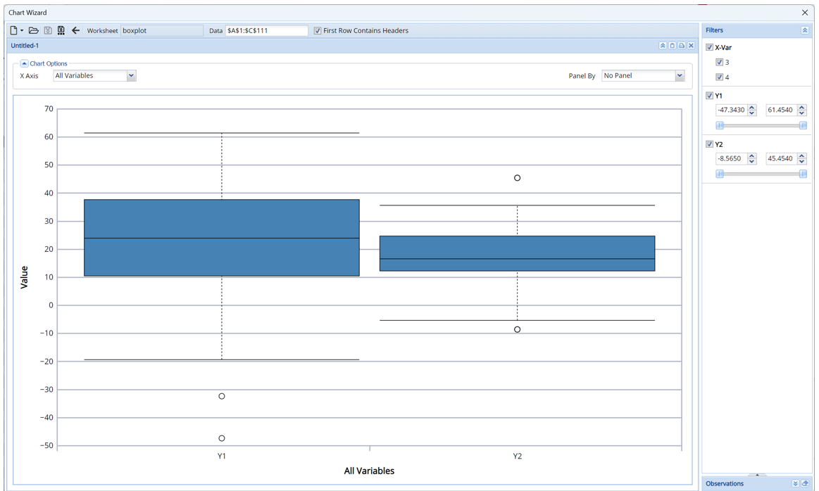
Note that the Filters pane applies to both charts. The bottom graph charts the Y1 and Y2 values for (only) X variable 3.